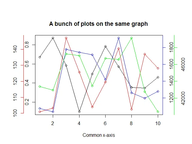
我有4组数值:y1、y2、y3、y4和一个数值x。这些y值范围不同,我需要将它们作为分离的曲线绘制到y轴上,并使用各自的数据集。
简而言之,我需要在同一图表上绘制具有不同值(刻度)的3个y轴。
简而言之,我需要在同一图表上绘制具有不同值(刻度)的3个y轴。
尝试一下这个...
# The data have a common independent variable (x)
x <- 1:10

# Generate 4 different sets of outputs
y1 <- runif(10, 0, 1)
y2 <- runif(10, 100, 150)
y3 <- runif(10, 1000, 2000)
y4 <- runif(10, 40000, 50000)
y <- list(y1, y2, y3, y4)

# Colors for y[[2]], y[[3]], y[[4]] points and axes
colors = c("red", "blue", "green")

# Set the margins of the plot wider
par(oma = c(0, 2, 2, 3))

plot(x, y[[1]], yaxt = "n", xlab = "Common x-axis", main = "A bunch of plots on the same graph",
     ylab = "")
lines(x, y[[1]])

# We use the "pretty" function go generate nice axes
axis(at = pretty(y[[1]]), side = 2)

# The side for the axes.  The next one will go on
# the left, the following two on the right side
sides <- list(2, 4, 4)

# The number of "lines" into the margin the axes will be
lines <- list(2, NA, 2)

for(i in 2:4) {
  par(new = TRUE)
  plot(x, y[[i]], axes = FALSE, col = colors[i - 1], xlab = "", ylab = "")
  axis(at = pretty(y[[i]]), side = sides[[i-1]], line = lines[[i-1]],
      col = colors[i - 1])
  lines(x, y[[i]], col = colors[i - 1])
}

# Profit.
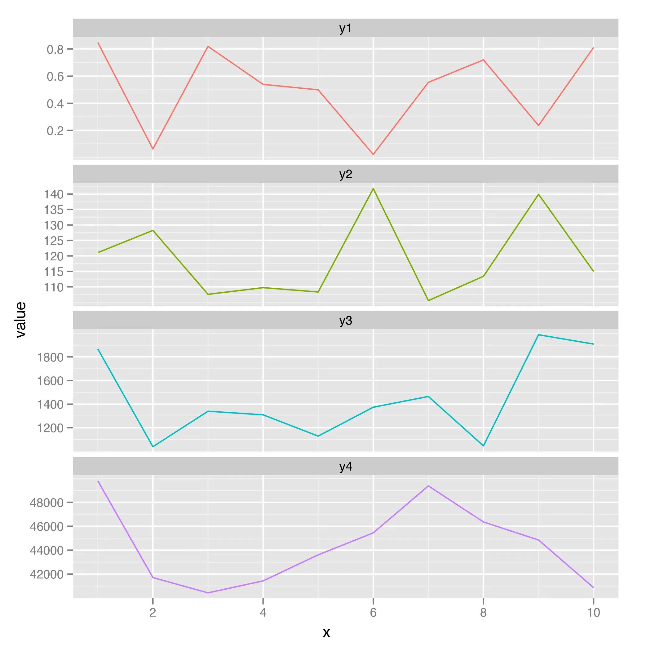
ggplot2 的解决方案:library(ggplot2)
dat <- data.frame(x, y1, y2, y3, y4)
dat.m <- melt(dat, "x")
ggplot(dat.m, aes(x, value, colour = variable)) + geom_line() +
facet_wrap(~ variable, ncol = 1, scales = "free_y") +
scale_colour_discrete(legend = FALSE)
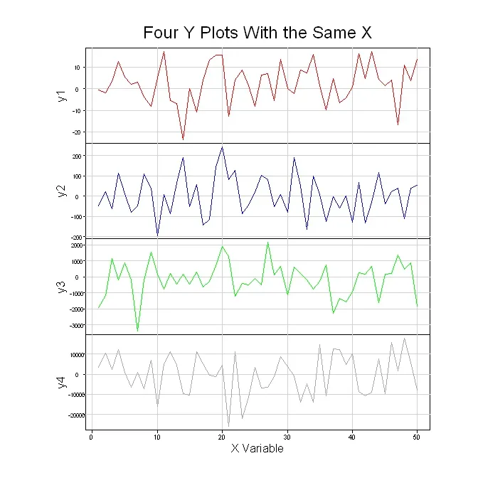
尝试以下方法,它并不像看上去那么复杂。一旦您观看了第一个图形被构建的过程,您会发现其他图形非常相似。由于有四个类似的图形,您可以很容易地重新配置代码为一个函数,用于反复绘制每个图形。但是,由于我通常绘制具有相同x轴的各种图形,我需要很高的灵活性。因此,我决定对于每个图形只需复制/粘贴/修改代码更容易些。
#Generate the data for the four graphs
x <- seq(1, 50, 1)
y1 <- 10*rnorm(50)
y2 <- 100*rnorm(50)
y3 <- 1000*rnorm(50)
y4 <- 10000*rnorm(50)

#Set up the plot area so that multiple graphs can be crammed together
par(pty="m", plt=c(0.1, 1, 0, 1), omd=c(0.1,0.9,0.1,0.9))

#Set the area up for 4 plots
par(mfrow = c(4, 1))

#Plot the top graph with nothing in it =========================
plot(x, y1, xlim=range(x), type="n", xaxt="n", yaxt="n", main="", xlab="", ylab="")
mtext("Four Y Plots With the Same X", 3, line=1, cex=1.5)

#Store the x-axis data of the top plot so it can be used on the other graphs
pardat<-par()
xaxisdat<-seq(pardat$xaxp[1],pardat$xaxp[2],(pardat$xaxp[2]-pardat$xaxp[1])/pardat$xaxp[3])

#Get the y-axis data and add the lines and label
yaxisdat<-seq(pardat$yaxp[1],pardat$yaxp[2],(pardat$yaxp[2]-pardat$yaxp[1])/pardat$yaxp[3])
axis(2, at=yaxisdat, las=2, padj=0.5, cex.axis=0.8, hadj=0.5, tcl=-0.3)
abline(v=xaxisdat, col="lightgray")
abline(h=yaxisdat, col="lightgray")
mtext("y1", 2, line=2.3)
lines(x, y1, col="red")

#Plot the 2nd graph with nothing ================================
plot(x, y2, xlim=range(x), type="n", xaxt="n", yaxt="n", main="", xlab="", ylab="")

#Get the y-axis data and add the lines and label
pardat<-par()
yaxisdat<-seq(pardat$yaxp[1],pardat$yaxp[2],(pardat$yaxp[2]-pardat$yaxp[1])/pardat$yaxp[3])
axis(2, at=yaxisdat, las=2, padj=0.5, cex.axis=0.8, hadj=0.5, tcl=-0.3)
abline(v=xaxisdat, col="lightgray")
abline(h=yaxisdat, col="lightgray")
mtext("y2", 2, line=2.3)
lines(x, y2, col="blue")

#Plot the 3rd graph with nothing =================================
plot(x, y3, xlim=range(x), type="n", xaxt="n", yaxt="n", main="", xlab="", ylab="")

#Get the y-axis data and add the lines and label
pardat<-par()
yaxisdat<-seq(pardat$yaxp[1],pardat$yaxp[2],(pardat$yaxp[2]-pardat$yaxp[1])/pardat$yaxp[3])
axis(2, at=yaxisdat, las=2, padj=0.5, cex.axis=0.8, hadj=0.5, tcl=-0.3)
abline(v=xaxisdat, col="lightgray")
abline(h=yaxisdat, col="lightgray")
mtext("y3", 2, line=2.3)
lines(x, y3, col="green")

#Plot the 4th graph with nothing =================================
plot(x, y4, xlim=range(x), type="n", xaxt="n", yaxt="n", main="", xlab="", ylab="")

#Get the y-axis data and add the lines and label
pardat<-par()
yaxisdat<-seq(pardat$yaxp[1],pardat$yaxp[2],(pardat$yaxp[2]-pardat$yaxp[1])/pardat$yaxp[3])
axis(2, at=yaxisdat, las=2, padj=0.5, cex.axis=0.8, hadj=0.5, tcl=-0.3)
abline(v=xaxisdat, col="lightgray")
abline(h=yaxisdat, col="lightgray")
mtext("y4", 2, line=2.3)
lines(x, y4, col="darkgray")

#Plot the X axis =================================================
axis(1, at=xaxisdat, padj=-1.4, cex.axis=0.9, hadj=0.5, tcl=-0.3)
mtext("X Variable", 1, line=1.5)
下面是四个图表的绘制结果。