我正在尝试绘制两个对齐的图形,但其中一个有标签,另一个没有。
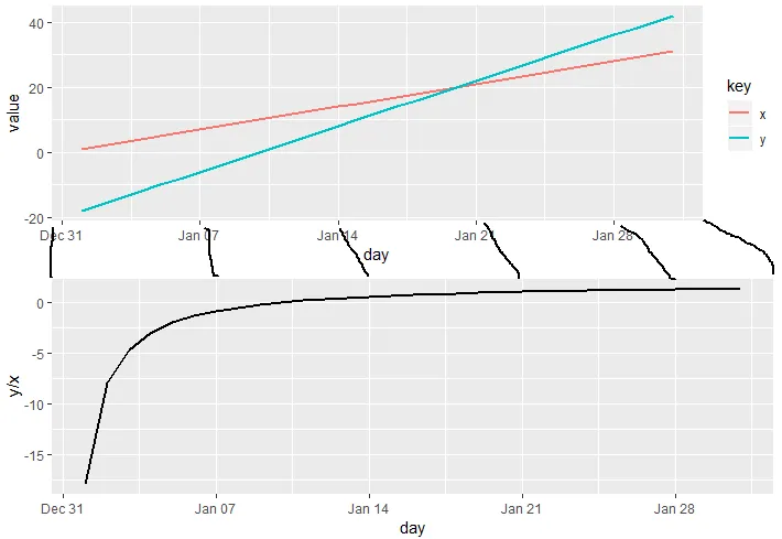
示例:
示例:
library(dplyr)
library(ggplot2)

df <-
  seq(as.Date("2019-01-01"), as.Date("2019-01-31"), by = 1) %>%
  as_tibble() %>%
  rename(day = value) %>%
  mutate(
    x = seq(1, 31, by = 1),
    y = x * 2 - 20
  )

p1 <-
  df %>%
  gather(key, value, c(x, y)) %>%
  ggplot(aes(x = day, y = value, color = key)) +
  geom_line(size = 1)

p2 <-
  df %>%
  ggplot(aes(x = day, y = y / x)) +
  geom_line(size = 1)

grid.arrange(
  p1, p2
)
结果:
有没有一种方法可以对齐轴而不使用facet_wrap?(我想为每个图表添加特定的标签格式,因为它们处于不同的单位中,并且据我所知,facet_wrap不允许我这样做)
最初的回答:
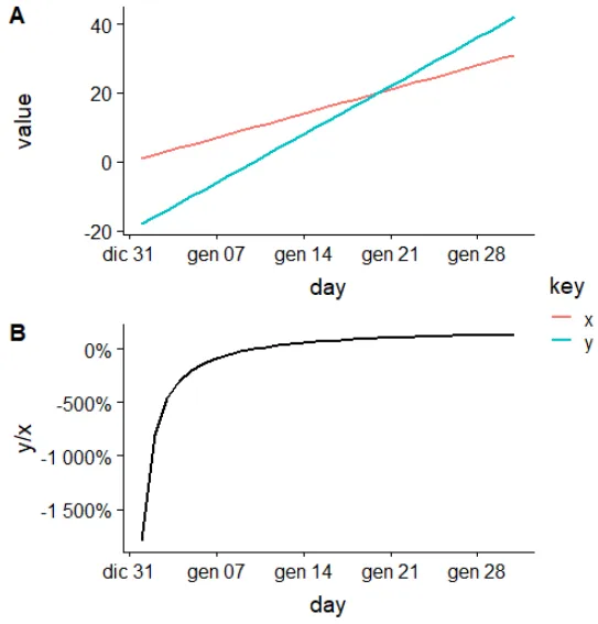
theme(legend.position="bottom")? - user2974951