时间序列中的日期与X轴不对齐

3

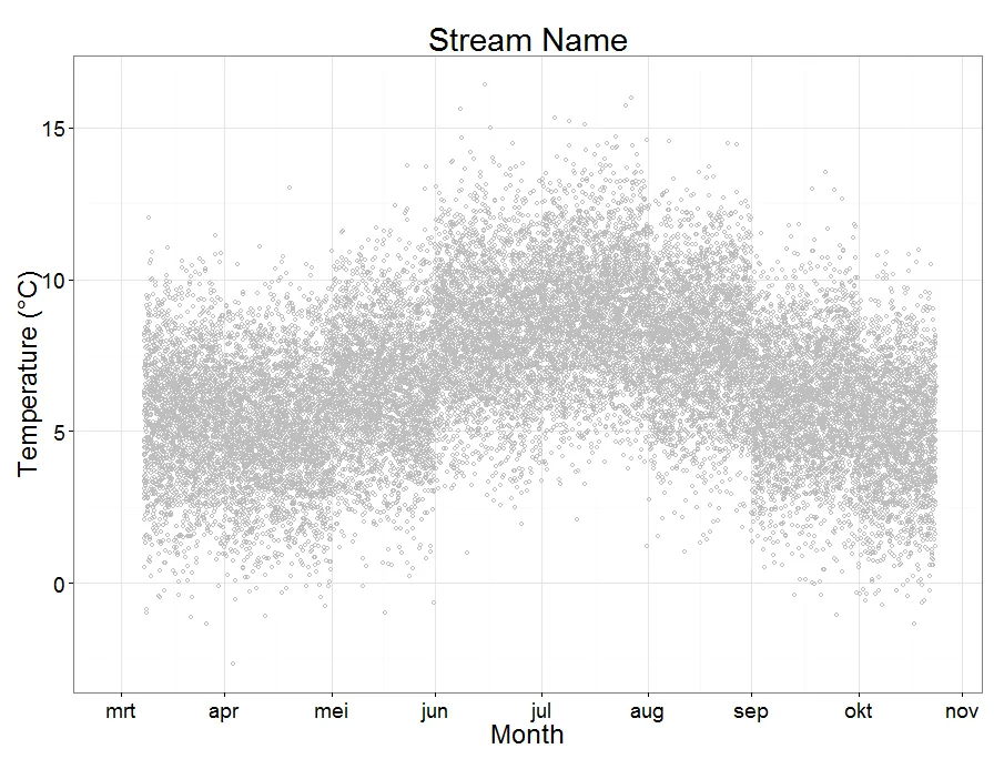
我试图绘制从2015年4月7日开始,每15分钟收集一次的溪流水温数据,到2015年11月23日结束。我希望x轴的每个刻度都有标签,如“Apr”,“May”等,直到“Nov”。我编写的代码生成了一个漂亮的图形,但温度读数与x轴刻度标记错位;它们从2015年4月1日开始,而不是从2015年4月7日开始,因此所有温度读数都比应该早7天。换句话说,我希望x轴从4月1日开始,但数据从收集日期开始。我认为这与我如何排序时间并应用刻度有关,但我不确定如何纠正。非常感谢您的任何帮助。谢谢

#Load Data
trib<-read.csv("C:\\r.data\\trib.csv",header=TRUE)    

#Index Time
    trib$DateTime<-as.POSIXct(strptime(trib$DateTime,"%m/%d/%Y %H:%M"))

#Create Time Series
trib.xts<-xts(trib,order.by=trib$DateTime)

#Example Data
 DateTime                      Temp
22666 2015-04-07 13:30:00      NA
22667 2015-04-07 13:45:00      2.983
22668 2015-04-07 14:00:00      3.142
22669 2015-04-07 14:15:00      3.274
22670 2015-04-07 14:30:00      3.354
22671 2015-04-07 14:45:00      3.433
22672 2015-04-07 15:00:00      3.485
22673 2015-04-07 15:15:00      3.670
22674 2015-04-07 15:30:00      3.749
22675 2015-04-07 15:45:00      3.827

#Plot
par(mfrow=c(1,1))

margins <- par(mar=c(2,2,1,1)+0.1)
omargins <- par(oma=c(2,2,0.5,0.5)+0.1)

Temp.lab=seq(0,30,by=5)
Temp.ticks=seq(0,30,by=5)
plot(trib.xts$Temp,axes=FALSE,auto.grid=FALSE,col="gray",ylim=c(0,30),main="Stream Name",cex.main=0.8,lwd=1)
axis(2,at=Temp.ticks,labels=format(Temp.lab,scientific=FALSE),ylab="Temperature (C)",las=1,cex.axis=0.8)

times <- time(trib.xts$DateTime["2015-04-01/2015-11-15"])
ticksm <- seq(times[1], times[length(times)], by = "months")
month.lab = c("Apr","May","Jun","Jul","Aug","Sep","Oct","Nov")
axis(1, at = ticksm, labels = month.lab, tcl = -0.5,cex.axis=0.8,xlab="Month")
mtext("Temperature (°C)",side=2,line=3,las=3,cex=0.8)
mtext("Month",side=1,line=3,cex=0.8)

我认为您没有正确输入索引列。左侧的整数列似乎并不像您应该尝试的日期时间索引。plot.xts方法将使用索引作为x轴定位。这进一步表明需要使用dput作为输出函数。 - IRTFM
谢谢您的回复,但是我应该如何正确地索引日期时间呢?再次感谢。 - mkRuser
假设您的意思是“如何改进索引”,那么我无法提供建议。因为您没有展示这个数据对象是如何创建的。 - IRTFM
数据来自一个包含两个列标题的 .csv 文件:DateTime 和 Temp。我已经更新了我的代码,以便读取 .csv 文件。谢谢。 - mkRuser
我仍然怀疑数据的初始输入存在问题。请发布 dput(trib)。我的 read.csv 测试,使用 NA 的初始值且不指定 colClasses,表明你认为是数字的列可能是因子类别。 - IRTFM
1个回答

0

这里有一种方法可以做到,假设您不介意使用 ggplot 解决方案。

# Let's first make SampleData to your specifications:
trib.xts <- data.frame(DateTime = seq.POSIXt(as.POSIXct("2015/04/07 13:30:00",Format="%Y/%m/%d %H:%M:%S", timezone ="CEST"),
                                             as.POSIXct("2015/11/23 13:00:00",Format="%Y/%m/%d %H:%M:%S", timezone ="CEST"),
                                             by="15 min"))
# Then add temperature, a bit warmer in summer.
trib.xts$Temp <- 2*sin(month(trib.xts$DateTime))+rnorm(22083,mean=7,sd=2)

#Now, we need ggplot and scales
library(ggplot2)
library(scales)

#then make a plot
(plot1 <- ggplot(trib.xts, aes(x=DateTime, y=Temp)) +
  geom_point(col="gray",shape=1) +
  theme_bw(24) +
  ggtitle("Stream Name") +
  ylab("Temperature (°C)") +
  xlab("Month"))

# Now set the breaks, labels and x-limits as you please
(plot1 <- plot1 +
  scale_x_datetime(breaks = "1 month", 
               labels=date_format("%b"),
               limits = as.POSIXct(c("2015-03-30","2015-11-25"), timezone="CEST")))

在此输入图像描述 请注意,我的 X 轴是用荷兰语表示的。你可以通过更改 Sys.setlocale 来改变它显示的语言。


谢谢您提供的解决方案RHA,但我如何以非ggplot的方式从读取.csv到最终绘制图形呢?再次感谢。 - mkRuser
@mkRuser 我不知道。我是一个ggplot爱好者。索引的问题在于R无法确定从哪里开始。您可以尝试添加所有日期从1-apr到7-apr与NA。但我会选择ggplot... - RHA

网页内容由stack overflow 提供, 点击上面的
可以查看英文原文,
原文链接