使用Plotly创建图像子图

8
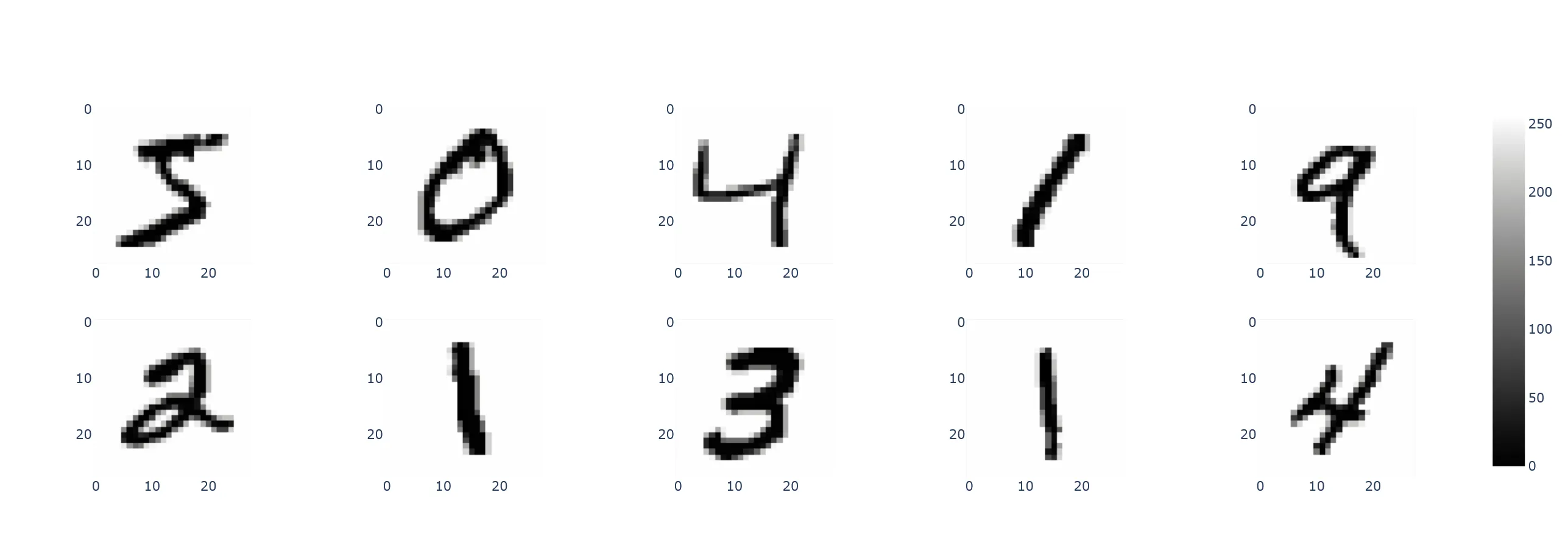
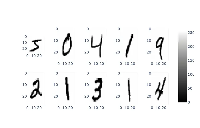
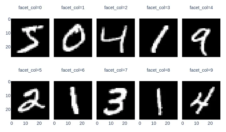
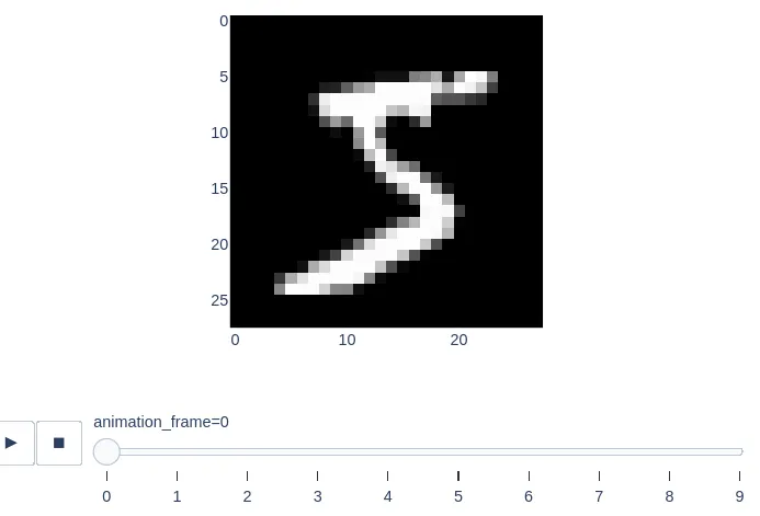
我想使用Plotly展示mnist数据集中的前10张图片。这比我想象的更加复杂。以下代码无法正常工作:
import numpy as np
np.random.seed(123)

import plotly.express as px
from keras.datasets import mnist

(X_train, y_train), (X_test, y_test) =  mnist.load_data()

fig = subplots.make_subplots(rows=1, cols=10)
fig.add_trace(px.imshow(X_train[0]), row=1, col=1)

由于其结果而产生

ValueError: 
    Invalid element(s) received for the 'data' property of 
        Invalid elements include: [Figure({
    'data': [{'coloraxis': 'coloraxis',
              'type': 'heatmap',
              'z': array([[0, 0, 0, ..., 0, 0, 0],
                          [0, 0, 0, ..., 0, 0, 0],
                          [0, 0, 0, ..., 0, 0, 0],
                          ...,
                          [0, 0, 0, ..., 0, 0, 0],
                          [0, 0, 0, ..., 0, 0, 0],
                          [0, 0, 0, ..., 0, 0, 0]], dtype=uint8)}],
    'layout': {'coloraxis': {'colorscale': [[0.0, '#0d0887'], [0.1111111111111111,
                                            '#46039f'], [0.2222222222222222,
                                            '#7201a8'], [0.3333333333333333,
                                            '#9c179e'], [0.4444444444444444,
                                            '#bd3786'], [0.5555555555555556,
                                            '#d8576b'], [0.6666666666666666,
                                            '#ed7953'], [0.7777777777777778,
                                            '#fb9f3a'], [0.8888888888888888,
                                            '#fdca26'], [1.0, '#f0f921']]},
               'margin': {'t': 60},
               'template': '...',
               'xaxis': {'constrain': 'domain', 'scaleanchor': 'y'},
               'yaxis': {'autorange': 'reversed', 'constrain': 'domain'}}
})]

    The 'data' property is a tuple of trace instances
    that may be specified as:
      - A list or tuple of trace instances
        (e.g. [Scatter(...), Bar(...)])
      - A single trace instance
        (e.g. Scatter(...), Bar(...), etc.)
      - A list or tuple of dicts of string/value properties where:
        - The 'type' property specifies the trace type
            One of: ['area', 'bar', 'barpolar', 'box',
                     'candlestick', 'carpet', 'choropleth',
                     'choroplethmapbox', 'cone', 'contour',
                     'contourcarpet', 'densitymapbox', 'funnel',
                     'funnelarea', 'heatmap', 'heatmapgl',
                     'histogram', 'histogram2d',
                     'histogram2dcontour', 'image', 'indicator',
                     'isosurface', 'mesh3d', 'ohlc', 'parcats',
                     'parcoords', 'pie', 'pointcloud', 'sankey',
                     'scatter', 'scatter3d', 'scattercarpet',
                     'scattergeo', 'scattergl', 'scattermapbox',
                     'scatterpolar', 'scatterpolargl',
                     'scatterternary', 'splom', 'streamtube',
                     'sunburst', 'surface', 'table', 'treemap',
                     'violin', 'volume', 'waterfall']

        - All remaining properties are passed to the constructor of
          the specified trace type

        (e.g. [{'type': 'scatter', ...}, {'type': 'bar, ...}])

也不

fig.add_trace(go.Image(X_train[0]), row=1, col=1)

或者
fig.add_trace(go.Figure(go.Heatmap(z=X_train[0])), 1,1)

我开始想不出主意了。应该可以将一排图像作为页眉。

2个回答

9

这个有效 - 我 希望 这不是最终答案:

fig = subplots.make_subplots(rows=2, cols=5)

for n, image in enumerate(X_train[:10]):
  fig.add_trace(px.imshow(255-image).data[0], row=int(n/5)+1, col=n%5+1)

# the layout gets lost, so we have to carry it over - but we cannot simply do
# fig.layout = layout since the layout has to be slightly different for subplots
# fig.layout.yaxis in a subplot refers only to the first axis for example
# update_yaxes updates *all* axis on the other hand
layout = px.imshow(X_train[0], color_continuous_scale='gray').layout
fig.layout.coloraxis = layout.coloraxis
fig.update_xaxes(**layout.xaxis.to_plotly_json())
fig.update_yaxes(**layout.yaxis.to_plotly_json())
fig.show()

enter image description here

有趣的是,如果您点击“plotly download plot as png”图标生成的图片与此不同,并且看起来像这样(参见 Github issue):

enter image description here


一旦我们合并 https://github.com/plotly/plotly.py/pull/2746,这将变得更容易 :) - nicolaskruchten

7

使用Facet

请参考以下较为简单的回答:

import plotly.express as px
from keras.datasets import mnist

(X_train, y_train), (X_test, y_test) = mnist.load_data()

fig = px.imshow(X_train[:10, :, :], binary_string=True, facet_col=0, facet_col_wrap=5)

它会产生以下输出:

output

使用动画

为了探索目的,虽然这不完全是您要求的内容,但您也可以制作动画并逐个可视化一个数字:

fig = px.imshow(X_train[:10, :, :], binary_string=True, animation_frame=0)

动画输出结果

来源

Imshow文档


网页内容由stack overflow 提供, 点击上面的
可以查看英文原文,
原文链接