我是一个相对新手的Python和Plotly用户(在这个阶段只有不到3个月的编程经验)。
我正在尝试在Plotly中创建子图。我已经使用下面的代码创建了Plotly图形(也附上了代码片段),但是我似乎无法使用子图开展工作。
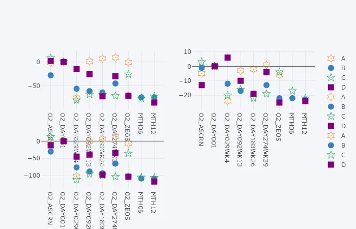
我创建了许多这样类型的数据图表,如果能帮我优化代码,将不胜感激。
这里是一个样本数据集(以下是我知道的唯一在此网站上排列它的方法??)[注意:它不是我用来生成下面图表的完全相同的数据集,但足够接近]:
我创建了许多这样类型的数据图表,如果能帮我优化代码,将不胜感激。
这里是一个样本数据集(以下是我知道的唯一在此网站上排列它的方法??)[注意:它不是我用来生成下面图表的完全相同的数据集,但足够接近]:
subjid_raw  studyarm    visit             pn_chg     fx_chg   totw_chg

20001       B           02_ASCRN              -1       -28      -30
20001       B           02_DAY001              0         0        0
20001       B           02_DAY029WK4         -12       -56      -76
20001       B           02_DAY092WK13        -17       -61      -88
20001       B           02_DAY183WK26        -19       -64      -93
20001       B           02_DAY274WK39        -13       -45      -65
20001       B           02_ZEOS              -22       -70     -102
20001       B           MTH06                -22       -74     -108
20001       B           MTH12                -23       -74     -109
20005       C           02_ASCRN               3         8       12
20005       C           02_DAY001              0         0        0
20005       C           02_DAY029WK4         -20       -80     -112
20005       C           02_DAY092WK13        -16       -68      -95
20005       C           02_DAY183WK26        -22       -69      -99
20005       C           02_DAY274WK39        -19       -71     -103
20005       C           02_ZEOS               -4       -26      -36
20005       C           MTH06                -17       -76     -105
20005       C           MTH12                -22       -72     -106
20007       D           02_ASCRN             -13         2      -12
20007       D           02_DAY001              0         0        0
20007       D           02_DAY029WK4           6       -15      -45
20007       D           02_DAY092WK13        -10       -26      -39
20007       D           02_DAY183WK26        -19       -72      -97
20007       D           02_DAY274WK39         -4       -30      -35
20007       D           02_ZEOS              -25       -71     -103
20007       D           MTH12                -24       -85     -117
20010       A           02_ASCRN              -5        -2       -6
20010       A           02_DAY001              0         0        0
20010       A           02_DAY029WK4         -24       -75     -102
20010       A           02_DAY092WK13         -3         1       -1
20010       A           02_DAY183WK26         -2         7        6
20010       A           02_DAY274WK39          1         9       13
20010       A           02_ZEOS                -6       -1       -7
需要:我希望将子图显示为带有两行两列的子图(虽然不确定是否可以实现,因为只有三列数据需要绘制?)
import pandas as pd ##(version: 0.22.0)
import numpy as np ##(version: 1.14.0)

import plotly.graph_objs as go
import plotly.tools as tls
from plotly.offline import *
import cufflinks as cf ##(version: 0.12.1)

init_notebook_mode(connected=True)
cf.go_offline()


dummy_data = pd.read_csv("desktop\dummy_data.csv")

a = dummy_data.groupby(['studyarm', 'visit']) ['fx_chg'].mean().unstack('studyarm').drop(['02_UNSCH','ZEOS'])
b = dummy_data.groupby(['studyarm', 'visit']) ['pn_chg'].mean().unstack('studyarm').drop(['02_UNSCH','ZEOS'])
c = dummy_data.groupby(['studyarm', 'visit']) ['totw_chg'].mean().unstack('studyarm').drop(['02_UNSCH','ZEOS'])

fig3 = a.iplot(kind='line', yTitle='Score', title='Dummy Data1', mode=markers, asFigure=True)
fig3['data'][0]['marker']['symbol'] = 'hexagram-open-dot'
fig3['data'][1]['marker']['symbol'] = 'circle-dot'
fig3['data'][2]['marker']['symbol'] = 'star-open-dot'
fig3['data'][3]['marker']['symbol'] = 'square'
iplot(fig3, filename='simple-plot')

fig4 = b.iplot(kind='line', yTitle='Score', title='Dummy Data2', mode=markers, asFigure=True)
fig4['data'][0]['marker']['symbol'] = 'hexagram-open-dot'
fig4['data'][1]['marker']['symbol'] = 'circle-dot'
fig4['data'][2]['marker']['symbol'] = 'star-open-dot'
fig4['data'][3]['marker']['symbol'] = 'square'
iplot(fig4, filename='simple-plot')

fig5 = c.iplot(kind='line', yTitle='Score', title='Dummy Data3', mode=markers, asFigure=True)
fig5['data'][0]['marker']['symbol'] = 'hexagram-open-dot'
fig5['data'][1]['marker']['symbol'] = 'circle-dot'
fig5['data'][2]['marker']['symbol'] = 'star-open-dot'
fig5['data'][3]['marker']['symbol'] = 'square'
iplot(fig5, filename='simple-plot')

## I have tried all forms of
##fig = tls.make_subplots(rows=n, cols=n) ##but it just shows graphs as blank?
如果能给予任何帮助或指引方向,将不胜感激。
<iframe width="900" height="800" frameborder="0" scrolling="no" src="//plot.ly/~t3c/29.embed"></iframe><iframe width="900" height="800" frameborder="0" scrolling="no" src="//plot.ly/~t3c/31.embed"></iframe><iframe width="900" height="800" frameborder="0" scrolling="no" src="//plot.ly/~t3c/34.embed"></iframe>