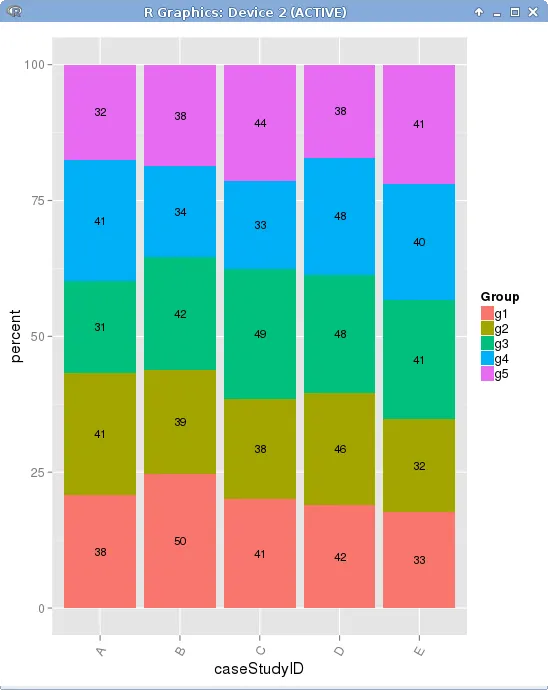
我想绘制一个(分面)堆叠条形图,其中X轴以百分比表示。此外,频率标签显示在条形内部。
经过一番努力和查看stackoverflow上的许多不同问题,我找到了一个使用ggplot2解决此问题的解决方案。然而,我没有直接使用ggplot2,而是手动使用表格调用聚合数据。我以一种复杂的方式进行手动聚合,并使用临时变量手动计算百分比值(请参见源代码注释“手动聚合数据”)。
如何以更好的方式完成相同的绘图,而无需手动和复杂的数据聚合?
经过一番努力和查看stackoverflow上的许多不同问题,我找到了一个使用ggplot2解决此问题的解决方案。然而,我没有直接使用ggplot2,而是手动使用表格调用聚合数据。我以一种复杂的方式进行手动聚合,并使用临时变量手动计算百分比值(请参见源代码注释“手动聚合数据”)。
如何以更好的方式完成相同的绘图,而无需手动和复杂的数据聚合?
library(ggplot2)
library(scales)

library(gridExtra)
library(plyr)

##
##  Random Data
##
fact1 <- factor(floor(runif(1000, 1,6)),
                      labels = c("A","B", "C", "D", "E"))

fact2 <- factor(floor(runif(1000, 1,6)),
                      labels = c("g1","g2", "g3", "g4", "g5"))

##
##  STACKED BAR PLOT that scales x-axis to 100%
##

## manually aggregate data
##
mytable <- as.data.frame(table(fact1, fact2))

colnames(mytable) <- c("caseStudyID", "Group", "Freq")

mytable$total <- sapply(mytable$caseStudyID,
                        function(caseID) sum(subset(mytable, caseStudyID == caseID)$Freq))

mytable$percent <- round((mytable$Freq/mytable$total)*100,2)

mytable2 <- ddply(mytable, .(caseStudyID), transform, pos = cumsum(percent) - 0.5*percent)


## all case studies in one plot (SCALED TO 100%)

p1 <- ggplot(mytable2, aes(x=caseStudyID, y=percent, fill=Group)) +
    geom_bar(stat="identity") +
    theme(legend.key.size = unit(0.4, "cm")) +
    theme(axis.text.x = element_text(angle = 60, hjust = 1)) +
    geom_text(aes(label = sapply(Freq, function(x) ifelse(x>0, x, NA)), y = pos), size = 3) # the ifelse guards against printing labels with "0" within a bar


print(p1)
..