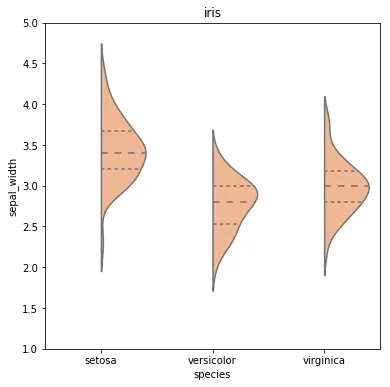
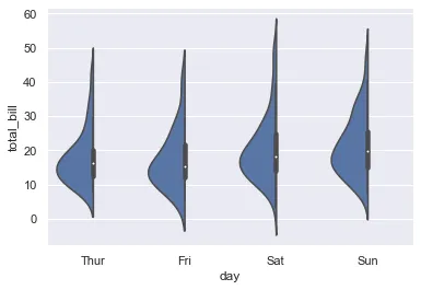
我曾寻找类似的解决方案,但没有找到令人满意的内容。最终,我多次调用seaborn.kdeplot,因为violinplot本质上是一个单侧核密度图。
示例
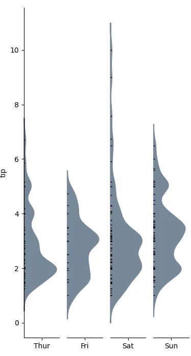
下面是categorical_kde_plot函数的定义
categorical_kde_plot(
    df,
    variable="tip",
    category="day",
    category_order=["Thur", "Fri", "Sat", "Sun"],
    horizontal=False,
)
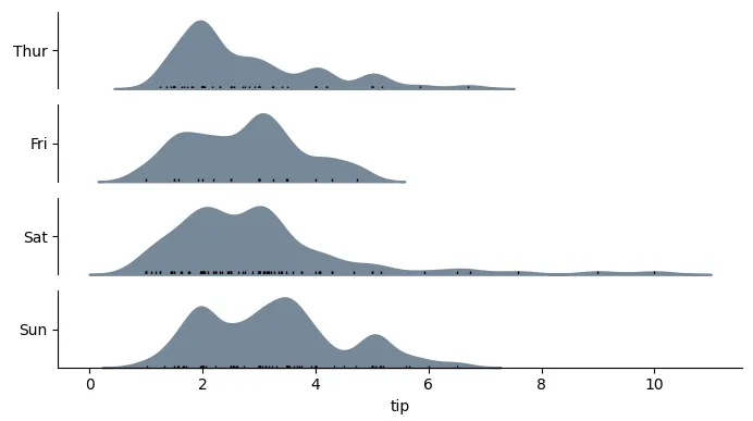
当 horizontal=True 时,输出将如下所示:
代码
import seaborn as sns
from matplotlib import pyplot as plt
def categorical_kde_plot(
df,
variable,
category,
category_order=None,
horizontal=False,
rug=True,
figsize=None,
):
"""Draw a categorical KDE plot
Parameters
----------
df: pd.DataFrame
The data to plot
variable: str
The column in the `df` to plot (continuous variable)
category: str
The column in the `df` to use for grouping (categorical variable)
horizontal: bool
If True, draw density plots horizontally. Otherwise, draw them
vertically.
rug: bool
If True, add also a sns.rugplot.
figsize: tuple or None
If None, use default figsize of (7, 1*len(categories))
If tuple, use that figsize. Given to plt.subplots as an argument.
"""
if category_order is None:
categories = list(df[category].unique())
else:
categories = category_order[:]
figsize = (7, 1.0 * len(categories))
fig, axes = plt.subplots(
nrows=len(categories) if horizontal else 1,
ncols=1 if horizontal else len(categories),
figsize=figsize[::-1] if not horizontal else figsize,
sharex=horizontal,
sharey=not horizontal,
)
for i, (cat, ax) in enumerate(zip(categories, axes)):
sns.kdeplot(
data=df[df[category] == cat],
x=variable if horizontal else None,
y=None if horizontal else variable,
bw_adjust=0.5,
clip_on=False,
fill=True,
alpha=1,
linewidth=1.5,
ax=ax,
color="lightslategray",
)
keep_variable_axis = (i == len(fig.axes) - 1) if horizontal else (i == 0)
if rug:
sns.rugplot(
data=df[df[category] == cat],
x=variable if horizontal else None,
y=None if horizontal else variable,
ax=ax,
color="black",
height=0.025 if keep_variable_axis else 0.04,
)
_format_axis(
ax,
cat,
horizontal,
keep_variable_axis=keep_variable_axis,
)
plt.tight_layout()
plt.show()
def _format_axis(ax, category, horizontal=False, keep_variable_axis=True):
ax.spines["top"].set_visible(False)
ax.spines["right"].set_visible(False)
if horizontal:
ax.set_ylabel(None)
lim = ax.get_ylim()
ax.set_yticks([(lim[0] + lim[1]) / 2])
ax.set_yticklabels([category])
if not keep_variable_axis:
ax.get_xaxis().set_visible(False)
ax.spines["bottom"].set_visible(False)
else:
ax.set_xlabel(None)
lim = ax.get_xlim()
ax.set_xticks([(lim[0] + lim[1]) / 2])
ax.set_xticklabels([category])
if not keep_variable_axis:
ax.get_yaxis().set_visible(False)
ax.spines["left"].set_visible(False)
if __name__ == "__main__":
df = sns.load_dataset("tips")
categorical_kde_plot(
df,
variable="tip",
category="day",
category_order=["Thur", "Fri", "Sat", "Sun"],
horizontal=True,
)