我正在为一个项目制作一些带有三个对应投影的3D散点图。我使用不同的颜色来表示第四个参数。首先,我用一种特定的颜色绘制数据,然后我再用另一种不同的颜色覆盖它,这样最终的顺序是我想要的,我可以看到所有的东西:
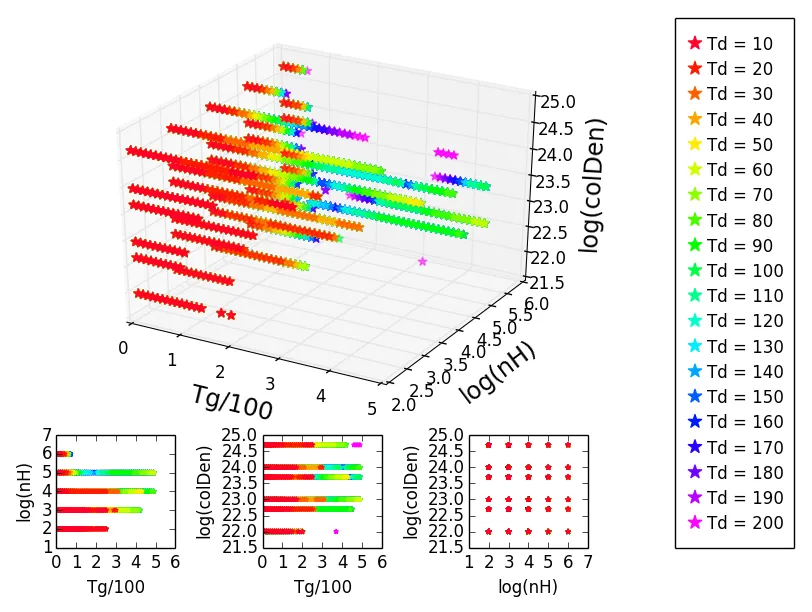
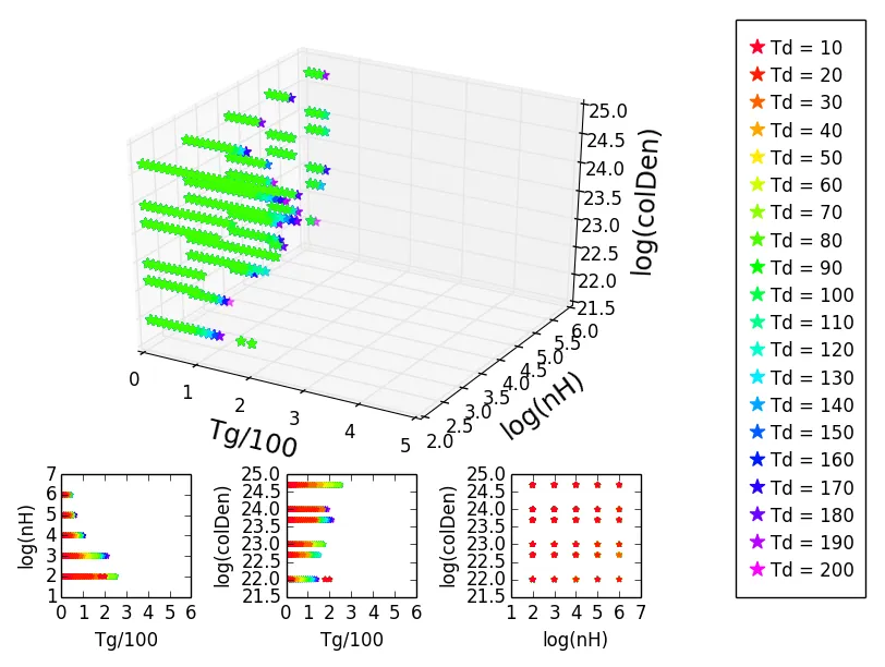
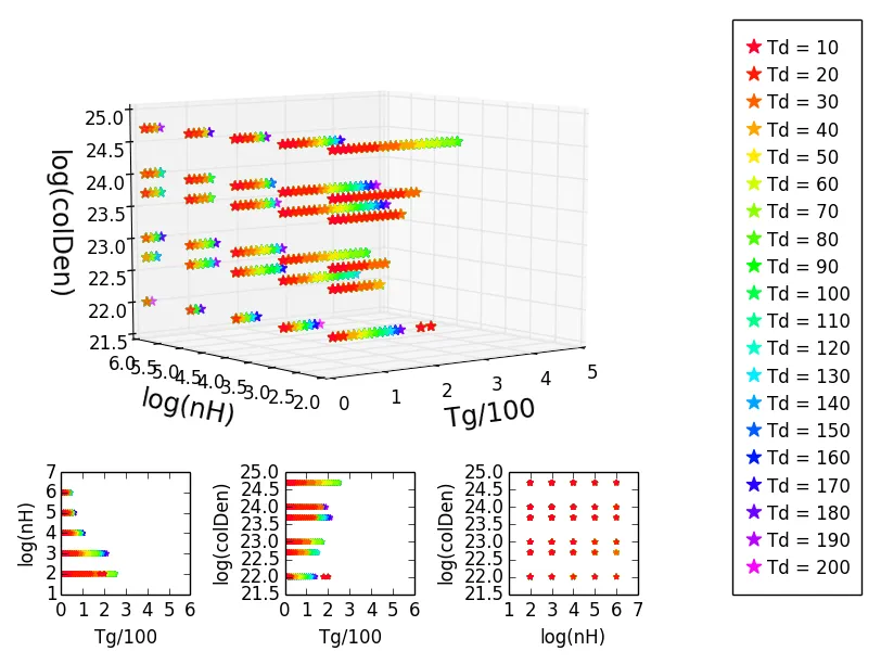
然而,我不想要一个以滑稽方式旋转的3D图像,因为轴会变得混乱,这样就无法正确阅读。
我在这里找到了一个解决方案: plotting 3d scatter in matplotlib。 它基本上说我应该用ax.plot(X,Y,'o')替换我的ax.scatter(X,Y)。当我这样做时,颜色的显示方式与预期相同,但是这种绘图方式更加杂乱且难看。 基本上,我只想能够用散点图完成这项任务。
有人知道如何解决这个问题吗?
这里是我代码的最小示例,仅涉及两种颜色:
from mpl_toolkits.mplot3d import art3d
import numpy as np
from mpl_toolkits.mplot3d import Axes3D
import matplotlib.pyplot as plt
from matplotlib import gridspec

art3d.zalpha = lambda *args:args[0]

numcols = 20
percentage = 50

def load(Td, pc):
    T = np.load(str(pc) + 'pctTemperaturesTd=' + str(Td) + '.npy')
    D = np.load(str(pc) + 'pctDensitiesTd=' + str(Td) + '.npy')
    CD = np.load(str(pc) + 'pctColDensitiesTd=' + str(Td) + '.npy')
    return T, D, CD

def colors(ax):
    colors = np.zeros((numcols, 4))
    cm = plt.get_cmap('gist_rainbow')
    ax.set_color_cycle([cm(1.*i/numcols) for i in range(numcols)])
    for i in range(numcols):
        color = cm(1.*i/numcols)
        colors[i,:] = color
    return colors

# LOAD DATA
T10, D10, CD10 = load(10, percentage)
T200, D200, CD200 = load(200, percentage)

# 3D PLOT
fig = plt.figure(1)
gs = gridspec.GridSpec(4, 4)

ax = fig.add_subplot(gs[:-1,:-1], projection='3d')
colours = colors(ax)

ax.plot(T200/100., np.log10(D200), np.log10(CD200), '*', markersize=10,color=colours[10], mec = colours[10], label='Td = 200', alpha=1)
ax.plot(T10/100., np.log10(D10), np.log10(CD10), '*', markersize=10,color=colours[0], mec = colours[0], label='Td = 10', alpha=1)

ax.set_xlabel('\nTg/100', fontsize='x-large')
ax.set_ylabel('\nlog(nH)', fontsize='x-large')
ax.set_zlabel('\nlog(colDen)', fontsize='x-large')
ax.set_xlim(0,5)
#ax.set_zlim(0,)
ax.set_ylim(2,6)

# PROJECTIONS

# Tg, nH
ax2 = fig.add_subplot(gs[3,0])

ax2.scatter(T200/100., np.log10(D200), marker='*', s=10, color=colours[10], label='Td = 200', alpha=1, edgecolor=colours[10])
ax2.scatter(T10/100., np.log10(D10), marker='*', s=10, color=colours[0], label='Td = 10', alpha=1, edgecolor=colours[0])

ax2.set_xlabel('Tg/100')
ax2.set_ylabel('log(nH)')
ax2.set_xlim(0,6)

# Tg, colDen
ax3 = fig.add_subplot(gs[3,1])

ax3.scatter(T200/100., np.log10(CD200), marker='*', s=10, color=colours[10], label='Td = 200', alpha=1, edgecolor=colours[10])
ax3.scatter(T10/100., np.log10(CD10), marker='*', s=10, color=colours[0], label='Td = 10', alpha=1, edgecolor=colours[0])

ax3.set_xlabel('Tg/100')
ax3.set_ylabel('log(colDen)')
ax3.set_xlim(0,6)

# nH, colDen
ax4 = fig.add_subplot(gs[3,2])

ax4.scatter(np.log10(D200), np.log10(CD200), marker='*', s=10, color=colours[10], label='Td = 200', alpha=1, edgecolor=colours[10])
ax4.scatter(np.log10(D10), np.log10(CD10), marker='*', s=10, color=colours[0], label='Td = 10', alpha=1, edgecolor=colours[0])

ax4.set_xlabel('log(nH)')
ax4.set_ylabel('log(colDen)')

# LEGEND
legend = fig.add_subplot(gs[:,3])

text = ['Td = 10', 'Td = 20', 'Td = 30', 'Td = 40', 'Td = 50', 'Td = 60', 'Td = 70', 'Td = 80', 'Td = 90', 'Td = 100', 'Td = 110', 'Td = 120', 'Td = 130', 'Td = 140', 'Td = 150', 'Td = 160', 'Td = 170', 'Td = 180', 'Td = 190', 'Td = 200']

array = np.arange(0,2,0.1)
for i in range(len(array)):
    legend.scatter(0, i, marker='*', s=100, c=colours[numcols-i-1], edgecolor=colours[numcols-i-1])
    legend.text(0.3, i-0.25, text[numcols-i-1])
    legend.set_xlim(-0.5, 2.5)
    legend.set_ylim(0-1, i+1)

legend.axes.get_xaxis().set_visible(False)
legend.axes.get_yaxis().set_visible(False)

gs.tight_layout(fig)

plt.show()
load()函数似乎依赖于六个.npy文件。你能否发布这些文件的最小版本,或者在脚本中包含一些示例数据? - Don Kirkby