3D散点图,带有色调颜色映射和图例。

35

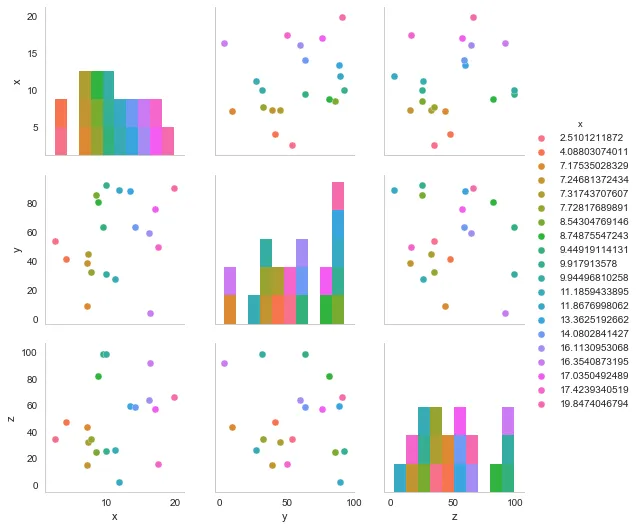
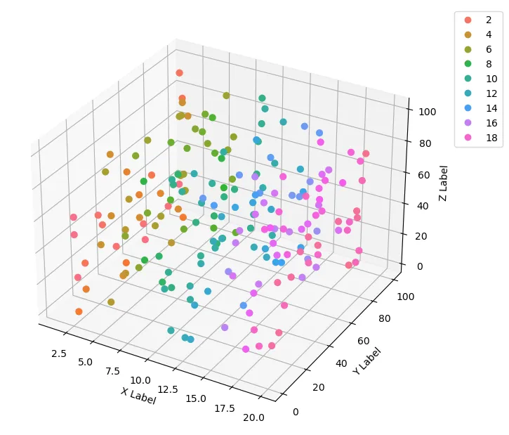
我一直在使用seaborn来寻找python中的3D图表,但没有看到任何有关这方面的内容。我想要用三维图表来获取我最初使用seaborn.pairplot绘制的数据集。 有谁能帮我解决以下两个问题:

  1. 我无法获得与sns pairplot相同的颜色板,例如如何从图2中获取颜色板并应用于图1上的点?
  2. 图例未粘附在图中或者在pairplot上显示不出来,例如当我执行plt.legend(bbox_to_anchor=(1.05, 1), loc=2, borderaxespad=0.,ncol=4)时,我会看到以下错误:anaconda2/lib/python2.7/site-packages/matplotlib/axes/_axes.py:545: UserWarning: No labelled objects found. Use label='...' kwarg on individual plots. warnings.warn("No labelled objects found. "

我的参考资料:如何在matplotlib中制作3D散点图 https://pythonspot.com/3d-scatterplot/ https://jakevdp.github.io/PythonDataScienceHandbook/04.12-three-dimensional-plotting.html

import re, seaborn as sns, numpy as np, pandas as pd, random
from pylab import *
from matplotlib.pyplot import plot, show, draw, figure, cm
import matplotlib.pyplot as plt
from mpl_toolkits.mplot3d import Axes3D
sns.set_style("whitegrid", {'axes.grid' : False})

fig = plt.figure(figsize=(6,6))

ax = Axes3D(fig) # Method 1
# ax = fig.add_subplot(111, projection='3d') # Method 2

x = np.random.uniform(1,20,size=20)
y = np.random.uniform(1,100,size=20)
z = np.random.uniform(1,100,size=20)


ax.scatter(x, y, z, c=x, marker='o')
ax.set_xlabel('X Label')
ax.set_ylabel('Y Label')
ax.set_zlabel('Z Label')

plt.show()

3D plot

#Seaborn pair plot
df_3d = pd.DataFrame()
df_3d['x'] = x
df_3d['y'] = y
df_3d['z'] = z

sns.pairplot(df_3d, hue='x')

Seaborn pairplot

2个回答

22
  1. 可以使用 Seaborn 的调色板通过实例化一个 ListedColorMap 类,用 Seaborn 调色板中的颜色列表初始化,并使用 as_hex() 方法将其转换为 Matplotlib 颜色图(参考原始回答)。

  2. Matplotlib 文档,可以从 scatter 函数输出的句柄和标签生成散点图的图例。

代码的结果如下图所示。请注意,我生成了更多的数据点,以便更好地看到颜色地图。此外,ListedColorMap 的输出会产生带有透明度变化的颜色图,因此我必须在散点图中手动设置 alpha 为 1。

import re, seaborn as sns
import numpy as np

from matplotlib import pyplot as plt
from mpl_toolkits.mplot3d import Axes3D
from matplotlib.colors import ListedColormap

# generate data
n = 200
x = np.random.uniform(1, 20, size=n)
y = np.random.uniform(1, 100, size=n)
z = np.random.uniform(1, 100, size=n)

# axes instance
fig = plt.figure(figsize=(6,6))
ax = Axes3D(fig, auto_add_to_figure=False)
fig.add_axes(ax)

# get colormap from seaborn
cmap = ListedColormap(sns.color_palette("husl", 256).as_hex())

# plot
sc = ax.scatter(x, y, z, s=40, c=x, marker='o', cmap=cmap, alpha=1)
ax.set_xlabel('X Label')
ax.set_ylabel('Y Label')
ax.set_zlabel('Z Label')

# legend
plt.legend(*sc.legend_elements(), bbox_to_anchor=(1.05, 1), loc=2)

# save
plt.savefig("scatter_hue", bbox_inches='tight')

scatter plot with seaborn hue palette and legend


3

第二张图没有颜色调色板的规定,但看起来像是Matplotlib的质性配色Paired (来源)。因此,在代码中,您需要使用cmap参数和在pairplot中使用palette 选项来指定它。

图例比较难做。您可以通过legend_elements来创建一个图例。在这里有更好的解释。

因此,您的代码应该像这样(我删除了未使用的导入):

import seaborn as sns, numpy as np, pandas as pd, random
import matplotlib.pyplot as plt
from mpl_toolkits.mplot3d import Axes3D
sns.set_style("whitegrid", {'axes.grid' : False})

fig = plt.figure(figsize=(6,6))

ax = Axes3D(fig)

x = np.random.uniform(1,20,size=20)
y = np.random.uniform(1,100,size=20)
z = np.random.uniform(1,100,size=20)


g = ax.scatter(x, y, z, c=x, marker='o', depthshade=False, cmap='Paired')
ax.set_xlabel('X Label')
ax.set_ylabel('Y Label')
ax.set_zlabel('Z Label')

# produce a legend with the unique colors from the scatter
legend = ax.legend(*g.legend_elements(), loc="lower center", title="X Values", borderaxespad=-10, ncol=4)
ax.add_artist(legend)

plt.show()

完全没有关系,但是有没有办法用这种方式显示体积?比如一个立方体。 - reza bagherian

网页内容由stack overflow 提供, 点击上面的
可以查看英文原文,
原文链接