这个问题已经存在了很长时间,现在是为后人记录答案的时候了。
简短的回答是,使用“lattice”和“ggplot2”包中的函数包装器无法完成高度定制的数据可视化。函数包装器的目的是将一些决策从你手中拿走,因此你始终会受到函数编码者最初设想的限制。我强烈建议每个人都学习“lattice”或“ggplot2”包,但这些包更适用于数据探索而不是对数据可视化进行创意处理。
本答案适用于那些想创建自定义可视化的人。以下过程可能需要半天时间,但这比将“lattice”或“ggplot2”包改成你想要的形状要花费的时间少得多。这并不是对这两个包的批评;这只是它们目的的副产品。当你需要为出版物或客户创建创意可视化时,你一天中的4或5个小时与回报相比微不足道。
使用“grid”包制作自定义可视化的工作非常简单,但这并不意味着其中的数学总是简单的。实际上,这个例子中的大部分工作都是数学而不是图形。
前言:在使用基本“grid”包制作可视化之前,有一些事情你应该知道。首先,“grid”是基于视口的概念工作的。这些是绘图空间,允许你从该空间内部引用,忽略其余的图形。这很重要,因为它允许你制作图形,而不必将你的工作缩放到整个空间的分数。这很像基本绘图函数中的布局选项,只是它们可以重叠、旋转和透明。
单位是另一件需要知道的事情。每个视口都有多种单位,你可以使用这些单位来指示位置和大小。你可以在“grid”文档中看到整个列表,但我经常只使用几个:npc、native、strwidth 和 lines。npc单位从左下角的(0,0)开始,到右上角的c(1,1)。本机单位使用“xscale”和“yscale”创建实际上是数据的绘图空间。strwidth单位告诉你一定字符串文本在图形上打印时的宽度。Lines单位告诉你一行文本在图形上打印时的高度。由于始终有多种类型的单位可用,所以你应该养成始终使用“unit”函数明确定义数字或在绘图函数内部指定“default.units”参数的习惯。
最后,你可以指定所有对象位置的对齐方式。这非常重要。这意味着你可以指定形状的位置,然后说你希望该形状如何水平和垂直对齐(中心、左、右、底部、顶部)。通过引用其他对象的位置,你可以完美地对齐这些物体。
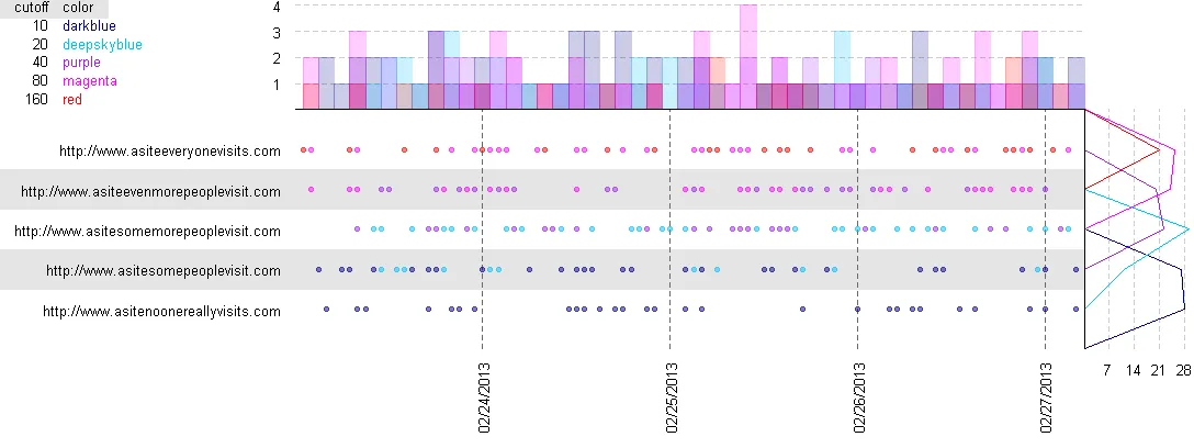
我们正在制作的是什么:这不是一个完美的图形,因为我需要猜测OP想要什么,但足以让我们走向完美的图形。
第一步:加载一些库来进行工作。当您想要进行高度自定义的可视化时,请使用“grid”包。它是调用“lattice”和“ggplot2”等封装器的基本函数集。当您想要使用日期时,请使用“lubridate”包,因为它可以使您的生活更好。最后一个是个人喜好:当我要进行任何数据摘要工作时,我喜欢使用“plyr”包。它允许我快速将数据形状转换为聚合形式。
library(grid)
library(lubridate)
library(plyr)
示例数据生成:如果您已经拥有数据,则不需要此步骤,但是为了本例,我正在创建一组示例数据。您可以通过更改数据生成的用户设置来玩弄它。该脚本是灵活的,并将适应生成的数据。请随意添加更多网站并调整 lambda 值。
set.seed(1)
time_Periods <- 100
start_Datetime <- "2/24/2013 00:00"
df_Websites <- read.table(text="
url lambda
http://www.asitenoonereallyvisits.com 1
http://www.asitesomepeoplevisit.com 10
http://www.asitesomemorepeoplevisit.com 20
http://www.asiteevenmorepeoplevisit.com 40
http://www.asiteeveryonevisits.com 80
", header=TRUE, sep=" ")
hits <- list()
websites <- list()
for (i in 1:nrow(df_Websites)){
hits[[i]] <- rbinom(time_Periods, 1, 0.5) * rpois(time_Periods, df_Websites$lambda[i])
websites[[i]] <- rep(df_Websites$url[i], time_Periods)
}
datetimes <- mdy_hm(start_Datetime) + hours(1:time_Periods)
df_Hits <- data.frame(datetime=rep(datetimes, nrow(df_Websites)), hits=unlist(hits), website=unlist(websites))
df_Hits <- df_Hits[df_Hits$hits > 0,]
rm(list=ls()[ls()!="df_Hits"])
步骤2:现在,我们需要决定我们想要的图形如何工作。将大小和颜色等内容分离到代码的不同部分是有用的,这样您就可以快速进行更改。在这里,我选择了一些基本设置,应该能够生成一个不错的图形。您会注意到,一些大小设置正在使用“unit”函数。这是“grid”包的神奇之一。您可以使用各种单位描述图形上的空间。例如,unit(1, "lines")是一行文本的高度。这使得布局图形变得更加容易。
device_Width=12
device_Height=4.5
pixels_Per_Inch <- 100
bin_Width <- 2
padding <- unit(1, "strwidth", "W")
bin_Settings <- read.table(text="
cutoff color
10 'darkblue'
20 'deepskyblue'
40 'purple'
80 'magenta'
160 'red'
", header=TRUE, sep=" ")
histogram_Size <- unit(nrow(bin_Settings) + 1, "lines")
row_Background <- "gray90"
date_Color <- "gray40"
marker_Color <- "gray80"
label_Size <- 10
第三步:是时候制作图形了。在SO的回答中,我的解释空间有限,所以我会概括一下,然后留下代码注释来解释细节。简而言之,我正在计算每个图表的大小,然后逐个制作图表。对于每个图表,我首先格式化我的数据,以便可以适当地指定视口。然后我放置需要在数据后面的标签,然后绘制数据。最后,我“弹出”视口以完成它。
bin_Settings <- bin_Settings[order(bin_Settings$cutoff),]
windows(
width=device_Width,
height=device_Height,
xpinch=pixels_Per_Inch,
ypinch=pixels_Per_Inch)
grid.newpage()
pushViewport(viewport(gp=gpar(fontsize=label_Size)))
unique_Urls <- as.character(unique(df_Hits$website))
label_Width <- list()
for (i in 1:length(unique_Urls)){
label_Width[[i]] <- convertWidth(unit(1, "strwidth", unique_Urls[i]), "npc")
}
x_Label_Margin <- unit(max(unlist(label_Width)), "npc") + padding * 2
y_Label_Margin <- unit(1, "strwidth", "99/99/9999") + padding * 2
main_Width <- unit(1, "npc") - histogram_Size - x_Label_Margin
main_Height <- unit(1, "npc") - histogram_Size - y_Label_Margin
x_Values <- as.integer((df_Hits$datetime - min(df_Hits$datetime)))/60^2
pushViewport(viewport(
x=x_Label_Margin,
y=y_Label_Margin,
width=main_Width,
height=main_Height,
xscale=c(-1, max(x_Values) + 1),
yscale=c(0, length(unique_Urls) + 1),
just=c("left", "bottom"),
gp=gpar(fontsize=label_Size)))
for (i in 1:length(unique_Urls)){
if (i%%2==0){
grid.rect(
x=unit(-1, "npc"),
y=i,
width=unit(2, "npc"),
height=1,
default.units="native",
just=c("left", "center"),
gp=gpar(col=row_Background, fill=row_Background))
}
grid.text(
unique_Urls[i],
x=unit(0, "npc") - padding,
y=i,
default.units="native",
just=c("right", "center"))
}
time_Offset <- as.integer(format(min(df_Hits$datetime), "%H"))
x_Labels <- unique(format(df_Hits$datetime, "%m/%d/%Y"))
midnight_Locations <- (0:max(x_Values))[(0:max(x_Values)+time_Offset)%%24==0]
grid.text(
x_Labels,
x=midnight_Locations,
y=unit(0, "npc") - padding,
default.units="native",
just=c("right", "center"),
rot=90)
grid.polyline(
x=c(midnight_Locations, midnight_Locations),
y=unit(c(rep(0, length(midnight_Locations)), rep(1, length(midnight_Locations))), "npc"),
default.units="native",
id=rep(midnight_Locations, 2),
gp=gpar(lty=2, col=date_Color))
bin_Assignment <- 1
for (i in 1:nrow(bin_Settings)){
bin_Assignment <- bin_Assignment + ifelse(df_Hits$hits>bin_Settings$cutoff[i], 1, 0)
}
grid.points(
x=x_Values,
y=match(df_Hits$website, unique_Urls),
pch=19,
size=unit(1, "native"),
gp=gpar(col=as.character(bin_Settings$color[bin_Assignment]), alpha=0.5))
popViewport()
bins <- ddply(
data.frame(df_Hits, bin_Assignment, mid=floor(x_Values/bin_Width)*bin_Width+bin_Width/2),
.(bin_Assignment, mid),
summarize,
freq=length(hits))
pushViewport(viewport(
x=x_Label_Margin,
y=y_Label_Margin + main_Height,
width=main_Width,
height=histogram_Size,
xscale=c(-1, max(x_Values) + 1),
yscale=c(0, max(bins$freq) * 1.05),
just=c("left", "bottom"),
gp=gpar(fontsize=label_Size)))
marker_Interval <- floor(max(bins$freq)/4)
digits <- nchar(marker_Interval)
marker_Interval <- round(marker_Interval, -digits+1)
grid.polyline(
x=unit(c(rep(0,4), rep(1,4)), "npc"),
y=c(1:4 * marker_Interval, 1:4 * marker_Interval),
default.units="native",
id=rep(1:4, 2),
gp=gpar(lty=2, col=marker_Color))
grid.text(
1:4 * marker_Interval,
x=unit(0, "npc") - padding,
y=1:4 * marker_Interval,
default.units="native",
just=c("right", "center"))
popViewport()
pushViewport(viewport(
x=x_Label_Margin,
y=y_Label_Margin + main_Height,
width=main_Width,
height=histogram_Size,
xscale=c(-1, max(x_Values) + 1),
yscale=c(0, max(bins$freq) * 1.05),
just=c("left", "bottom"),
gp=gpar(fontsize=label_Size),
clip="on"))
for (i in 1:nrow(bin_Settings)){
active_Bin <- bins[bins$bin_Assignment==i,]
if (nrow(active_Bin)>0){
for (j in 1:nrow(active_Bin)){
grid.rect(
x=active_Bin$mid[j],
y=0,
width=bin_Width,
height=active_Bin$freq[j],
default.units="native",
just=c("center","bottom"),
gp=gpar(col=as.character(bin_Settings$color[i]), fill=as.character(bin_Settings$color[i]), alpha=1/nrow(bin_Settings)))
}
}
}
grid.lines(x=unit(c(0, 1), "npc"), y=0, default.units="native")
popViewport()
freq_Data <- ddply(
data.frame(df_Hits, bin_Assignment),
.(website, bin_Assignment),
summarize,
freq=length(hits))
line_Data <- matrix(0, nrow=length(unique_Urls)+2, ncol=nrow(bin_Settings))
for (i in 1:nrow(freq_Data)){
line_Data[match(freq_Data$website[i], unique_Urls)+1,freq_Data$bin_Assignment[i]] <- freq_Data$freq[i]
}
pushViewport(viewport(
x=x_Label_Margin + main_Width,
y=y_Label_Margin,
width=histogram_Size,
height=main_Height,
xscale=c(0, max(line_Data) * 1.05),
yscale=c(0, length(unique_Urls) + 1),
just=c("left", "bottom"),
gp=gpar(fontsize=label_Size)))
marker_Interval <- floor(max(line_Data)/4)
digits <- nchar(marker_Interval)
marker_Interval <- round(marker_Interval, -digits+1)
grid.polyline(
x=c(1:4 * marker_Interval, 1:4 * marker_Interval),
y=unit(c(rep(0,4), rep(1,4)), "npc"),
default.units="native",
id=rep(1:4, 2),
gp=gpar(lty=2, col=marker_Color))
grid.text(
1:4 * marker_Interval,
x=1:4 * marker_Interval,
y=unit(0, "npc") - padding,
default.units="native",
just=c("center", "top"))
grid.polyline(
x=array(line_Data),
y=rep(0:(length(unique_Urls)+1), nrow(bin_Settings)),
default.units="native",
id=array(t(matrix(1:nrow(bin_Settings), nrow=nrow(bin_Settings), ncol=length(unique_Urls)+2))),
gp=gpar(col=as.character(bin_Settings$color)))
grid.lines(x=0, y=c(0, length(unique_Urls)+1), default.units="native")
popViewport()
grid.rect(
x=0,
y=1,
width=unit(1, "strwidth", names(bin_Settings)[1]) + unit(1, "strwidth", names(bin_Settings)[2]) + 3 * padding,
height=unit(1, "lines"),
default.units="npc",
just=c("left","top"),
gp=gpar(col=row_Background, fill=row_Background))
grid.text(
names(bin_Settings)[1],
x=padding,
y=1,
default.units="npc",
just=c("left","top"))
grid.text(
names(bin_Settings)[2],
x=unit(1, "strwidth", names(bin_Settings)[1]) + 2 * padding,
y=1,
default.units="npc",
just=c("left","top"))
for (i in 1:nrow(bin_Settings)){
grid.text(
bin_Settings$cutoff[i],
x=unit(1, "strwidth", names(bin_Settings)[1]) + padding,
y=unit(1, "npc") - i * unit(1, "lines"),
default.units="npc",
just=c("right","top"))
grid.text(
bin_Settings$color[i],
x=unit(1, "strwidth", names(bin_Settings)[1]) + 2 * padding,
y=unit(1, "npc") - i * unit(1, "lines"),
default.units="npc",
just=c("left","top"),
gp=gpar(col=as.character(bin_Settings$color[i])))
}
+opts(keep="ylabel")足够吗? - kohske- opts(keep="ylabel") 将保留 Y 轴的标题。我想要保留每个 y 值的所有文本标签。但由于 "ylabel" 可以正常工作,我将尝试一些其他排列组合,看看是否能够捕获 Y 轴的文本。
- zachg = ggplotGrob(p) ; gg = editGrob(getGrob(g, gPath("axis_v-3-1"), grep=TRUE), vp=viewport()) ; grid.draw(gg)只绘制了图表的 y 轴,如果这有所帮助。 - baptiste