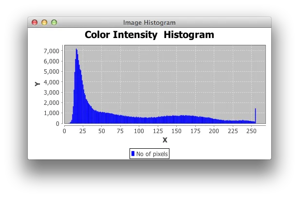
我将计算图像红色分量的直方图,并将其存储在redhisto[]中。数组的索引表示强度(0到255),值表示具有该强度的像素数。然后,使用JFreeChart绘制这些值。
我的问题是:
我的问题是:
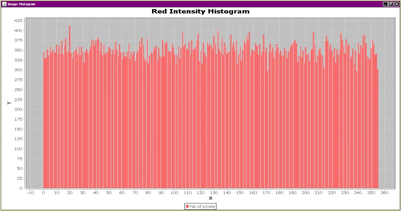
- How to make X-axis value start from 0. Now its starting from negative number.
Can we change the color of the bars in the graph
 code is :
 public class Histogram extends ApplicationFrame {
   public Histogram(final String title) throws IOException {
    super(title);
    IntervalXYDataset dataset = createDataset();
    JFreeChart chart = createChart(dataset);
    final ChartPanel chartPanel = new ChartPanel(chart);
    chartPanel.setPreferredSize(new java.awt.Dimension(500, 270));
    setContentPane(chartPanel);
   }

  private IntervalXYDataset createDataset() throws IOException {
   BufferedImage imageA = ImageIO.read(new File("XYZ.bmp"));
   int[] red = new int[imageA.getHeight()*imageA.getWidth()];
   int[] redhisto = new int[256];
   int[] pixel;
   int k= 0;
   for (int y = 0; y < imageA.getHeight(); y++) {
      for (int x = 0; x < imageA.getWidth(); x++) {
        pixel = imageA.getRaster().getPixel(x, y, new int[3]);
        red[k] = pixel[0];
        k++;
      }
   }

   for(int x=0;x<red.length;x++){
       int y = red[x];
       redhisto[y]++;
    }

  final XYSeries series = new XYSeries("No of pixels");
  for(int i=0; i<redhisto.length;i++)
    series.add(i,redhisto[i]);

  final XYSeriesCollection dataset = new XYSeriesCollection(series);
  return dataset;
 }

 private JFreeChart createChart(IntervalXYDataset dataset) {
  final JFreeChart chart = ChartFactory.createXYBarChart("Color Intensity   Histogram","X",false,"Y",dataset,PlotOrientation.VERTICAL,true,true,false);
  XYPlot plot = (XYPlot) chart.getPlot();
  return chart;
 }

 public static void main(final String[] args) throws IOException {
  final Histogram demo = new Histogram("Image Histogram");
  demo.pack();
  RefineryUtilities.centerFrameOnScreen(demo);
  demo.setVisible(true);
 }
}