经典的股票价格图表由一条垂直线连接每个时间段的最高和最低价格,左侧有一个标记表示开盘(第一)价格,右侧有一个标记表示收盘(最后)价格。
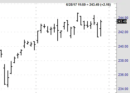
经典的股票价格图表由一条垂直线连接每个时间段的最高和最低价格,左侧有一个标记表示开盘(第一)价格,右侧有一个标记表示收盘(最后)价格。
从matplotlib finance包中调整蜡烛图函数(文档, 代码):
def westerncandlestick(ax, quotes, width=0.2, colorup='k', colordown='r',
                 ochl=True, linewidth=0.5):

    """
    Plot the time, open, high, low, close as a vertical line ranging
    from low to high.  Use a rectangular bar to represent the
    open-close span.  If close >= open, use colorup to color the bar,
    otherwise use colordown
    Parameters
    ----------
    ax : `Axes`
        an Axes instance to plot to
    quotes : sequence of quote sequences
        data to plot.  time must be in float date format - see date2num
        (time, open, high, low, close, ...) vs
        (time, open, close, high, low, ...)
        set by `ochl`
    width : float
        fraction of a day for the open and close lines
    colorup : color
        the color of the lines close >= open
    colordown : color
         the color of the lines where close <  open
    ochl: bool
        argument to select between ochl and ohlc ordering of quotes
    linewidth: float
        linewidth of lines
    Returns
    -------
    ret : tuple
        returns (lines, openlines, closelines) where lines is a list of lines
        added
    """

    OFFSET = width / 2.0

    lines = []
    openlines = []
    closelines = []
    for q in quotes:
        if ochl:
            t, open, close, high, low = q[:5]
        else:
            t, open, high, low, close = q[:5]

        if close >= open:
            color = colorup
        else:
            color = colordown

        vline = Line2D( xdata=(t, t), ydata=(low, high),
            color=color, linewidth=linewidth, antialiased=True)
        lines.append(vline)

        openline = Line2D(xdata=(t - OFFSET, t), ydata=(open,open),
                          color=color, linewidth=linewidth, antialiased=True)
        openlines.append(openline)

        closeline = Line2D(xdata=(t , t+OFFSET), ydata=(close,close),
                          color=color, linewidth=linewidth, antialiased=True)
        closelines.append(closeline)

        ax.add_line(vline)
        ax.add_line(openline)
        ax.add_line(closeline)

    ax.autoscale_view()

    return lines, openlines, closelines
像这样调用:
westerncandlestick(ax, quotes, width=0.6, linewidth=1.44, ochl=False)
当然,您可以使用 colorup 和 colordown 参数来调整颜色。
完整的代码以重现上图:
import matplotlib.pyplot as plt
from matplotlib.finance import quotes_historical_yahoo_ohlc
from matplotlib.lines import Line2D
def westerncandlestick(ax, quotes, width=0.2, colorup='k', colordown='r',
ochl=True, linewidth=0.5):
"""
Plot the time, open, high, low, close as a vertical line ranging
from low to high. Use a rectangular bar to represent the
open-close span. If close >= open, use colorup to color the bar,
otherwise use colordown
Parameters
----------
ax : `Axes`
an Axes instance to plot to
quotes : sequence of quote sequences
data to plot. time must be in float date format - see date2num
(time, open, high, low, close, ...) vs
(time, open, close, high, low, ...)
set by `ochl`
width : float
fraction of a day for the open and close lines
colorup : color
the color of the lines close >= open
colordown : color
the color of the lines where close < open
ochl: bool
argument to select between ochl and ohlc ordering of quotes
linewidth: float
linewidth of lines
Returns
-------
ret : tuple
returns (lines, openlines, closelines) where lines is a list of lines
added
"""
OFFSET = width / 2.0
lines = []
openlines = []
closelines = []
for q in quotes:
if ochl:
t, open, close, high, low = q[:5]
else:
t, open, high, low, close = q[:5]
if close >= open:
color = colorup
else:
color = colordown
vline = Line2D( xdata=(t, t), ydata=(low, high),
color=color, linewidth=linewidth, antialiased=True)
lines.append(vline)
openline = Line2D(xdata=(t - OFFSET, t), ydata=(open,open),
color=color, linewidth=linewidth, antialiased=True)
openlines.append(openline)
closeline = Line2D(xdata=(t , t+OFFSET), ydata=(close,close),
color=color, linewidth=linewidth, antialiased=True)
closelines.append(closeline)
ax.add_line(vline)
ax.add_line(openline)
ax.add_line(closeline)
ax.autoscale_view()
return lines, openlines, closelines
from matplotlib.dates import DateFormatter, WeekdayLocator,\
DayLocator, MONDAY
# (Year, month, day) tuples suffice as args for quotes_historical_yahoo
date1 = (2004, 2, 1)
date2 = (2004, 4, 12)
mondays = WeekdayLocator(MONDAY) # major ticks on the mondays
alldays = DayLocator() # minor ticks on the days
weekFormatter = DateFormatter('%b %d') # e.g., Jan 12
dayFormatter = DateFormatter('%d') # e.g., 12
quotes = quotes_historical_yahoo_ohlc('INTC', date1, date2)
if len(quotes) == 0:
raise SystemExit
fig, ax = plt.subplots()
fig.subplots_adjust(bottom=0.2)
ax.xaxis.set_major_locator(mondays)
ax.xaxis.set_minor_locator(alldays)
ax.xaxis.set_major_formatter(weekFormatter)
westerncandlestick(ax, quotes, width=0.6, linewidth=1.44, ochl=False)
ax.xaxis_date()
ax.autoscale_view()
plt.setp(plt.gca().get_xticklabels(), rotation=45, horizontalalignment='right')
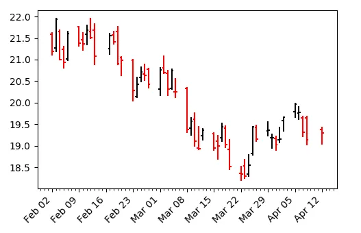
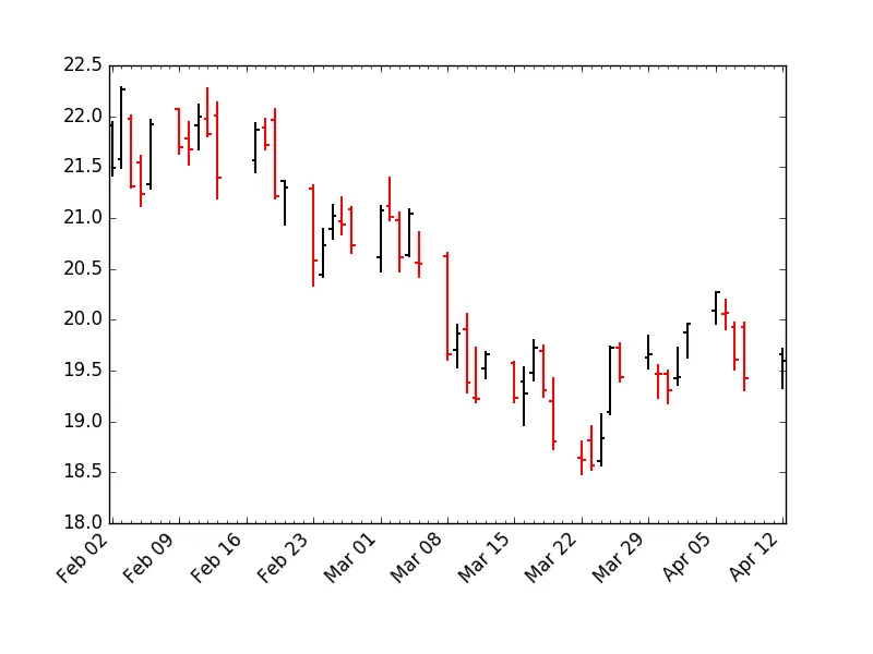
plt.show()在西方经典中,条形图的颜色由最接近的关系决定;高关系使用黑色,低关系使用红色。我修改了@ImportanceOfBeingErnes的代码,使其可以选择日本或西方的着色方案。
import matplotlib.pyplot as plt

from matplotlib.finance import quotes_historical_yahoo_ohlc
from matplotlib.lines import Line2D

def westerncandlestick(ax, quotes, width=0.2, colorup='k', colordown='r',
             ochl=True, linewidth=0.5, westerncolor=True):
    """
    Plot the time, open, high, low, close as a vertical line ranging
    from low to high.  Use a rectangular bar to represent the
    open-close span.  If close >= open, use colorup to color the bar,
    otherwise use colordown
    Parameters
    ----------
    ax : `Axes`
        an Axes instance to plot to
    quotes : sequence of quote sequences
        data to plot.  time must be in float date format - see date2num
        (time, open, high, low, close, ...) vs
        (time, open, close, high, low, ...)
        set by `ochl`
    width : float
        fraction of a day for the open and close lines
    colorup : color
        the color of the lines close >= open
    colordown : color
         the color of the lines where close <  open
    ochl: bool
        argument to select between ochl and ohlc ordering of quotes
    linewidth: float
        linewidth of lines
    westerncolor: bool
        use western cannon colors?
    Returns
    -------
    ret : tuple
        returns (lines, openlines, closelines) where lines is a list of lines
        added
    """
    OFFSET = width / 2.0
    lines = []
    openlines = []
    closelines = []
    for q in quotes:
        if ochl:
            t, open, close, high, low = q[:5]
        else:
            t, open, high, low, close = q[:5]
        if westerncolor:
            try:
                close_
            except NameError:
                close_ = close

            if close >= close_:
                color = colorup
            else:
                color = colordown
            close_ = close
        else:
            if close >= open:
                color = colorup
            else:
                color = colordown

        vline = Line2D( xdata=(t, t), ydata=(low, high),
            color=color, linewidth=linewidth, antialiased=True)
        lines.append(vline)

        openline = Line2D(xdata=(t - OFFSET, t), ydata=(open,open),
                          color=color, linewidth=linewidth, antialiased=True)
        openlines.append(openline)

        closeline = Line2D(xdata=(t , t+OFFSET), ydata=(close,close),
                          color=color, linewidth=linewidth, antialiased=True)
        closelines.append(closeline)
        ax.add_line(vline)
        ax.add_line(openline)
        ax.add_line(closeline)
    ax.autoscale_view()
    return lines, openlines, closelines


from matplotlib.dates import DateFormatter, WeekdayLocator,\
    DayLocator, MONDAY
# (Year, month, day) tuples suffice as args for quotes_historical_yahoo
date1 = (2004, 2, 1)
date2 = (2004, 4, 12)

mondays = WeekdayLocator(MONDAY)        # major ticks on the mondays
alldays = DayLocator()              # minor ticks on the days
weekFormatter = DateFormatter('%b %d')  # e.g., Jan 12
dayFormatter = DateFormatter('%d')      # e.g., 12

quotes = quotes_historical_yahoo_ohlc('INTC', date1, date2)
if len(quotes) == 0:
    raise SystemExit

fig, ax = plt.subplots()
fig.subplots_adjust(bottom=0.2)
ax.xaxis.set_major_locator(mondays)
ax.xaxis.set_minor_locator(alldays)
ax.xaxis.set_major_formatter(weekFormatter)

westerncandlestick(ax, quotes, width=0.6, linewidth=1.44, ochl=False, westerncolor=True)

ax.xaxis_date()
ax.autoscale_view()
plt.setp(plt.gca().get_xticklabels(), rotation=45, horizontalalignment='right')

plt.show()import matplotlib.pyplot as plt
import matplotlib.dates as mdates
from matplotlib.lines import Line2D
import yfinance as yf
def westerncandlestick(ax, quotes, width=0.2, colorup='k', colordown='r',
ochl=True, linewidth=0.5, westerncolor=True):
"""
Plot the time, open, high, low, close as a vertical line ranging
from low to high. Use a rectangular bar to represent the
open-close span. If close >= open, use colorup to color the bar,
otherwise use colordown
Parameters
----------
ax : `Axes`
an Axes instance to plot to
quotes : sequence of quote sequences
data to plot. time must be in float date format - see date2num
(time, open, high, low, close, ...) vs
(time, open, close, high, low, ...)
set by `ochl`
width : float
fraction of a day for the open and close lines
colorup : color
the color of the lines close >= open
colordown : color
the color of the lines where close < open
ochl: bool
argument to select between ochl and ohlc ordering of quotes
linewidth: float
linewidth of lines
westerncolor: bool
use western cannon colors?
Returns
-------
ret : tuple
returns (lines, openlines, closelines) where lines is a list of lines
added
"""
OFFSET = width / 2.0
lines = []
openlines = []
closelines = []
for q in quotes.reset_index().values:
if ochl:
t, open, close, high, low = q[:5]
t = mdates.date2num(t)
#t = t.strftime('%Y-%m-%d')
else:
t, open, high, low, close = q[:5]
t = mdates.date2num(t)
if westerncolor:
try:
close_
except NameError:
close_ = close
if close >= close_:
color = colorup
else:
color = colordown
close_ = close
else:
if close >= open:
color = colorup
else:
color = colordown
vline = Line2D( xdata=(t, t), ydata=(low, high),
color=color, linewidth=linewidth, antialiased=True)
lines.append(vline)
openline = Line2D(xdata=(t - OFFSET, t), ydata=(open,open),
color=color, linewidth=linewidth, antialiased=True)
openlines.append(openline)
closeline = Line2D(xdata=(t , t+OFFSET), ydata=(close,close),
color=color, linewidth=linewidth, antialiased=True)
closelines.append(closeline)
ax.add_line(vline)
ax.add_line(openline)
ax.add_line(closeline)
ax.autoscale_view()
return lines, openlines, closelines
from matplotlib.dates import DateFormatter, WeekdayLocator,\
DayLocator, MONDAY
# (Year, month, day) tuples suffice as args for quotes_historical_yahoo
date1 = '2020-01-01'
date2 = '2020-03-20'
mondays = WeekdayLocator(MONDAY) # major ticks on the mondays
alldays = DayLocator() # minor ticks on the days
weekFormatter = DateFormatter('%b %d') # e.g., Jan 12
dayFormatter = DateFormatter('%d') # e.g., 12
quotes = yf.download('0939.HK', start= date1, end= date2)
if len(quotes) == 0:
raise SystemExit
fig, ax = plt.subplots()
fig.subplots_adjust(bottom=0.2)
ax.xaxis.set_major_locator(mondays)
ax.xaxis.set_minor_locator(alldays)
ax.xaxis.set_major_formatter(weekFormatter)
westerncandlestick(ax, quotes, width=0.6, linewidth=1.44, ochl=False, westerncolor=True)
ax.xaxis_date()
ax.autoscale_view()
plt.setp(plt.gca().get_xticklabels(), rotation=45, horizontalalignment='right')
plt.show()
我对第一段代码进行了一些修改:
def westerncandlestick(ax, Data, width=0.2, colorup='k', colordown='r', linewidth=0.5):

    Date, Open, Hight, Low, Close = Data
    Date = np.array(Date)
    Color = ['C']
    for i in xrange(1,len(Date)): Color.append(['r','k'][Open[i-1]<Close[i]])
    OFFSET = .4

    #Hight Low Lines
    ax.vlines(Date,Low,Hight,Color)

    #Open Lines
    ax.hlines(Open,Date-OFFSET,Date,Color)
    #Close Lines
    ax.hlines(Close,Date+OFFSET,Date,Color)

    ax.autoscale_view()

    return