我正在尝试绘制的数据结构如下所示:
我已经创建了下面的分组条形图: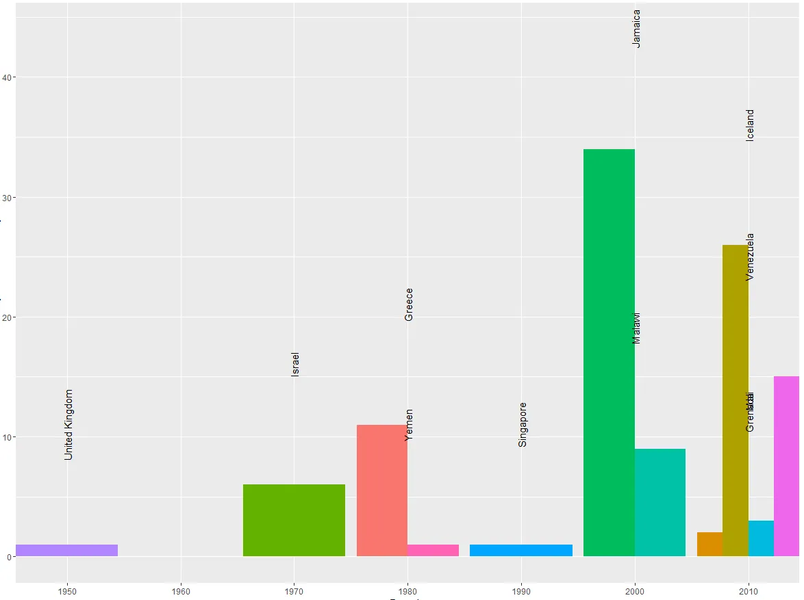 我需要让国家标签与相应的条形图对齐。即使参考了这里和这里,并使用建议中的position = position_dodge(width= 0.9),标签仍然无法对齐。我还尝试了不同的width值。
以下是创建上述图表的代码:
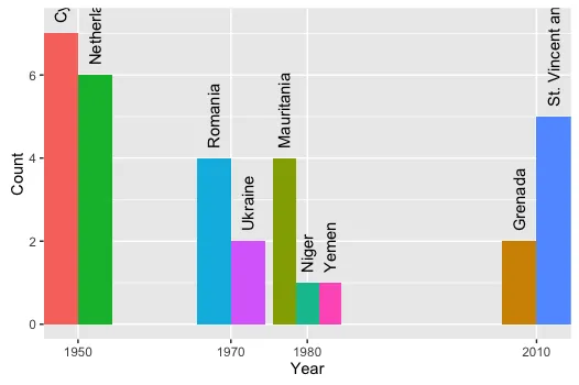
      Year                        Country                           Count
 1:   2010 St. Vincent and the Grenadines                               0
 2:   1970                        Ukraine                               0
 3:   1980                          Yemen                               1
 4:   1970                        Romania                               0
 5:   1950                         Cyprus                               0
 6:   1950                    Netherlands                               0
 7:   1980                     Mauritania                               0
 8:   1980                          Niger                               0
 9:   2010                        Grenada                               2
10:   1970                         Israel                               6
11:   1990                       Suriname                               0
12:   1990                      Singapore                               1
13:   1960                         Russia                               0
14:   1970                       Barbados                               0
15:   1950                         Panama                               0
16:   2010                           Mali                               3
17:   1980                         Greece                              11
18:   2010                      Venezuela                              15
19:   2000                         Malawi                               9
20:   2000                        Jamaica                              34
21:   1970                         Angola                               0
22:   1990                        Lebanon                               0
23:   1980       Central African Republic                               0
24:   1950                 United Kingdom                               1
25:   2010                        Iceland                              26
我已经创建了下面的分组条形图:
我需要让国家标签与相应的条形图对齐。即使参考了这里和这里,并使用建议中的position = position_dodge(width= 0.9),标签仍然无法对齐。我还尝试了不同的width值。以下是创建上述图表的代码:
> p<-ggplot(x[which(x$Count>0)], aes(Year, Count, label=Country)) + geom_bar(aes(fill = Country), position = "dodge", stat="identity")
> p+ theme(legend.position="none")+scale_x_discrete(limits=unique(x$Year))+geom_text(position = position_dodge(width= 0.9), aes(y=Count+10), angle=90)
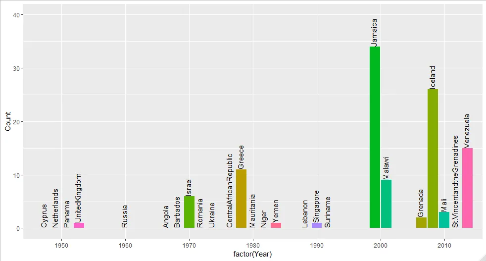
position_dodge2和position_dodge之间有很大的区别。 - saQuist