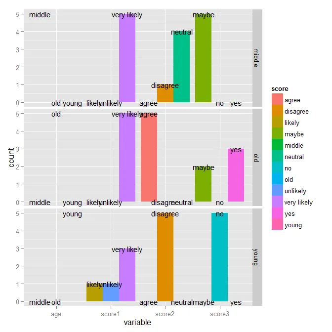
在ggplot中使用geom_text为标签条形图加上标签

9

我用下面的代码创建了这个图表:

library(ggplot2); library(reshape2); library(plyr)

likert <- data.frame(age = c(rep("young", 5), rep("middle", 5), rep("old", 5)),
                     score1 = c(rep("unlikely", 1), rep("likely", 1), rep("very likely", 13)),
                     score2  = c(rep("disagree", 6), rep("neutral", 4), rep("agree", 5)),
                     score3 = c(rep("no", 5), rep("maybe", 7), rep("yes", 3)))

meltedLikert <- melt(dlply(likert, .(age), function(x) llply(x, table)))

names(meltedLikert) <- c("score", "count", "variable", "age")

ggplot(meltedLikert[meltedLikert$variable != "age",], aes(variable, count, fill=score)) + 
  geom_bar(position="dodge", stat="identity") +
  geom_text(data=data.frame(meltedLikert), aes(variable, count, group=score, label=meltedLikert$score), size=4) +
  facet_grid(age ~ .)

enter image description here

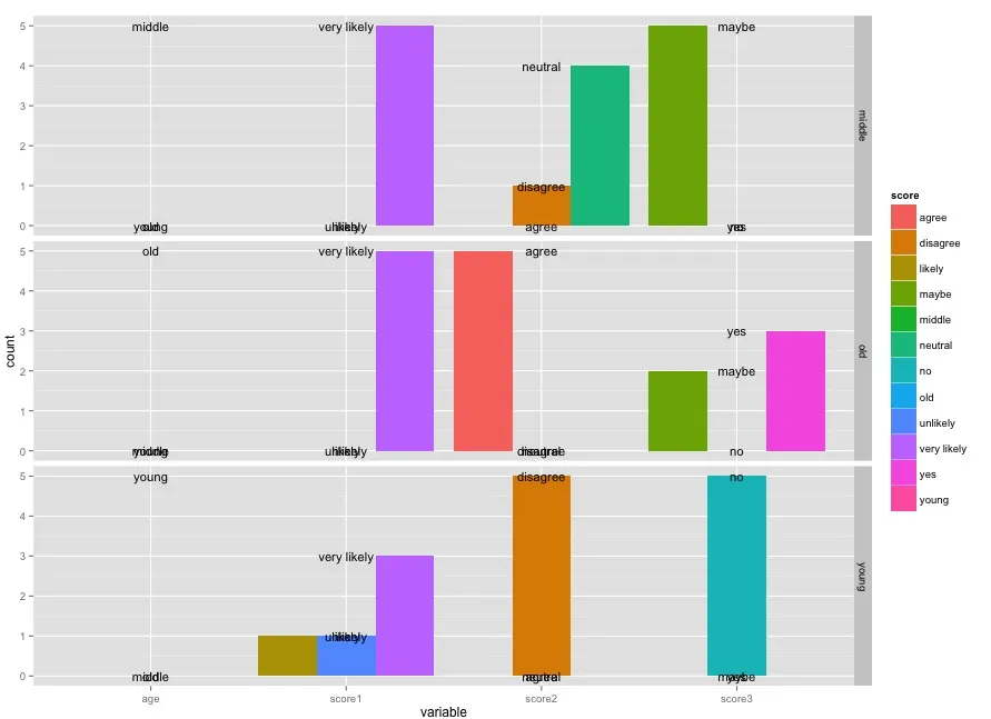
我如何标记位置文本,使得每个score标签都位于相应条形图的variable顶部对齐?

1个回答

19
根据相关问题中的回答,在geom_text调用中添加position = position_dodge(width=0.9)可以对齐数值:
ggplot(meltedLikert[meltedLikert$variable != "age",], 
       aes(variable, count, fill=score)) + 
  geom_bar(position="dodge", stat="identity") +
  geom_text(data=data.frame(meltedLikert), 
            aes(variable, count, group=score, label=meltedLikert$score), 
            position = position_dodge(width=0.9),
            size=4) +
  facet_grid(age ~ .)

在此输入图片描述

然而,我还想指出一些其他的事情。在aes()调用中不应使用meltedLikert$score,你只应该引用作为data传递的数据框中的内容。另外,meltedLikert已经是一个data.frame,因此对其调用data.frame()是不必要的(尽管并没有什么害处)。

真正的改进在于你如何开始创建你的选项卡。考虑使用这个来代替:

tabulatedLikert <- ldply(likert[-1], function(sc) {
  as.data.frame(table(age = likert$age, score = sc))
})
ggplot(tabulatedLikert, aes(x=.id, y=Freq, fill=score)) +
  geom_bar(position="dodge", stat="identity") +
  geom_text(aes(label=score), position=position_dodge(width=0.9), size=4) +
  facet_grid(age ~ .)

这里输入图片描述

您可以通过在原始数据中进行排序来修复栏的顺序:

likert2 <- mutate(likert,
                  score1 = factor(score1, levels=c("unlikely", "likely", "very likely")),
                  score2 = factor(score2, levels=c("disagree", "neutral", "agree")),
                  score3 = factor(score3, levels=c("no", "maybe", "yes")))
tabulatedLikert2 <- ldply(likert2[-1], function(sc) {
  as.data.frame(table(age = likert2$age, score = sc))
})
ggplot(tabulatedLikert2, aes(x=.id, y=Freq, fill=score)) +
  geom_bar(position="dodge", stat="identity") +
  geom_text(aes(label=score), position=position_dodge(width=0.9), size=4) +
  facet_grid(age ~ .)

当然,此时颜色并没有实际添加任何内容,因为一切都直接标在图表上,所以我会完全摒弃它们。

ggplot(tabulatedLikert2, aes(x=.id, y=Freq, group=score)) +
  geom_bar(position="dodge", stat="identity", fill="gray70") +
  geom_text(aes(label=score), position=position_dodge(width=0.9), size=4) +
  facet_grid(age ~ .)

在此输入图片描述


感谢您深入的回答 - 我在那里学到了很多 - luciano
另一种可能性是:
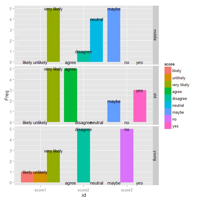
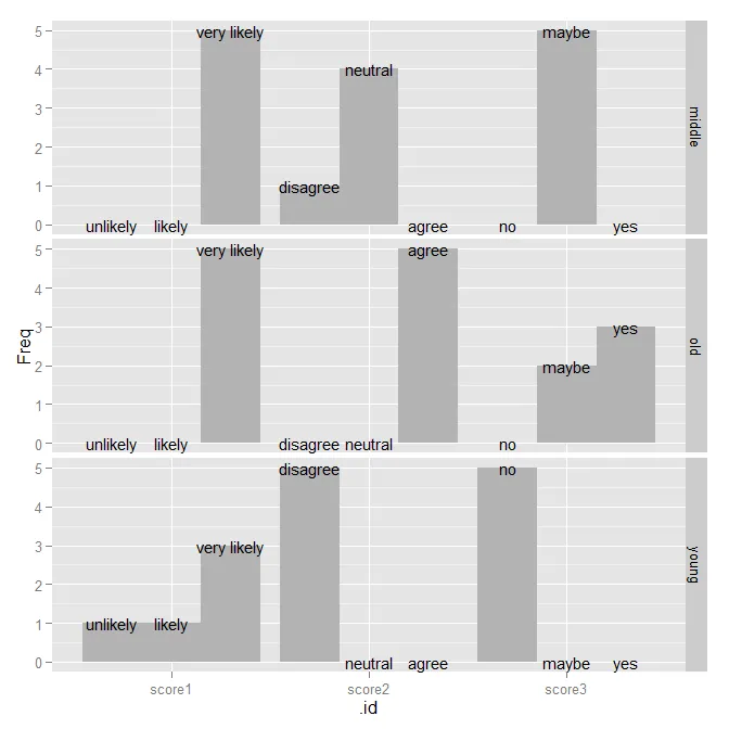
ggplot(tabulatedLikert2,aes(x = score,y = Freq))+ geom_bar(stat =“identity”,fill =“gray70”)+ geom_text(aes(label = score),size = 4)+ facet_grid(age〜。id,scales =“free_x”) - bdemarest

网页内容由stack overflow 提供, 点击上面的
可以查看英文原文,
原文链接