我正在尝试使用R创建条形图,但图例中的分组颜色看起来不正确。
我可以想象是什么原因导致了这个问题。我的初步猜测是,我应该使用矩阵而不是向量,然后设置
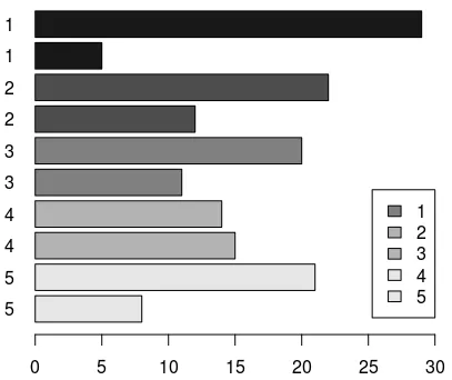
data = c(29,5,22,12,20,11,14,15,21,8)

colors = c(gray.colors(1, start = .1),gray.colors(1, start = .1),
           gray.colors(1, start = .3),gray.colors(1, start = .3),
           gray.colors(1, start = .5),gray.colors(1, start = .5),
           gray.colors(1, start = .7),gray.colors(1, start = .7),
           gray.colors(1, start = .9),gray.colors(1, start = .9))

names = c('1','1','2','2','3','3','4','4','5','5')

barplot(rev(data), horiz=TRUE, col = rev(colors), names.arg = rev(names),
        legend.text = rev(c("1","2","3","4","5")), las=1, xlim = c(0,30),
        args.legend = list(x ='bottomright', inset=c(0,0.05))
)
我可以想象是什么原因导致了这个问题。我的初步猜测是,我应该使用矩阵而不是向量,然后设置
beside = True,但是当我这样做时,条形图的间距不均匀。
legend.text = rev(rep(c("1","2","3","4","5"), each = 2)),它就不再看起来是错误的了。但是这时图例可能不是你期望的样子。 - Rui Barradas