在ggplot中对齐绘图区域

21

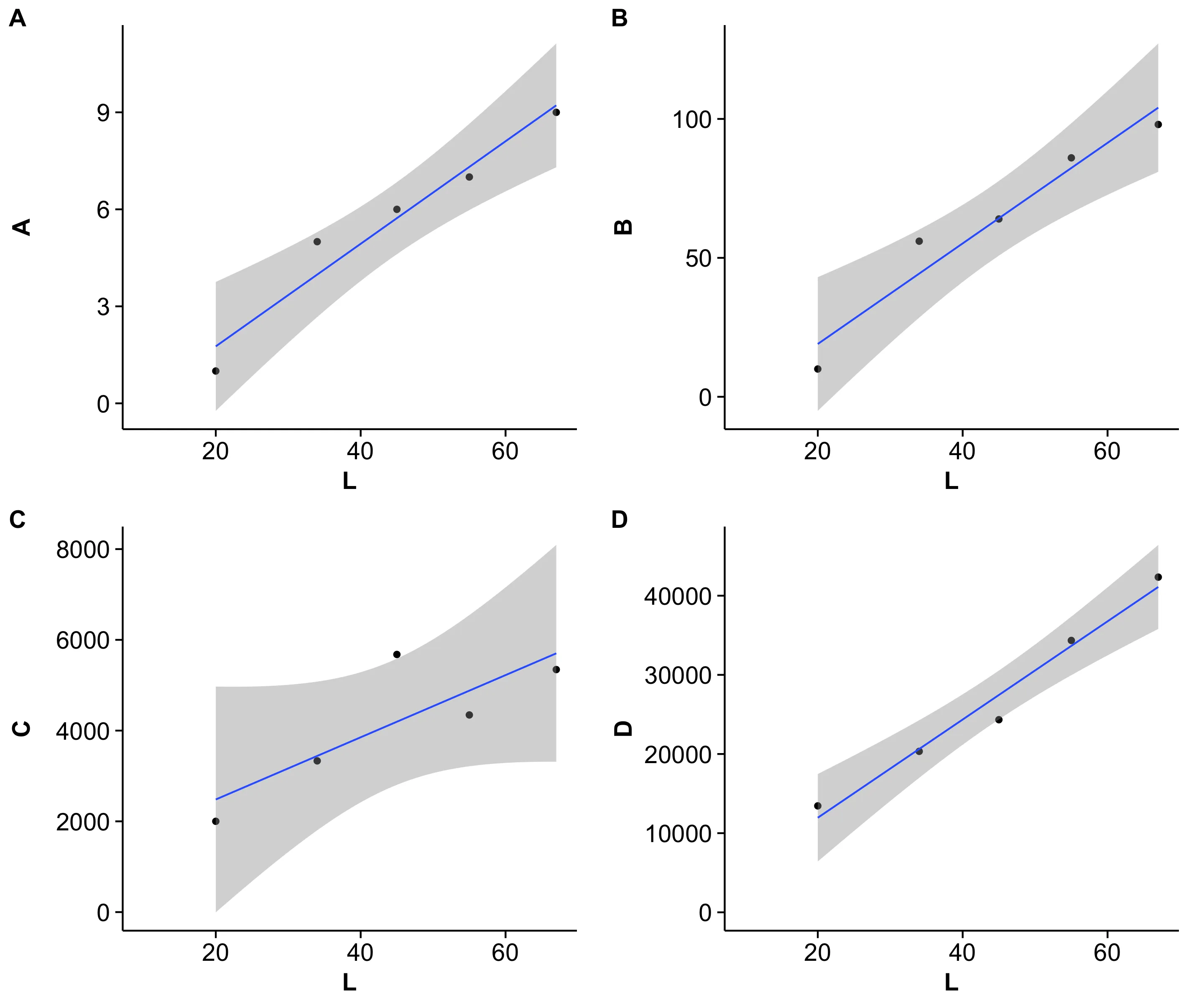
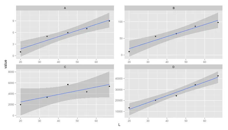
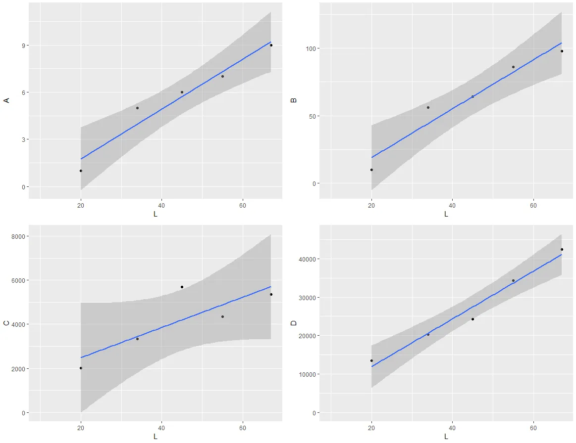
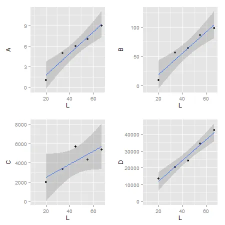
我试图使用grid.arrange来在同一页上显示由ggplot生成的多个图表。这些图表使用相同的x数据,但具有不同的y变量。由于y数据具有不同的比例尺,这些图表的大小不同。

我尝试了在ggplot2中使用各种主题选项来更改图表大小并移动y轴标签,但都无法使图表对齐。我希望将这些图表排列成2 x 2的正方形,以使每个图表具有相同的大小,并使x轴对齐。

以下是一些测试数据:

A <- c(1,5,6,7,9)
B <- c(10,56,64,86,98)
C <- c(2001,3333,5678,4345,5345)
D <- c(13446,20336,24333,34345,42345)
L <- c(20,34,45,55,67)
M <- data.frame(L, A, B, C, D)

我正在使用的用于绘图的代码:

x1 <- ggplot(M, aes(L, A,xmin=10,ymin=0)) + geom_point() + stat_smooth(method='lm')
x2 <- ggplot(M, aes(L, B,xmin=10,ymin=0)) + geom_point() + stat_smooth(method='lm')
x3 <- ggplot(M, aes(L, C,xmin=10,ymin=0)) + geom_point() + stat_smooth(method='lm')
x4 <- ggplot(M, aes(L, D,xmin=10,ymin=0)) + geom_point() + stat_smooth(method='lm')
grid.arrange(x1,x2,x3,x4,nrow=2)
如果您运行此代码,您会发现底部两个图的绘图区较小,这是由于y轴单位长度更长造成的。
如何使实际绘图窗口相同?
5个回答

21

编辑

更简单的解决方案有两种:1)使用cowplot包(参见此处的答案);或者2)使用在github上可用的egg包。

最初的回答已被修改,请参阅上述内容。

# devtools::install_github("baptiste/egg")
library(egg)
library(grid)

g = ggarrange(x1, x2, x3, x4, ncol = 2)
grid.newpage()
grid.draw(g)

最初的回答

小修改:更新代码。

如果您想保留坐标轴标签,那么通过一些调整,并从这里借用代码,可以完成此任务。

library(ggplot2)
library(gtable)
library(grid)
library(gridExtra)

# Get the widths
gA <- ggplotGrob(x1)
gB <- ggplotGrob(x2)
gC <- ggplotGrob(x3)
gD <- ggplotGrob(x4)
maxWidth = unit.pmax(gA$widths[2:3], gB$widths[2:3], 
                     gC$widths[2:3], gD$widths[2:3])

# Set the widths
gA$widths[2:3] <- maxWidth
gB$widths[2:3] <- maxWidth
gC$widths[2:3] <- maxWidth
gD$widths[2:3] <- maxWidth

# Arrange the four charts
grid.arrange(gA, gB, gC, gD, nrow=2)

enter image description here

备选方案: 将grobs组合成一个grobs有rbindcbind函数在gtable包中。对于这里的图表,应该使用size = "max"设置宽度,但是CRAN版本的gtable会抛出错误。

一种选择是检查grid.arrange绘图,然后使用size = "first"size = "last"选项:

# Get the ggplot grobs
gA <- ggplotGrob(x1)  
gB <- ggplotGrob(x2)
gC <- ggplotGrob(x3)
gD <- ggplotGrob(x4)

# Arrange the four charts
grid.arrange(gA, gB, gC, gD, nrow=2)

# Combine the plots   
g = cbind(rbind(gA, gC, size = "last"), rbind(gB, gD, size = "last"), size = "first")

# draw it
grid.newpage()
grid.draw(g)

第二个选项是从gridExtra包中绑定函数。"bind"在这里的意思是将函数与指定的参数组合在一起,以便于后续调用。
# Get the ggplot grobs
gA <- ggplotGrob(x1)  
gB <- ggplotGrob(x2)
gC <- ggplotGrob(x3)
gD <- ggplotGrob(x4)

# Combine the plots
g = cbind.gtable(rbind.gtable(gA, gC, size = "max"), rbind.gtable(gB, gD, size = "max"), size = "max")

# Draw it
grid.newpage()
grid.draw(g)

+1 没想到你可以直接像那样编辑它。非常酷。 - Brandon Bertelsen
同意。非常有帮助。谢谢 Sandy。 - user1868064
如果我想针对高度进行编码,代码会如何更改?我需要查找gtable的哪个组件来提取数据? - Ankur Chakravarthy

12

这正是我编写cowplot包的原因所在。在该软件包中,可以用一行代码解决此类问题:

require(cowplot) # loads ggplot2 as dependency
# re-create the four plots
A <- c(1,5,6,7,9)
B <- c(10,56,64,86,98)
C <- c(2001,3333,5678,4345,5345)
D <- c(13446,20336,24333,34345,42345)
L <- c(20,34,45,55,67)
M <- data.frame(L, A, B, C, D)
x1 <- ggplot(M, aes(L, A,xmin=10,ymin=0)) + geom_point() + stat_smooth(method='lm')
x2 <- ggplot(M, aes(L, B,xmin=10,ymin=0)) + geom_point() + stat_smooth(method='lm')
x3 <- ggplot(M, aes(L, C,xmin=10,ymin=0)) + geom_point() + stat_smooth(method='lm')
x4 <- ggplot(M, aes(L, D,xmin=10,ymin=0)) + geom_point() + stat_smooth(method='lm')

# arrange into grid and align
plot_grid(x1, x2, x3, x4, align='vh')

这是结果: enter image description here 
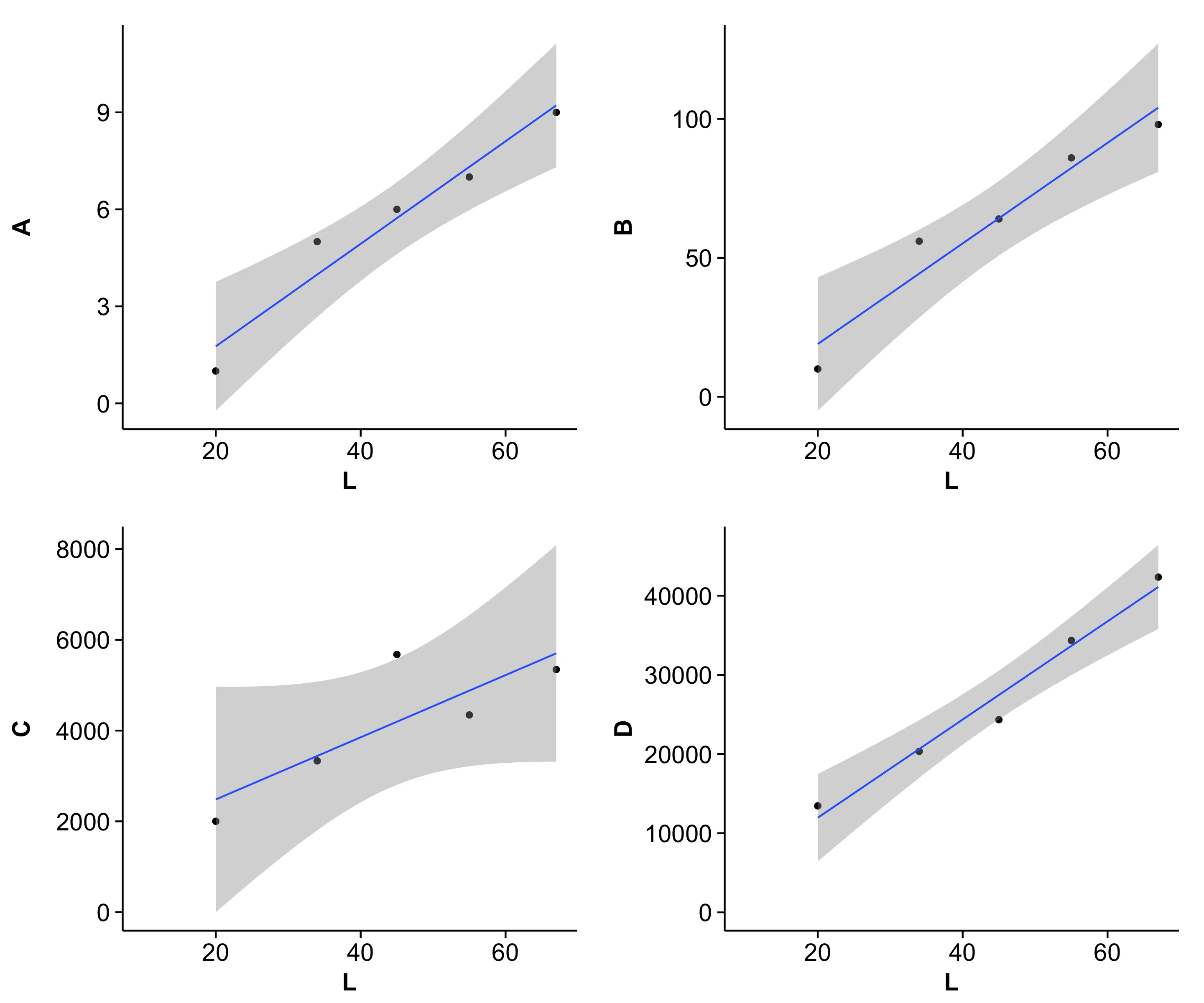
(请注意,cowplot更改了默认的ggplot2主题。但如果你真的想要,你可以把灰色主题换回来。)

作为额外功能,您还可以在每个图形的左上角添加绘图标签:

plot_grid(x1, x2, x3, x4, align='vh', labels=c('A', 'B', 'C', 'D'))

结果: 图片描述输入

我在几乎每个多部分图表中使用标签选项。


@Claus,你能否看一下我的类似问题(https://dev59.com/gFwY5IYBdhLWcg3wuZym)并关注一下你的软件包? - ikashnitsky
@ilya: baptiste的回答 是正确的方法。你可以在最后使用cowplot库中的plot_grid()代替arrangeGrob()函数。详见这里: https://cran.r-project.org/web/packages/cowplot/vignettes/plot_grid.html - Claus Wilke

9
我会在这个问题中使用分面技术:

library(reshape2)
dat <- melt(M,"L") # When in doubt, melt!

ggplot(dat, aes(L,value)) + 
geom_point() + 
stat_smooth(method="lm") + 
facet_wrap(~variable,ncol=2,scales="free")

示例

注意:对于不熟悉此领域的人,可能会忽略不同面板之间的比例尺不同。


4

Patchwork 是一个新的包,它使得对多个 ggplot 进行格式化和布局变得非常容易。其中最好的一点是它自动对齐绘图区域。此外,其语法也非常简单。

devtools::install_github("thomasp85/patchwork")
library(patchwork)
x1 + x2 + x3 + x4 + plot_layout(ncol = 2)

在此输入图片描述

更多示例请查看GitHub页面:https://github.com/thomasp85/patchwork


0
如果您正在使用RMarkdown并将其编织为PDF,我有一种替代方法。Knitr提供了在创建PDF时绘制子图的功能,这允许您在一个图中拥有多个图形,每个图形都有自己的标题。
为了使此功能正常工作,每个图必须单独显示。通过将cowplot包中的几个函数组合在一起,我制作了以下函数,可以对齐图形并将它们保持为单独的对象:
plot_grid_split <- function(..., align = "hv", axis= "tblr"){
  aligned_plots <- cowplot::align_plots(..., align=align, axis=axis)
  plots <- lapply(1:length(aligned_plots), function(x){
    cowplot::ggdraw(aligned_plots[[x]])
  })
  invisible(capture.output(plots))
}

这里有一个例子,比较通常布局和使用函数的布局:

---
output: pdf_document
header-includes:
   - \usepackage{subfig}
---

```{r}
plot_grid_split <- function(..., align = "hv", axis= "tblr"){
  aligned_plots <- cowplot::align_plots(..., align=align, axis=axis)
  plots <- lapply(1:length(aligned_plots), function(x){
    cowplot::ggdraw(aligned_plots[[x]])
  })
  invisible(capture.output(plots))
}
```

```{r fig-sub, fig.cap='Four Plots Not Aligned', fig.subcap=c('Plot One', 'Plot Two', 'Plot Three', 'Plot Four'), out.width='.49\\linewidth', fig.asp=1, fig.ncol = 2}  
library(ggplot2) 
plot <- ggplot(iris, aes(Sepal.Length, Sepal.Width, colour = Species)) +
  geom_point()

plot + labs(title = "A nice title")
plot + labs(caption = "A sample caption")
plot + theme(legend.position = "none")
plot + theme(legend.position = "top")
```  

```{r fig-sub-2, fig.cap='Four Plots Aligned', fig.subcap=c('Plot One', 'Plot Two', 'Plot Three', 'Plot Four'), out.width='.49\\linewidth', fig.asp=1, fig.ncol = 2}

x1 <- plot + labs(title = "A nice title")
x2 <- plot + labs(caption = "A sample caption")
x3 <- plot + theme(legend.position = "none")
x4 <- plot + theme(legend.position = "top")

plot_grid_split(x1, x2, x3, x4)
```

enter image description here


网页内容由stack overflow 提供, 点击上面的
可以查看英文原文,
原文链接