倒三角形带圆角

3

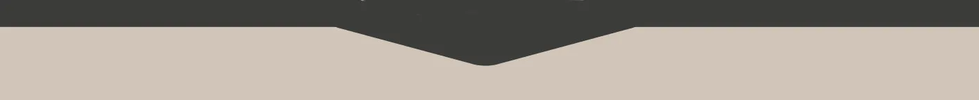
我需要在我的网站头部重新创建这样的效果。我想通过CSS来实现,有人可以帮助我吗?因为我卡在那个三角形上了...

这是我的测试:

#main-nav {height:200px;width:1200px;background-color:#000}
#triangle {
    width: 0;
    height: 0px;
    border-style: solid;
    border-width: 300px 300px 0px 0px;
    border-color: #007bff transparent transparent transparent;
    border-radius: 70px 2px 2px 2px;
    margin: auto;
    top: -400px;
    position: relative;
    /* background-color: #ccc; */
    -moz-border-radius: 20px;
    transform: rotate(-135deg);
    /* border-top: 80px solid blue; */
    /* border-bottom: 80px solid blue; */
    /* border-right:80px solid blue; */
}
<div id="main-nav">
</div>
<div id="triangle">
</div>

image


这些链接可能会对您有所帮助 - https://dev59.com/Mobca4cB1Zd3GeqPQgjA 或者 https://dev59.com/A2Ag5IYBdhLWcg3wS5aC#23759602 - Harry
1个回答

1
你可以这样做:

CSS

#main-nav {
  position: relative;
  height: 200px;
  width: 1200px;
  overflow: hidden;
  background-color: #D1C5B9;
  z-index: 1;
}

#triangle {
  position: absolute;
  display: block;
  width: 100%;
  background: #3C3C3A;
  height: 40px;
  z-index: 4;
}

#triangle:after {
  position: absolute;
  content: "";
  display: block;
  width: 100px;
  height: 50px;
  transform: rotate(15deg);
  background: #3C3C3A;
  z-index: 4;
  border-radius: 14px;
  left: 50%;
  margin-left: -65px;
  top: 0px;
  border: 1px solid #3C3C3A;
}

#triangle:before {
  position: absolute;
  content: "";
  display: block;
  width: 100px;
  height: 50px;
  transform: rotate(-15deg);
  background: #3C3C3A;
  z-index: 3;
  border-radius: 14px;
  left: 50%;
  margin-right: 0;
  top: 0px;
  border: 1px solid #3C3C3A;
}

HTML是指超文本标记语言。
<div id="main-nav">
  <div id="triangle">
  </div>
</div>

注意: 根据您的需要进行调整

在此处查看演示


网页内容由stack overflow 提供, 点击上面的
可以查看英文原文,
原文链接