以下是两种不同的 ggplot2 方法将提供的数据转换为极坐标图。这两种方法在处理 month 方式上有所不同。
读取数据
library(data.table)
m <- fread("id   season pa month sampled occupancy
           1  spring  1     3       1   present
           2  spring  1     4       1   present
           3  spring  1     5       1   present
           4  summer  1     6       1   present
           5  summer  1     7       1   present
           6  summer  1     8       1   present
           7  winter  0    12       1    absent
           8  winter  0     1       0    absent
           9  winter  0     2       0    absent
           10   fall  1     9       1   present
           11   fall  1    10       1   present
           12   fall  1    11       1   present")
准备数据
ml <- melt(m, measure.vars = c("pa", "sampled"))
ml[, variable := factor(variable, levels = c("pa", "sampled"))]
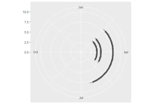
变量1:将月份作为因子
ml[, fct_month := factor(month, levels = 1:12, labels = month.abb)]
library(ggplot2)
ggplot(ml[value != 0], aes(x = fct_month, y = variable,
                           group = variable, colour = variable)) +
  geom_line(size = 5) +
  scale_y_discrete(expand = c(0, 1), breaks = NULL) +
  xlim(month.abb) +
  coord_polar() +
  theme_bw() + xlab(NULL) + ylab(NULL)
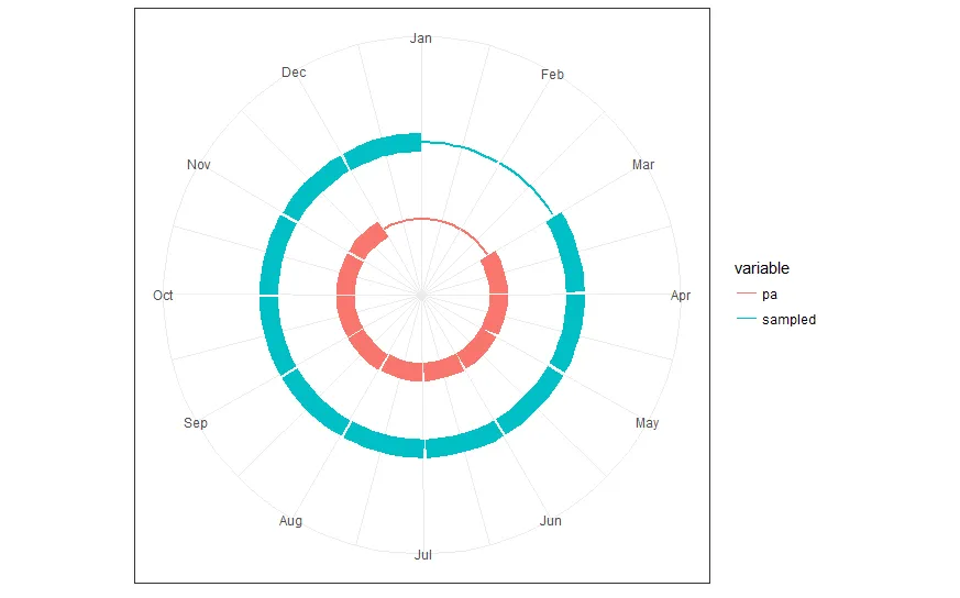
变体2:以时间段(包括开始和结束日期)表示的月份
ml[, start := as.Date("2016-01-01") + base::months(month - 1L)]
ml[, end := as.Date("2016-01-01") + base::months(month) - 1L]
library(ggplot2)
ggplot(ml, aes(x = start, xend = end, y = variable, yend = variable,
group = variable, colour = variable,
size = value)) +
geom_segment() +
scale_y_discrete(expand = c(0, 1), breaks = NULL) +
scale_x_date(date_breaks = "1 month", date_labels = month.abb,
limits = range(c(ml$start, ml$end))) +
scale_size(guide = FALSE) +
coord_polar() +
theme_bw() + xlab(NULL) + ylab(NULL)
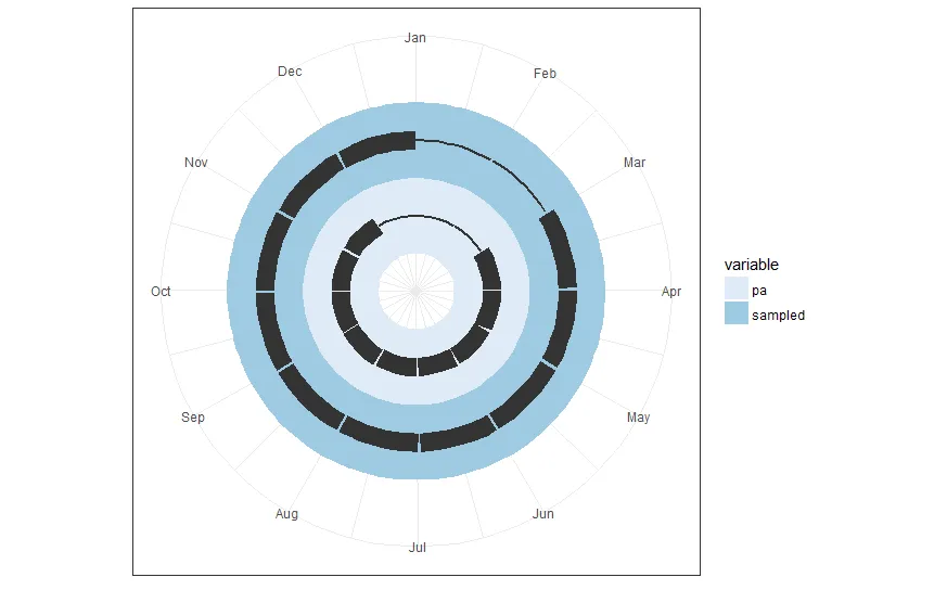
变体3:彩色背景
根据评论中的一个请求,这个变体会为每个变量单独着色背景,而环形段将保持黑色。因此,如果我们添加第三个变量,它将获得自己的彩色背景环。
ml[, start_year := as.Date("2016-01-01")]
ml[, end_year := as.Date("2016-12-31")]
ml[, start := start_year + base::months(month - 1L)]
ml[, end := start_year + base::months(month) - 1L]
library(ggplot2)
bg_height <- 1.0
ggplot(ml) +
geom_rect(aes(xmin = start_year, xmax = end_year,
ymin = as.integer(variable) - 0.5 * bg_height,
ymax = as.integer(variable) + 0.5 * bg_height,
group = variable, fill = variable)
) +
geom_segment(aes(x = start, xend = end, y = variable, yend = variable,
group = variable, size = value),
colour = "gray20") +
scale_y_discrete(expand = c(0, 1), breaks = NULL) +
scale_x_date(date_breaks = "1 month", date_labels = month.abb,
limits = range(c(ml$start, ml$end))) +
scale_size(guide = FALSE) +
scale_fill_brewer(palette = "Blues") +
coord_polar() +
theme_bw() + xlab(NULL) + ylab(NULL)