使用ggplot2创建分组小提琴图

65

我想使用ggplot创建一个分裂小提琴密度图,就像seaborn文档这个页面上的第四个示例。

enter image description here

以下是一些数据:

set.seed(20160229)

my_data = data.frame(
    y=c(rnorm(1000), rnorm(1000, 0.5), rnorm(1000, 1), rnorm(1000, 1.5)),
    x=c(rep('a', 2000), rep('b', 2000)),
    m=c(rep('i', 1000), rep('j', 2000), rep('i', 1000))
)

我可以像这样绘制躲闪的小提琴图:

library('ggplot2')

ggplot(my_data, aes(x, y, fill=m)) +
  geom_violin()

在此输入图片描述

但是在并排分布的情况下,视觉上比较不同点的宽度很困难。我没有找到任何关于ggplot中分割小提琴图的例子 - 这可能吗?

我找到了一个基于R语言的解决方案,但这个函数非常长,而且我想突出显示分布模式,这在ggplot中可以很容易地添加为额外的图层,但如果我需要弄清楚如何编辑那个函数,则会更加困难。

4个回答

84

或者,为了避免费力地调整密度,您可以像这样扩展ggplot2的GeomViolin

GeomSplitViolin <- ggproto("GeomSplitViolin", GeomViolin, 
                           draw_group = function(self, data, ..., draw_quantiles = NULL) {
  data <- transform(data, xminv = x - violinwidth * (x - xmin), xmaxv = x + violinwidth * (xmax - x))
  grp <- data[1, "group"]
  newdata <- plyr::arrange(transform(data, x = if (grp %% 2 == 1) xminv else xmaxv), if (grp %% 2 == 1) y else -y)
  newdata <- rbind(newdata[1, ], newdata, newdata[nrow(newdata), ], newdata[1, ])
  newdata[c(1, nrow(newdata) - 1, nrow(newdata)), "x"] <- round(newdata[1, "x"])

  if (length(draw_quantiles) > 0 & !scales::zero_range(range(data$y))) {
    stopifnot(all(draw_quantiles >= 0), all(draw_quantiles <=
      1))
    quantiles <- ggplot2:::create_quantile_segment_frame(data, draw_quantiles)
    aesthetics <- data[rep(1, nrow(quantiles)), setdiff(names(data), c("x", "y")), drop = FALSE]
    aesthetics$alpha <- rep(1, nrow(quantiles))
    both <- cbind(quantiles, aesthetics)
    quantile_grob <- GeomPath$draw_panel(both, ...)
    ggplot2:::ggname("geom_split_violin", grid::grobTree(GeomPolygon$draw_panel(newdata, ...), quantile_grob))
  }
  else {
    ggplot2:::ggname("geom_split_violin", GeomPolygon$draw_panel(newdata, ...))
  }
})

geom_split_violin <- function(mapping = NULL, data = NULL, stat = "ydensity", position = "identity", ..., 
                              draw_quantiles = NULL, trim = TRUE, scale = "area", na.rm = FALSE, 
                              show.legend = NA, inherit.aes = TRUE) {
  layer(data = data, mapping = mapping, stat = stat, geom = GeomSplitViolin, 
        position = position, show.legend = show.legend, inherit.aes = inherit.aes, 
        params = list(trim = trim, scale = scale, draw_quantiles = draw_quantiles, na.rm = na.rm, ...))
}

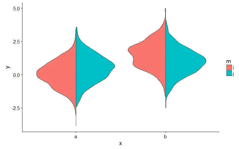
然后像这样使用新的geom_split_violin:

ggplot(my_data, aes(x, y, fill = m)) + geom_split_violin()

输入图像描述


1
如果我想要为“a”组和“b”组使用不同的颜色怎么办?谢谢! - user3236841
2
@user3236841 不确定这种情况是否是需要的,但由于它是用模数实现的,所以可能已经可以工作了?你尝试在因子“m”中使用4个级别吗?如果你只有两个级别,你可以使用:
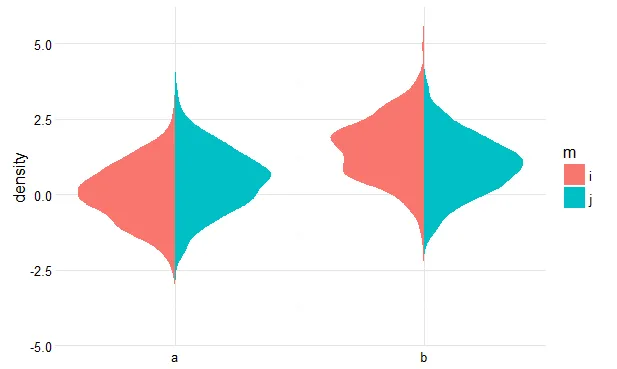
ggplot(my_data, aes(x, y, fill=interaction(x,m))) + geom_split_violin() 来获得不同的颜色,我想。 - jan-glx
1
是的,确实有效!谢谢。当a和b的分布不同且分布被标准化时,这非常有用。 - user3236841
3
请参见这里,其中包含有关基于此函数在分裂小提琴图上绘制分位数的大多数可行代码。 - Axeman
1
我认为这是一个很棒的函数。然而,我更喜欢使用@Axeman的解决方案,因为它返回一个连续的x轴。我相信在你的几何图形中也有一种使用底层(连续)密度分布的方法,但对我来说不是那么直接。 - tjebo
显示剩余5条评论

57

注意:我认为jan-glx的答案更好,大多数人应该使用它。但有时手动方法仍然有助于做一些奇怪的事情。


您可以通过预先计算密度,然后绘制多边形来实现此目的。以下是一个大致的想法。

获取密度

library(dplyr)
pdat <- my_data %>%
  group_by(x, m) %>%
  do(data.frame(loc = density(.$y)$x,
                dens = density(.$y)$y))

翻转并偏移群体密度

pdat$dens <- ifelse(pdat$m == 'i', pdat$dens * -1, pdat$dens)
pdat$dens <- ifelse(pdat$x == 'b', pdat$dens + 1, pdat$dens)

情节

ggplot(pdat, aes(dens, loc, fill = m, group = interaction(m, x))) + 
  geom_polygon() +
  scale_x_continuous(breaks = 0:1, labels = c('a', 'b')) +
  ylab('density') +
  theme_minimal() +
  theme(axis.title.x = element_blank())

结果

这里输入图片描述


1
如果有三个组(例如i,j和x),您将如何计算密度? - Areza
1
三组图应该长什么样子?如果您想在每个小提琴内显示所有三组的密度曲线,可能很难想象。 - user102162
这是一个非常好的选择,特别是当原始数据非常庞大时。预先计算密度可以使绘图更加轻便! - JelenaČuklina
1
太棒了!我成功地使用plotnine让你的方法运行起来了。我想使用plotnine而不是seaborn,以便与其他图表保持一致的感觉,而第一个解决方案看起来太难实现了。你的方法很简单。真是个绝妙的解决方案! - brb

3
现在,使用introdataviz包中的geom_split_violin函数,可以轻松创建这些图表。以下是可重现的示例:

introdataviz 包中的 geom_split_violin 函数使得创建这些图表变得非常容易。

请注意保留HTML标签。
set.seed(20160229)
my_data = data.frame(
  y=c(rnorm(1000), rnorm(1000, 0.5), rnorm(1000, 1), rnorm(1000, 1.5)),
  x=c(rep('a', 2000), rep('b', 2000)),
  m=c(rep('i', 1000), rep('j', 2000), rep('i', 1000))
)

library(ggplot2)
# devtools::install_github("psyteachr/introdataviz")
library(introdataviz)

ggplot(my_data, aes(x = x, y = y, fill = m)) +
  geom_split_violin()

使用 reprex v2.0.2 工具,于2022年08月24日创建。

如图所示,它创建了一个分割小提琴图。如果您想获得更多信息和该软件包的教程,请查看上面的链接。


2

@jan-jlx 的解决方案非常棒。对于尾部较薄的密度,我想在小提琴的两个半部分之间插入一点空间,以便更容易区分尾部。这里是 @jan-jlx 代码的轻微修改,借用了 gghalves 包中的 nudge 参数来实现:

GeomSplitViolin <- ggplot2::ggproto(
    "GeomSplitViolin",
    ggplot2::GeomViolin,
    draw_group = function(self,
                          data,
                          ...,
                          # add the nudge here
                          nudge = 0,
                          draw_quantiles = NULL) {
        data <- transform(data,
                          xminv = x - violinwidth * (x - xmin),
                          xmaxv = x + violinwidth * (xmax - x))
        grp <- data[1, "group"]
        newdata <- plyr::arrange(transform(data,
                                           x = if (grp %% 2 == 1) xminv else xmaxv),
                                 if (grp %% 2 == 1) y else -y)
        newdata <- rbind(newdata[1, ],
                         newdata,
                         newdata[nrow(newdata), ],
                         newdata[1, ])
        newdata[c(1, nrow(newdata)-1, nrow(newdata)), "x"] <- round(newdata[1, "x"])

        # now nudge them apart
        newdata$x <- ifelse(newdata$group %% 2 == 1,
                            newdata$x - nudge,
                            newdata$x + nudge)

        if (length(draw_quantiles) > 0 & !scales::zero_range(range(data$y))) {

            stopifnot(all(draw_quantiles >= 0), all(draw_quantiles <= 1))

            quantiles <- ggplot2:::create_quantile_segment_frame(data,
                                                             draw_quantiles)
            aesthetics <- data[rep(1, nrow(quantiles)),
                               setdiff(names(data), c("x", "y")),
                               drop = FALSE]
            aesthetics$alpha <- rep(1, nrow(quantiles))
            both <- cbind(quantiles, aesthetics)
            quantile_grob <- ggplot2::GeomPath$draw_panel(both, ...)
            ggplot2:::ggname("geom_split_violin",
                             grid::grobTree(ggplot2::GeomPolygon$draw_panel(newdata, ...),
                                            quantile_grob))
        }
    else {
            ggplot2:::ggname("geom_split_violin",
                             ggplot2::GeomPolygon$draw_panel(newdata, ...))
        }
    }
)

geom_split_violin <- function(mapping = NULL,
                              data = NULL,
                              stat = "ydensity",
                              position = "identity",
                              # nudge param here
                              nudge = 0,
                              ...,
                              draw_quantiles = NULL,
                              trim = TRUE,
                              scale = "area",
                              na.rm = FALSE,
                              show.legend = NA,
                              inherit.aes = TRUE) {

    ggplot2::layer(data = data,
                   mapping = mapping,
                   stat = stat,
                   geom = GeomSplitViolin,
                   position = position,
                   show.legend = show.legend,
                   inherit.aes = inherit.aes,
                   params = list(trim = trim,
                                 scale = scale,
                                 # don't forget the nudge
                                 nudge = nudge,
                                 draw_quantiles = draw_quantiles,
                                 na.rm = na.rm,
                                 ...))
}

这是我使用geom_split_violin(nudge = 0.02)得到的图表。

enter image description here


这是一个很好的答案,因为它允许在两个小提琴图的中间空间中使用geom_jitter(),通过将geom_split_violin()中的nudgegeom_jitter()中的width匹配,有效地创建了一个镜像的、垂直的雨云图。然而,对于长尾分布的KDE,我在我的一个问题中(https://stackoverflow.com/questions/76088376/how-to-plot-difficult-probability-distributions-with-ggplot2)中提到遇到了困难。也许你们有什么好的想法,可以将这个添加到你们的优秀代码中,@Trang Q. Nguyen和@jan-glx? - undefined

网页内容由stack overflow 提供, 点击上面的
可以查看英文原文,
原文链接