使用ggplot2在R中绘制连接线段的圆形图

15

我正在尝试创建一个环形图,但卡在一个点上:

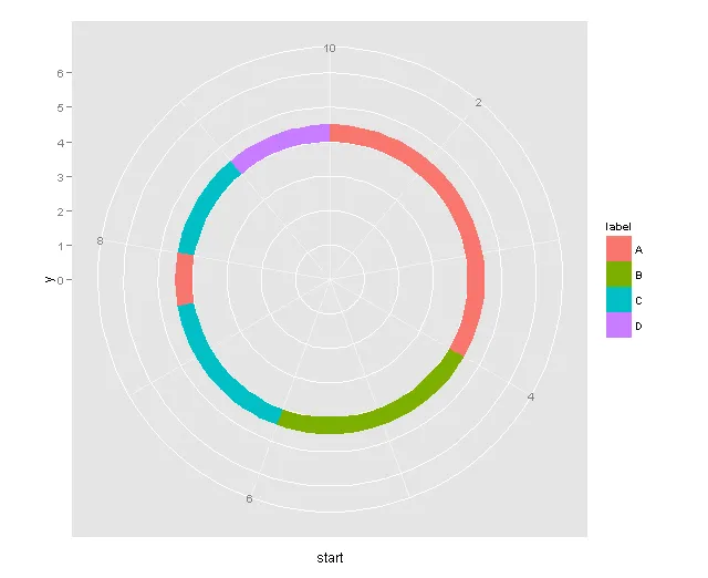
dat1 <- data.frame (xvar = 1:10, y = 6, ymin = 4, ymax = 4.5)
使用这些数据,我可以在ggplot2中生成一个环形带图。
require(ggplot2) 
 ggplot(dat1, aes(x=xvar, y=y)) +  geom_ribbon(aes(ymin=ymin, ymax=ymax),
  col = "blue", fill = "blue2") + ylim (c(0,6)) + coord_polar()
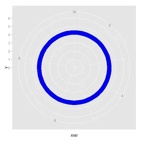
但我想要更多。

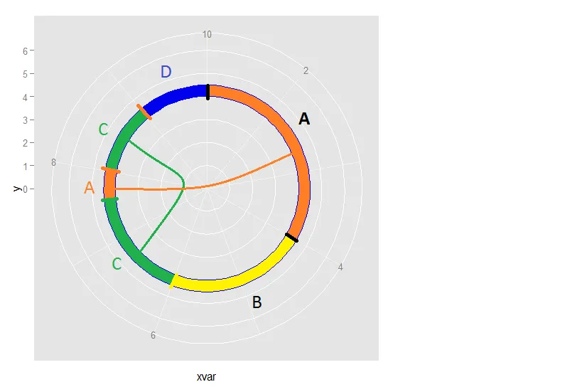
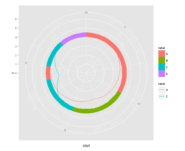
我想使用以下数据,用不同的颜色和标签填充带状段。

 filld <- data.frame (start = c(1, 4, 6, 7.5, 8, 9), end = c(4, 6, 7.5, 8, 9, 10),
                         label = c("A", "B", "C", "A", "C", "D"))
  filld
##    start  end label
## 1   1.0  4.0     A
## 2   4.0  6.0     B
## 3   6.0  7.5     C
## 4   7.5  8.0     A
## 5   8.0  9.0     C
## 6   9.0 10.0     D

根据标签变量,该带状图将被填充不同的颜色。例如,段A将从1开始并结束于4。然后段B将从6开始并以不同的颜色填充。带有相同标签(如A和C)的段将通过线连接。

生成的图表将类似于以下内容:


漂亮的图表 :) 添加抗锯齿效果非常棒 - Viet
3个回答

19

以下是一个示例:

filld$p <- rowMeans(subset(filld, select = c(start, end)))
ggplot(filld, aes(xmin = start, xmax = end, ymin = 4, ymax = 5, fill = label)) + 
  geom_rect() + 
  geom_segment(data = subset(filld, label %in% label[duplicated(label)]),
               aes(x = p, y = 0, xend = p, yend = 4, colour = label),
               size = 2, show_guide = FALSE) +
  geom_text(aes(x = p, y = 4.5, label = label), colour = "white", size = 10) +
  coord_polar() + 
  scale_y_continuous(limits = c(0, 5))

已更新

我不推荐这样做,但可以尝试类似以下的代码:

filld <- data.frame (start = c(1, 4, 6, 7.5, 8, 9), end = c(4, 6, 7.5, 8, 9, 10),
                     label = c("A", "B", "C", "A", "C", "D"))
filld$p <- rowMeans(subset(filld, select = c(start, end)))
filld <- merge(filld, ddply(filld, .(label), summarize, p2 = mean(p)))

lnd <- subset(filld, label %in% label[duplicated(label)])
lnd <- ddply(lnd, .(label), function(x) {
  x <- seq(x$p[1], x$p[2], length = 100)
  y <- 4.5 + ((x - mean(x))^2 - (x[1]-mean(x))^2) / (x[1]-mean(x))^2 * 3 + sin(x*3*pi) * 0.1
  data.frame(x, y)
})


p <- ggplot(filld, aes(xmin = start, xmax = end, ymin = 4, ymax = 5, colour = label, fill = label)) + 
  geom_line(aes(x, y, xmin = NULL, ymin = NULL, xmax = NULL, ymax = NULL), data = lnd, size = 2) +
  geom_rect() + 
  geom_text(aes(x = p, y = 4.5, label = label), colour = "white", size = 10) +
  coord_polar() + 
  scale_y_continuous(limits = c(0, 5))
p

也许你想要的已经超出了ggplot2的范围。


@kohske 很不错...这些线条好多了,但我想知道是否可能使低于180的线条通过中心连接来制作较小的循环,以避免拥挤。 - shNIL
我曾考虑过 p + annotation_custom(gridExtra::arcTextGrob()),但遗憾的是它与极坐标不兼容。也许只应该是一个警告。 - baptiste
可能会有一个带有关联统计信息的geom_arc,它的工作方式类似于geom_segment,但永远不会被压缩,并且将使用curveGrob连接观测值对。 - baptiste
很棒的例子,让我想起了圆环图。但是我的几何知识不够强,无法提出如何在极坐标系中映射这样的弧线的建议。这里还有一个d3.js的例子。编辑-我看到Paolo的答案也给出了一个非常相似的例子。 - Andy W
很遗憾,Circos是Perl编写的,而在R中我找不到类似质量的R包。 - shNIL

8
请看 ggbio。该软件包扩展了 ggplot2 和图形语法到序列数据(生物信息学),但它们似乎可以解决您的问题(例如,参见 这里)。查看软件包的源代码可能会指向更通用的解决方案。

6

添加ymin等以填充d

fd <- data.frame(filld, ymin = 4, y =6, ymax = 4.5)

然后使用geom_rect,将列label作为fillcolour美学属性。

 ggplot(fd, aes(x=start,xmin = start, xmax = end, y=y)) +  
   geom_rect(aes(ymin=ymin, ymax=ymax, fill = label )) + 
   ylim (c(0,6)) + 
   coord_polar() 

添加以下行:

## calculate the midpoint for each segment
fd$xmid <- apply(fd[,1:2],1,mean)
## get the replicate id for the labels (what occurence is this)
library(plyr)
library(reshape2)
fd1 <- ddply(fd, .(label), mutate, id = 1:length(xmid))
## reshape to wide, subsetting only with more than one rep
.lines <- na.omit(dcast(fd1, label~id, value.var = 'xmid'))
## add a mid point between the mid points
.lines$mid <- apply(.lines[,2:3],1,mean)
## reshape to long, and add some y values 
ld <- data.frame(arrange(melt(.lines,value.name = 'x'), label, x), y = rep(c(4,3,4),2))

ggplot(fd) +  
  geom_rect(aes(x=start,xmin = start, xmax = end, y=y,ymin=ymin, ymax=ymax, fill = label )) + 
  ylim (c(0,6)) + 
  coord_polar() + geom_path(data = ld, aes(x=x,y=y,colour = label))

这些代码看起来难看,但是它们存在的意义!


网页内容由stack overflow 提供, 点击上面的
可以查看英文原文,
原文链接