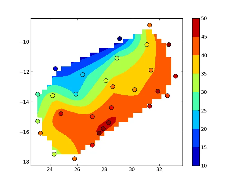
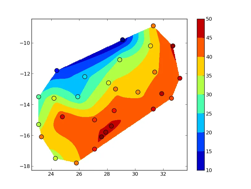
这是我的数据:
Lon   Lat     Z   Z2  pos
32.6  -13.6   41   9  CHIP
27.1  -16.9   43  12  CHOM
32.7  -10.2   46  14  ISOK
24.2  -13.6   33  13  KABO
28.5  -14.4   43  11  KABW
28.1  -12.6   33  16  KAFI
27.9  -15.8   46  13  KAFU
24.8  -14.8   44   9  KAOM
31.1  -10.2   35  14  KASA
25.9  -13.5   24   8  KASE
29.1   -9.8   10  13  KAWA
25.8  -17.8   39  11  LIVI
33.2  -12.3   44   8  LUND
28.3  -15.4   46  12  LUSA
27.6  -16.1   47   9  MAGO
28.9  -11.1   31  15  MANS
31.3   -8.9   39   9  MBAL
31.9  -13.3   45   9  MFUW
23.1  -15.3   31   9  MONG
31.4  -11.9   39   9  MPIK
27.1  -15.0   42  12  MUMB
24.4  -11.8   15   9  MWIN
28.6  -13.0   39   9  NDOL
31.3  -14.3   44  12  PETA
23.3  -16.1   39   5  SENA
30.2  -13.2   38  11  SERE
24.3  -17.5   32  10  SESH
26.4  -12.2   23  12  SOLW
23.1  -13.5   27  14  ZAMB
以下是我尝试过的代码。让我困扰的部分是数据网格化和等高线绘制。下面的代码主要来自stackoverflow上的各种帖子,但很难找到与我的主题相关的内容。
#!/usr/bin/python

from mpl_toolkits.basemap import Basemap
import matplotlib.pyplot as plt
import numpy as np
from scipy.interpolate import griddata

#prepare a basemap
m = Basemap(projection = 'merc',llcrnrlon = 21, llcrnrlat = -18, urcrnrlon = 34, urcrnrlat = -8)
m.drawmapboundary(fill_color = 'white')
m.fillcontinents(color = '0.85')

# draw country outlines.
m.drawcountries(linewidth=0.5, linestyle='solid', color='k', antialiased=1, ax=None, zorder=None)

m.drawparallels(np.arange(-18, -8, 2.), color = '0.25', linewidth = 0.5)
m.drawparallels(parallels,labels=[True,False,False,False])

m.drawmeridians(np.arange(21,36, 2.), color = '0.25', linewidth = 0.5)
m.drawmeridians(meridians,labels=[False,False,False,True])

#plt.show() ##Code works up to here, drawing basemap
#######################################################

#prepare data for contouring
#declare empty arrays for xyz
xarray = []
yarray = []
zarray = []

#get data and pack in the arrays
with open("meansr.txt", "r") as f:
    for line in f:
        (x, y, z, z2, pos) = line.split()
        xarray.append(x)
        yarray.append(y)
        zarray.append(z)
    f.close()

#prepare and grid the data
extent = (min(xarray), max(xarray), min(yarray), max(yarray))
xs,ys = np.mgrid[extent[0]:extent[1]:30j, extent[2]:extent[3]:30j]
z = griddata((xarray, yarray),  zarray, (xs, ys))
x,y = m(xarray,yarray)

#make contour plot
cs = m.contourf(x, y, z)
cs2 = m.contour(x,y,z, levels = range(10,50,5),colors = 'blue')
plt.clabel(cs, fmt = '%.0f', inline = True)
plt.show()
这是我在等高线部分遇到的错误:
Traceback (most recent call last):
File "./contour12.py", line 44, in <module>
xs,ys = np.mgrid[extent[0]:extent[1]:29j, extent[2]:extent[3]:29j]
File "/home/zmumba/anaconda/lib/python2.7/site-packages/numpy/lib/index_tricks.py", line 185, in __getitem__
step = key.step
AttributeError: 'tuple' object has no attribute 'step'
我不确定上面代码中的“30j”应该做什么,尽管我的数据只有29个点。