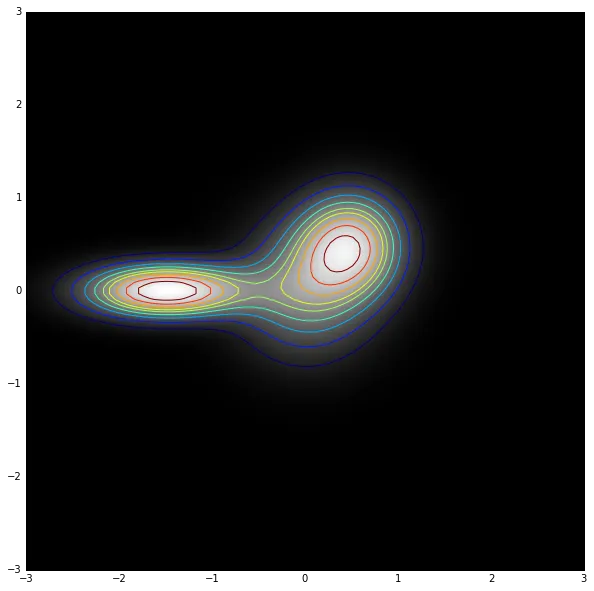
给定一个具有未知函数形式的概率分布(以下为示例),我希望绘制“基于百分位”的轮廓线,即对应于积分为10%,20%,...,90%等区域的轮廓线。
## example of an "arbitrary" probability distribution ##
from matplotlib.mlab import bivariate_normal
import matplotlib.pyplot as plt
import numpy as np
X, Y = np.mgrid[-3:3:100j, -3:3:100j]
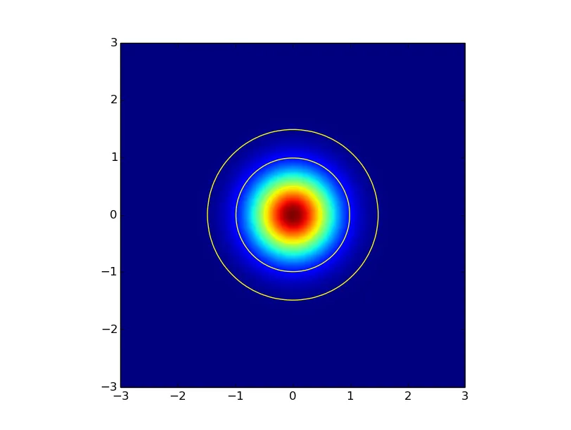
z1 = bivariate_normal(X, Y, .5, .5, 0., 0.)
z2 = bivariate_normal(X, Y, .4, .4, .5, .5)
z3 = bivariate_normal(X, Y, .6, .2, -1.5, 0.)
z = z1+z2+z3
plt.imshow(np.reshape(z.T, (100,-1)), origin='lower', extent=[-3,3,-3,3])
plt.show()
 我已经尝试了多种方法,包括使用matplotlib中的默认轮廓函数,使用scipy中的stats.gaussian_kde方法,甚至可能从分布中生成随机点样本,然后估计内核。但是没有一个方法提供解决方案。