我想将来自pandas列的数据可视化为3D散点图。 我遇到的问题是如何调整颜色条以匹配我的z轴的确切大小。
我的代码:
import matplotlib.pyplot as plt
from mpl_toolkits.mplot3d import Axes3D

s = pd.read_csv('FahrerVP8.out_1.csv', index_col=0)

ax = plt.figure()
three_d = ax.gca(projection='3d')
three_d1 = three_d.scatter(s['Latitude'], s['Longitude'],s['Mean_ VehicleSpeed'], c =s['Mean_ VehicleSpeed'] )
three_d.set_xlabel('Latitude')
three_d.set_ylabel('Longitude')
three_d.set_zlabel('Mean Vehicle Speed')


plt.colorbar(three_d1)
plt.show()
我的结果
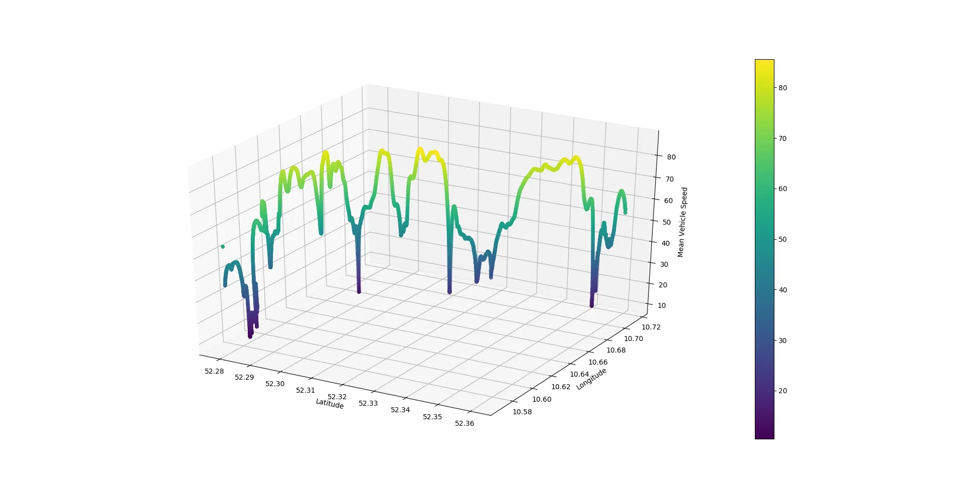
我希望我的颜色条高度能够随着z轴高度调整。