完美对齐多个图表

6
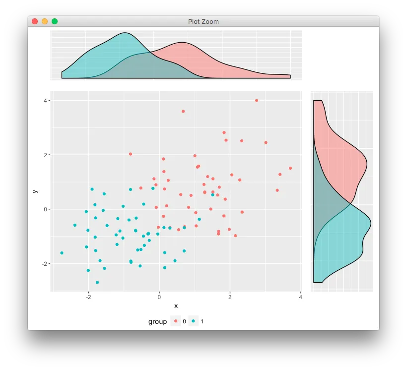
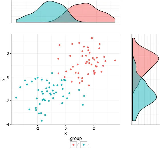
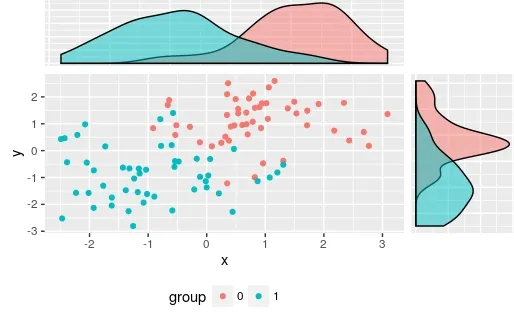
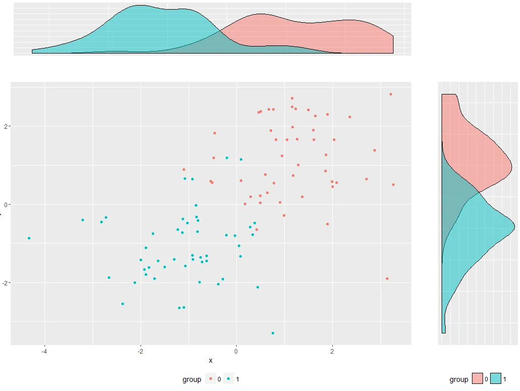
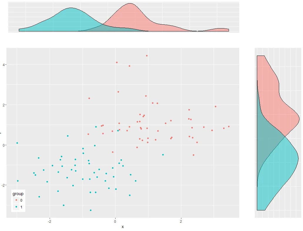
我的目标是制作一个组合图,将散点图和两个密度估计图结合在一起。我面临的问题是,由于密度图缺少轴标签和散点图的图例,密度图与散点图没有正确对齐。可以通过调整plot.margin来解决,但这不是一个理想的解决方案,因为如果对绘图进行更改,就需要一遍又一遍地进行调整。有没有一种方法可以使所有绘图区域完美对齐?

enter image description here

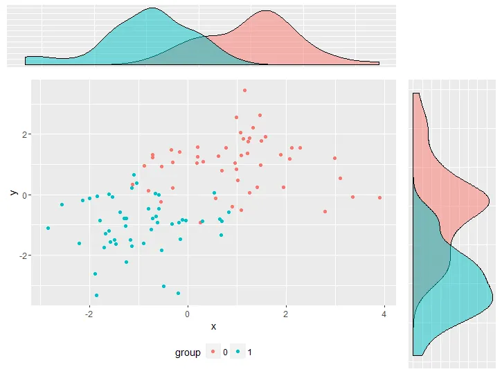
我尽可能保持代码的简洁,但为了重现问题,仍然有相当多的代码。

library(ggplot2)
library(gridExtra)

df <- data.frame(y     = c(rnorm(50, 1, 1), rnorm(50, -1, 1)), 
                 x     = c(rnorm(50, 1, 1), rnorm(50, -1, 1)), 
                 group = factor(c(rep(0, 50), rep(1,50))))


empty <- ggplot() + 
              geom_point(aes(1,1), colour="white") +
              theme(                              
                plot.background = element_blank(), 
                panel.grid.major = element_blank(), 
                panel.grid.minor = element_blank(), 
                panel.border = element_blank(), 
                panel.background = element_blank(),
                axis.title.x = element_blank(),
                axis.title.y = element_blank(),
                axis.text.x = element_blank(),
                axis.text.y = element_blank(),
                axis.ticks = element_blank()
              )


scatter <-  ggplot(df, aes(x = x, y = y, color = group)) + 
                geom_point() +
                theme(legend.position = "bottom")

top_plot <- ggplot(df, aes(x = y)) + 
                geom_density(alpha=.5, mapping = aes(fill = group)) + 
                theme(legend.position = "none") +
                theme(axis.title.y = element_blank(),
                      axis.title.x = element_blank(),
                      axis.text.y=element_blank(),
                      axis.text.x=element_blank(),
                      axis.ticks=element_blank() )

right_plot <- ggplot(df, aes(x = x)) + 
                geom_density(alpha=.5, mapping = aes(fill = group)) + 
                coord_flip() + theme(legend.position = "none") +
                theme(axis.title.y = element_blank(),
                      axis.title.x = element_blank(),
                      axis.text.y  = element_blank(),
                      axis.text.x=element_blank(),
                      axis.ticks=element_blank())

grid.arrange(top_plot, empty, scatter, right_plot, ncol=2, nrow=2, widths=c(4, 1), heights=c(1, 4))

顺便提一下,在使用R进行抽样的示例之前,你应该先使用set.seed()函数,以确保输出结果可复现。 - Chris
@Chris:这里实际数据并不重要,所以我认为这没关系。 - Alex
1
https://dev59.com/xGQm5IYBdhLWcg3wwxHF#17371177 - user20650
@user20650:感谢提供链接。我正在尝试使用它,但是还无法使其正常工作。但我认为这是正确的方法。 - Alex
5个回答

6

另一个选项是,

library(egg) 
ggarrange(top_plot, empty, scatter, right_plot, 
          ncol=2, nrow=2, widths=c(4, 1), heights=c(1, 4))

enter image description here


2

以下是基于R语言的解决方案。它使用了这个问题中提到的line2user函数。

par(mar = c(5, 4, 6, 6))
with(df, plot(y ~ x, bty = "n", type = "n"))
with(df[df$group == 0, ], points(y ~ x, col = "dodgerblue2"))
with(df[df$group == 1, ], points(y ~ x, col = "darkorange"))

x0_den <- with(df[df$group == 0, ], 
               density(x, from = par()$usr[1], to = par()$usr[2]))
x1_den <- with(df[df$group == 1, ], 
               density(x, from = par()$usr[1], to = par()$usr[2]))
y0_den <- with(df[df$group == 0, ], 
               density(y, from = par()$usr[3], to = par()$usr[4]))
y1_den <- with(df[df$group == 1, ], 
               density(y, from = par()$usr[3], to = par()$usr[4]))

x_scale <- max(c(x0_den$y, x1_den$y))
y_scale <- max(c(y0_den$y, y1_den$y))

lines(x = x0_den$x, y = x0_den$y/x_scale*2 + line2user(1, 3), 
      col = "dodgerblue2", xpd = TRUE)
lines(x = x1_den$x, y = x1_den$y/x_scale*2 + line2user(1, 3), 
      col = "darkorange", xpd = TRUE)

lines(y = y0_den$x, x = y0_den$y/x_scale*2 + line2user(1, 4), 
      col = "dodgerblue2", xpd = TRUE)
lines(y = y1_den$x, x = y1_den$y/x_scale*2 + line2user(1, 4), 
      col = "darkorange", xpd = TRUE)

enter image description here


谢谢,但我想坚持使用 ggplot2 - Alex
这里为什么需要ggplot呢? - dayne
我在所有的图表中都使用ggplot,我也很好奇如何使用ggplot完成它。 - Alex

2

这里有一个选项,使用cowplot包中的plot_gridgridExtra包中的grid.arrange组合:

library(ggplot2)
library(gridExtra)
library(grid)
library(cowplot)

df <- data.frame(y     = c(rnorm(50, 1, 1), rnorm(50, -1, 1)), 
                 x     = c(rnorm(50, 1, 1), rnorm(50, -1, 1)), 
                 group = factor(c(rep(0, 50), rep(1,50))))

首先,进行一些设置:一个用于提取图例的函数作为单独的grob,再加上一些可重复使用的绘图组件:
# Function to extract legend
# https://github.com/hadley/ggplot2/wiki/Share-a-legend-between-two-ggplot2-graphs
g_legend<-function(a.gplot) {
  tmp <- ggplot_gtable(ggplot_build(a.gplot))
  leg <- which(sapply(tmp$grobs, function(x) x$name) == "guide-box")
  legend <- tmp$grobs[[leg]]
  return(legend)
  }


# Set up reusable plot components
my_thm = list(theme_bw(),
              theme(legend.position = "none",
                    axis.title.y = element_blank(),
                    axis.title.x = element_blank(),
                    axis.text.y=element_blank(),
                    axis.text.x=element_blank(),
                    axis.ticks=element_blank()))

marg = theme(plot.margin=unit(rep(0,4),"lines"))

创建图表:
## Empty plot
empty <- ggplot() + geom_blank() + marg

## Scatterplot
scatter <-  ggplot(df, aes(x = x, y = y, color = group)) + 
  geom_point() +
  theme_bw() + marg +
  guides(colour=guide_legend(ncol=2))

# Copy legend from scatterplot as a separate grob
leg = g_legend(scatter)

# Remove legend from scatterplot
scatter = scatter + theme(legend.position = "none")

## Top density plot
top_plot <- ggplot(df, aes(x = y)) + 
  geom_density(alpha=.5, mapping = aes(fill = group)) + 
  my_thm + marg

## Right density plot
right_plot <- ggplot(df, aes(x = x)) + 
  geom_density(alpha=.5, mapping = aes(fill = group)) + 
  coord_flip() + my_thm + marg

现在排列三个图以及图例:
# Lay out the three plots
p1 = plot_grid(top_plot, empty, scatter, right_plot, align="hv",
               rel_widths=c(3,1), rel_heights=c(1,3))

# Combine plot layout and legend
grid.arrange(p1, leg, heights=c(10,1))

enter image description here


谢谢!这也是一种不错的解决方案,但在这种情况下我更喜欢使用gtable。 - Alex

1

使用垂直对齐ggplot2图表的答案,通过向gtable添加内容来对齐图表(很可能会使问题过于复杂!!)

library(ggplot2)
library(gtable)
library(grid)

您的数据和图表

set.seed(1)
df <- data.frame(y     = c(rnorm(50, 1, 1), rnorm(50, -1, 1)), 
                 x     = c(rnorm(50, 1, 1), rnorm(50, -1, 1)), 
                 group = factor(c(rep(0, 50), rep(1,50))))

scatter <-  ggplot(df, aes(x = x, y = y, color = group)) + 
                geom_point() +  theme(legend.position = "bottom")

top_plot <- ggplot(df, aes(x = y)) + 
                geom_density(alpha=.5, mapping = aes(fill = group))+
               theme(legend.position = "none") 

right_plot <- ggplot(df, aes(x = x)) + 
                geom_density(alpha=.5, mapping = aes(fill = group)) + 
                coord_flip() + theme(legend.position = "none") 

使用Baptiste答案中的想法
g <- ggplotGrob(scatter)

g <- gtable_add_cols(g, unit(0.2,"npc"))    
g <- gtable_add_grob(g, ggplotGrob(right_plot)$grobs[[4]], t = 2, l=ncol(g), b=3, r=ncol(g))

g <- gtable_add_rows(g, unit(0.2,"npc"), 0)
g <- gtable_add_grob(g, ggplotGrob(top_plot)$grobs[[4]], t = 1, l=4, b=1, r=4)

grid.newpage()
grid.draw(g)

Which produces

enter image description here

我使用了ggplotGrob(right_plot)$grobs[[4]]来手动选择panel grob,但是当然你可以自动化这个过程。
还有其他的选择:使用ggplot2绘制带边际直方图的散点图

我非常喜欢gtable所能实现的功能。不幸的是,我并不理解它的概念。有没有一个好的解释它工作方式的地方?我找不到任何有用的信息。 - Alex
它的文档很差。我只能通过在这个网站上玩弄问题和答案来稍微使用一下(非常少)。Baptiste在他的wiki https://github.com/baptiste/gridextra/wiki/gtable 上写了一点。 - user20650
在这种情况下,它可以成为新的文档功能的一个良好候选者。 - Alex
@Alex;可能值得将勾选标记添加到Baptiste的答案中,因为它更加自动化。 - user20650
1
我同意。另一种解决方案看起来不错。然而,我现在对gtable的解决方案感到非常满意,因为我理解了其中的原理。 - Alex

0

当您将轴设置为element_blank()时,它会移除轴并允许图形填充其余空间。相反,设置为color = "white"(或者您的背景颜色):

# All other code remains the same:

scatter <-  ggplot(df, aes(x = x, y = y, color = group)) + 
  geom_point() +
  theme(legend.position = "bottom")

top_plot <- ggplot(df, aes(x = y)) + 
  geom_density(alpha=.5, mapping = aes(fill = group)) + 
  theme(legend.position = "none")+
  theme(axis.title = element_text(color = "white"),
        axis.text=element_text(color = "white"),
        axis.ticks=element_line(color = "white") )

right_plot <- ggplot(df, aes(x = x)) + 
  geom_density(alpha=.5, mapping = aes(fill = group)) + 
  coord_flip() +
  theme(legend.position = "bottom") +
  theme(axis.title = element_text(color = "white"),
        axis.text  = element_text(color = "white"),
        axis.ticks=element_line(color = "white"))

grid.arrange(top_plot, empty, scatter, right_plot, ncol=2, nrow=2, widths=c(4, 1), heights=c(1, 4))

enter image description here

我还必须在右图中添加一个图例。如果您不想要这个,我建议将散点图中的图例也移动到图内:

scatter <-  ggplot(df, aes(x = x, y = y, color = group)) + 
  geom_point() +
  theme(legend.position = c(0.05,0.1))

top_plot <- ggplot(df, aes(x = y)) + 
  geom_density(alpha=.5, mapping = aes(fill = group)) + 
  theme(legend.position = "none")+
  theme(axis.title = element_text(color = "white"),
        axis.text=element_text(color = "white"),
        axis.ticks=element_line(color = "white") )

right_plot <- ggplot(df, aes(x = x)) + 
  geom_density(alpha=.5, mapping = aes(fill = group)) + 
  coord_flip() +
  theme(legend.position = "none") +
  theme(axis.title = element_text(color = "white"),
        axis.text  = element_text(color = "white"),
        axis.ticks=element_line(color = "white"))

grid.arrange(top_plot, empty, scatter, right_plot, ncol=2, nrow=2, widths=c(4, 1), heights=c(1, 4))

enter image description here


这更接近我想要的,但我希望图例仍在原位,如果散点图在y轴上有标签,则左侧仍无法对齐。 - Alex

网页内容由stack overflow 提供, 点击上面的
可以查看英文原文,
原文链接