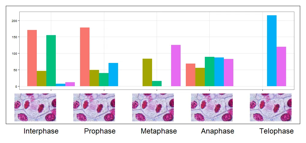
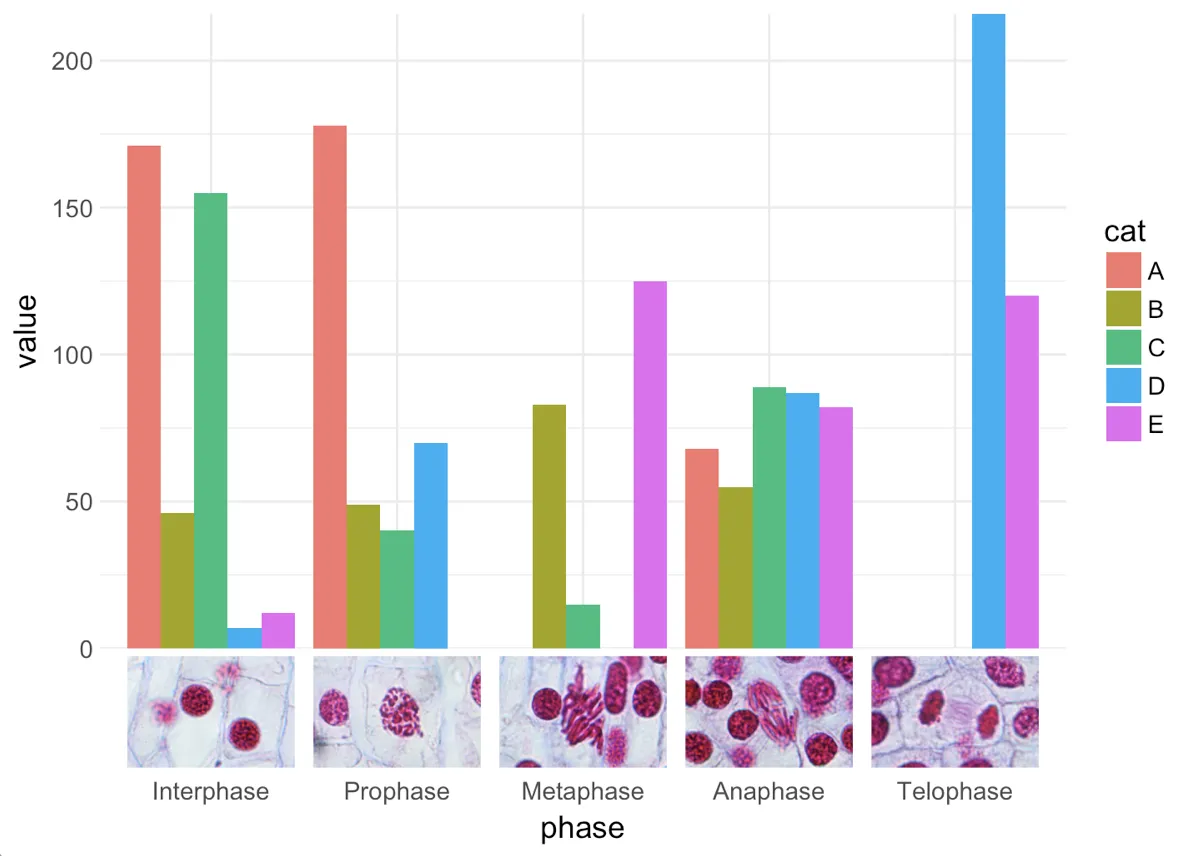
使用 grid 包,并通过操作视口,你可以得到这个结果
library(jpeg)
names.axis <- c("Interphase", "Prophase", "Metaphase", "Anaphase", "Telophase")
images <- lapply(names.axis,function(x){
img <- readJPEG(paste('lily_',x,'.jpg',sep=''), native=TRUE)
img <- rasterGrob(img, interpolate=TRUE)
img
} )
pushViewport(plotViewport(margins = c(1,1,1,1),
layout=grid.layout(nrow=10, ncol=5),xscale =c(1,5)))
pushViewport(plotViewport(layout.pos.col=1:5, layout.pos.row=1:7,
margins = c(1,1,1,1)))
pp <- ggplot() +
geom_bar(data=myd, aes(y = value, x = phase, fill = cat),
stat="identity",position='dodge') +
theme_bw()+theme(legend.position="none", axis.title.y=element_blank(),
axis.title.x=element_blank(),axis.text.x=element_blank())
gg <- ggplotGrob(pp)
grid.draw(gg)
upViewport()
sapply(1:5,function(x){
pushViewport(viewport(layout.pos.col=x, layout.pos.row=8:9,just=c('top')))
pushViewport(plotViewport(margins = c(5.2,3,4,3)))
grid.draw(images[[x]])
upViewport(2)
pushViewport(viewport(layout.pos.col=x, layout.pos.row=10,just=c('top')))
pushViewport(plotViewport(margins = c(1,3,1,1)))
grid.text(names.axis[x],gp = gpar(cex=1.5))
upViewport(2)
})
pushViewport(plotViewport(layout.pos.col=1:5, layout.pos.row=1:9,
margins = c(1,1,1,1)))
grid.rect(gp=gpar(fill=NA))
upViewport(2)
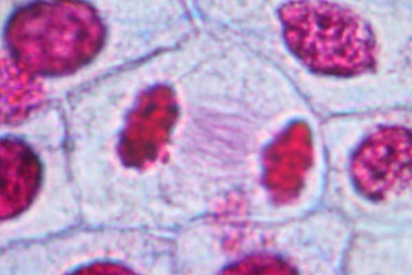
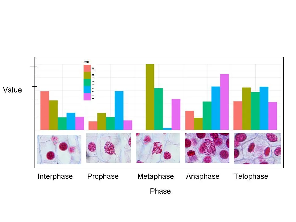 JPEG 图片可以随机生成(用于演示示例),或者使用以下链接中的示例图像:
Interphase prophase , metaphase, anaphase , telophase
编辑:
建议 @bapste
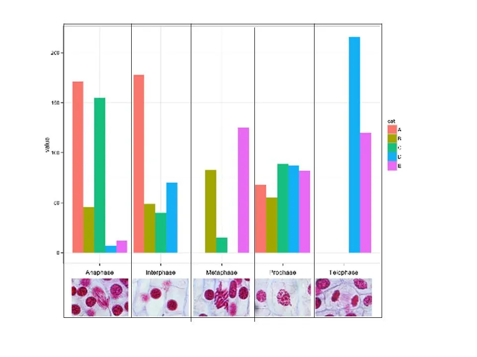
JPEG 图片可以随机生成(用于演示示例),或者使用以下链接中的示例图像:
Interphase prophase , metaphase, anaphase , telophase
编辑:
建议 @bapste

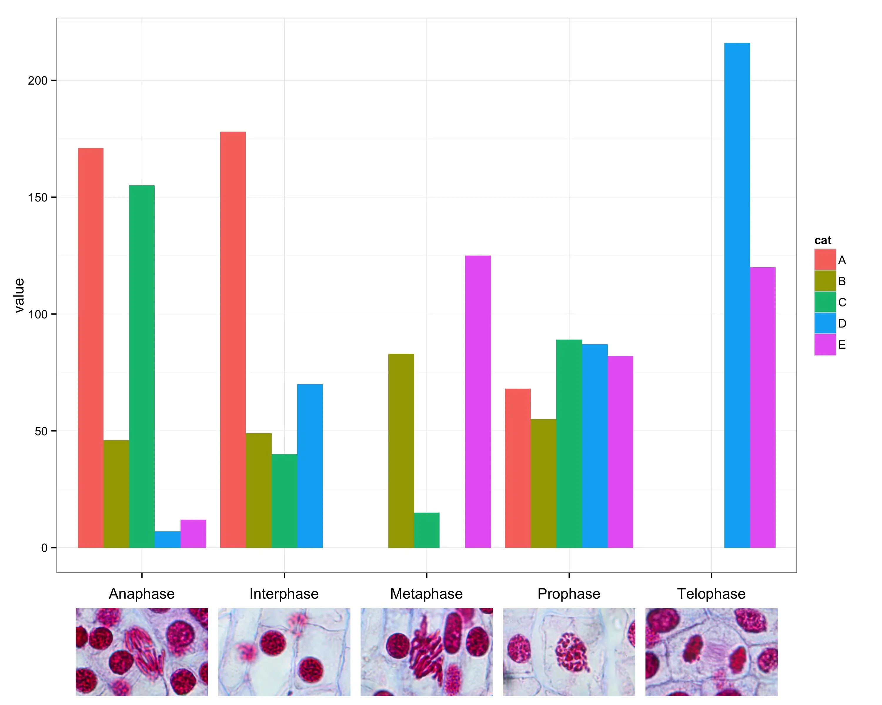
annotation_raster的工作,但不幸的是它似乎无法与离散轴一起使用。 - baptiste