我正在尝试在R中制作类似于Bloomberg终端的图表,我找到了以下适用于Mathematica的文章:
https://mathematica.stackexchange.com/questions/48185/make-plot-look-like-bloomberg-terminal
我的问题是,这可以在R中使用ggplot2完成吗?我正在尝试在R中制作类似于Bloomberg终端的图表,我找到了以下适用于Mathematica的文章:
https://mathematica.stackexchange.com/questions/48185/make-plot-look-like-bloomberg-terminal
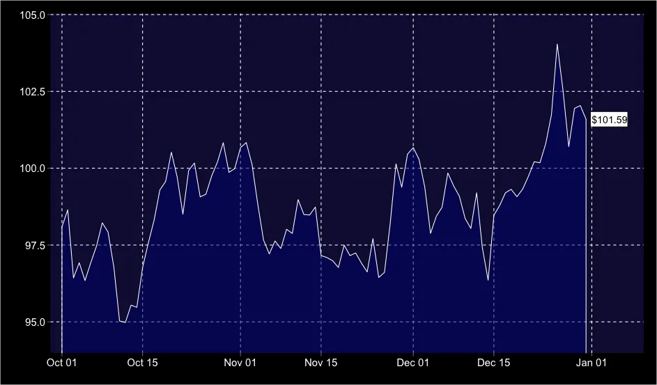
我的问题是,这可以在R中使用ggplot2完成吗?annotate和geom="segment"来获得箭头背景,但看起来这在日期方面不能正常工作)。为了一般使用,还需要一些逻辑来决定右侧边缘的收盘价文本所需的区域大小,而不是硬编码。我还没有包括一个带高、低、平均等的面板,这可以通过annotate添加。library(ggplot2)
set.seed(199)
dat = data.frame(date = seq(as.Date("2013/10/01"), as.Date("2013/12/31"), by="1 day"),
price = cumsum(rnorm(92, 0, 1)) + 100)
ggplot(dat, aes(date, y=price)) +
geom_area(fill="navyblue", colour="white", alpha=0.5) +
theme(plot.background=element_rect(fill="black"),
panel.background=element_rect(fill="#101040"),
panel.grid.minor=element_blank(),
panel.grid.major=element_line(linetype=2),
axis.text=element_text(size=15, colour="white")) +
coord_cartesian(ylim=c(min(dat$price) - 1, max(dat$price) + 1),
xlim=c(min(dat$date)-2, max(dat$date)+10)) +
annotate("rect", xmin=max(dat$date) + 0.75, xmax=max(dat$date) + 7.25,
ymin=dat$price[dat$date==max(dat$date)] - 0.25,
ymax=dat$price[dat$date==max(dat$date)] + 0.25, fill="white", colour="black") +
annotate("text", max(dat$date) + 1, dat$price[dat$date==max(dat$date)],
label=paste0("$", round(dat$price[dat$date==max(dat$date)],2)),
colour="black", hjust=0)
quantmod包中的chartSeries(...)函数就是为此而设计的。它非常接近你所需要的。但如果你想要在价格时间序列下方进行渐变填充,那么我认为这是不可能的。 - jlhoward?theme。考虑将你的工作添加到ggthemes! - hrbrmstr