如何对齐和避免多个单独创建并添加到图表中的图例重叠?

7

我正在尝试创建一个图,将2个单独的图例和多个图的网格组合在一起。我的问题是我发现很难对齐图例,使它们可见且不重叠。希望下面的示例能解释我的意思。

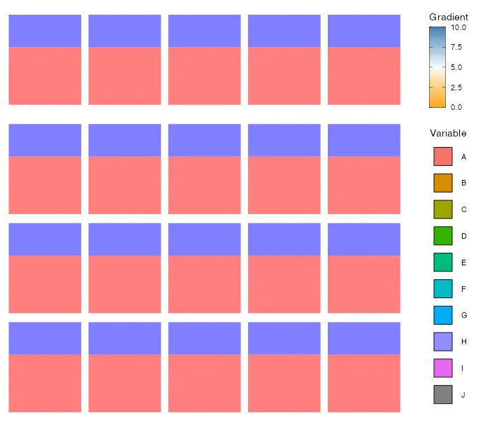
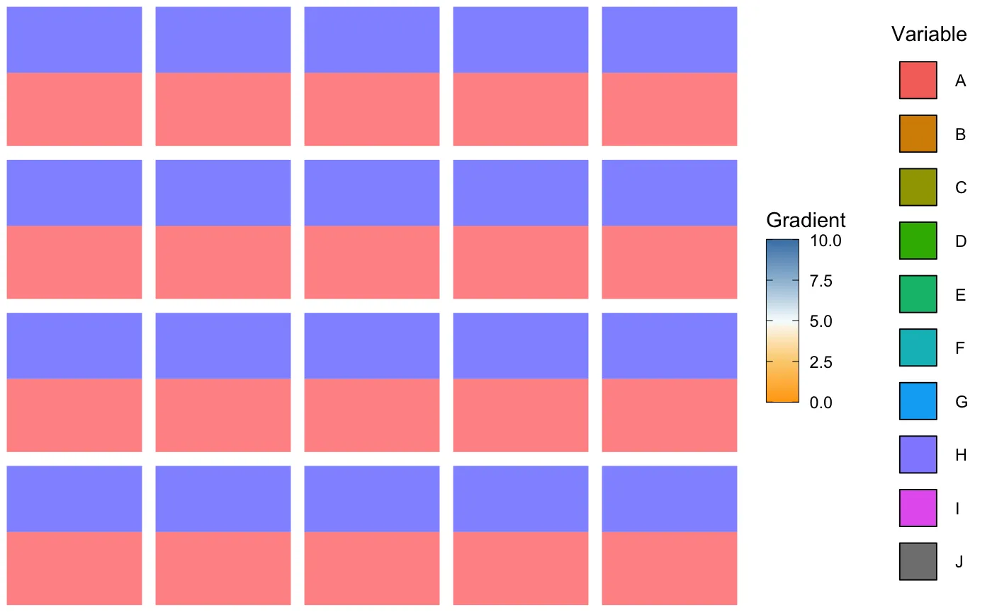
首先,我要创建2个图。在这两个图中,我只关心图例,并且舍弃了实际的图(请忽略这两个图中的实际图)。为了仅获取图例,我使用了cowplot包。

library(ggplot2)
library(cowplot)
# -------------------------------------------------------------------------
# plot 1 ------------------------------------------------------------------

# create fake data
dfLegend_1 <- data.frame(x = LETTERS[1:10], y = c(1:10))
# set colours
pointColours <- c(A = "#F5736A", B = "#D58D00", C = "#A0A300",
                  D = "#36B300", E = "#00BC7B", F = "#00BCC2",
                  G = "#00ADF4", H = "#928DFF", I = "#E568F0",
                  J = "#808080")

# plot
ggLegend_1 <- ggplot(dfLegend_1, aes(x=x, y=y))+
  geom_point(aes(fill = pointColours), shape = 22, size = 10) +
  scale_fill_manual(values = unname(pointColours),
                    label = names(pointColours),
                    name = 'Variable') +
  theme(legend.key.size = unit(0.5, "cm")) +
  theme_void()

# get legend
legend_1 <- get_legend(ggLegend_1)


# -------------------------------------------------------------------------
# plot 2 ------------------------------------------------------------------


# Create fake data
dflegend_2 <- data.frame(
  x = runif(100),
  y = runif(100),
  z2 = abs(rnorm(100))
)

# plot
ggLegend_2 <- ggplot(dflegend_2, aes(x=x, y = y))+
  geom_point(aes(color = z2), shape = 22, size = 10) +
  scale_color_gradientn(
    colours = rev(colorRampPalette(c('steelblue', '#f7fcfd', 'orange'))(5)),
    limits = c(0,10),
    name = 'Gradient',
    guide = guide_colorbar(
      frame.colour = "black",
      ticks.colour = "black"
    ))

# get legend
legend_2 <- get_legend(ggLegend_2)

然后我创建了许多图表(在这个例子中,我创建了20个单独的图表),并将它们绘制在一个网格上:

# create data
dfGrid <- data.frame(x = rnorm(10), y = rnorm(10))

# make a list of plots
plotList <- list()
for(i in 1:20){
  plotList[[i]] <- ggplot(dfGrid) +
    geom_ribbon(aes(x = x, ymin = min(y), ymax = 0), fill = "red", alpha = .5) +
    geom_ribbon(aes(x = x, ymin = min(0), ymax = max(y)), fill = "blue", alpha = .5) +
    theme_void()
}

# plot them on  a grid
gridFinal <- cowplot::plot_grid(plotlist = plotList)

最后,我将这两个传奇人物结合在一起,并将它们添加到许多图形的网格中:
# add legends together into on single plot
legendFinal <- plot_grid(legend_2, legend_1, ncol = 1)

# plot everything on the same plot
plot_grid(gridFinal, legendFinal,  rel_widths = c(3, 1))

这会导致看起来像这样的结果: 例图 
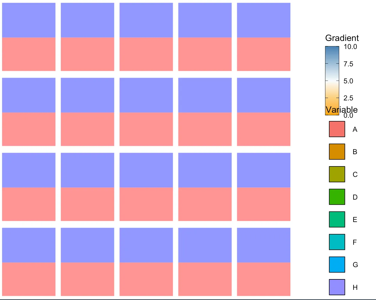
如您所见,图例重叠且间距不太合适。我想知道是否有任何方法可以使所有内容适合,并且具有适当的间距和可读性呢?
我还应该注意,在一般情况下,可以有任意数量的变量和网格化图。
3个回答

5

修复您的问题的一种选择是切换到patchwork,将您的图形和图例粘合在一起。我特别使用design参数来为Variable图例分配更多的空间。但是,您应该知道,与绘图相比,图例要灵活得多,即图例的大小是绝对单位,不会根据可用空间调整。因此,我不确定我的解决方案是否符合您对“一刀切”的期望。

library(patchwork)

design <- 
"
ABCDEU
FGHIJV
KLMNOV
PQRSTV
"

plotList2 <- c(plotList, list(legend_2, legend_1))

wrap_plots(plotList2) +
  plot_layout(design = design)

enter image description here


关于图例大小以绝对单位为基础且不会自动调整以适应可用空间的问题,您提出的观点确实存在。手动调整绘图窗口的大小将导致两个图例在使用cowplotpatchwork时重叠。 - Electrino
是的,当涉及到粘合图形时,我仍会选择拼贴 (patchwork),即使我喜欢使用 cowplot 来操作 ggplot。但是我还没有找到适用于所有情况的方法。个人建议尝试使用具有多列的图例或者放置在底部或顶部的水平图例。或者... - stefan
2
是的,我目前正在使用一个解决方法,它有三列(每个图例在单独的一列中)。它实际上并没有解决问题...如果手动调整绘图窗口大小,重叠仍然存在。但我会继续寻找解决方案。 - Electrino

2

避免这种情况的一种方法是在plot_grid()函数中添加align = "v"参数,下面是结果:

enter image description here


不幸的是,使用align = 'v'对我并不完全有效。它似乎只适用于这个特定的示例。例如,如果变量名比一个字母更长,则图例将剪切到绘制的网格上。 - Electrino
如果是那样的话,我猜测这更多是一个填充问题。 - Yas

2

基于一个大胆的假设,即您图例中的颜色实际上代表了图中显示的某些内容,我建议采用完全不同的方法来解决这个问题。而不是笨拙地创建完全无关的图例,使用ggplot的自动图例创建功能,将正确地将图例映射到您的绘图美学中。我想知道颜色渐变是用来干什么的,但您可以通过使用虚假的geom层(例如geom_point(shape = NA))来创建一个。

这需要您正确地将组(例如A/B/C等)映射到数据中。完成后,您只需调用一次geom_ribbon。

然后我使用patchwork将您的图形组合起来,并且您可以收集指南。这要求所有指南(图例)完全相同。您可以通过在scale_函数中指定限制来确保这一点。

更好的方法是使用facets。这可以通过绑定预定的几个数据框并使用原点作为facet的ID来实现。

带子带看起来有点不同,因为我实际上正在绘制与y<0和y>0相对应的带子。否则,我认为拥有x将是毫无意义的。当然也可以改为填充整个x限制。

library(ggplot2)
library(dplyr)
library(patchwork)

pointColours <- c(
  A = "#F5736A", B = "#D58D00", C = "#A0A300",
  D = "#36B300", E = "#00BC7B", F = "#00BCC2",
  G = "#00ADF4", H = "#928DFF", I = "#E568F0",
  J = "#808080"
)
set.seed(1)
dfGrid <- data.frame(x = rnorm(10), y = rnorm(10))

## assuming that your color mean something, and this something is represented in your legend,
## you need to map the aesthetic to your data. based on this assumption, this example
df_ribbon <-
  dfGrid %>%
  mutate(
    group = ifelse(y <= 0, pointColours["A"], pointColours["H"]),
    ## I find it better to define your ymin and ymax outside of ggplot
    ymin = ifelse(y <= 0, min(y), 0),
    ymax = ifelse(y > 0, max(y), 0)
  )

# ls_p <- rep(
rep(list(ggplot(df_ribbon) +
  ## use fill as an aesthetic
  geom_ribbon(aes(x = x, ymin = ymin, ymax = ymax, fill = I(group)), alpha = .5) +
  ## fake geom_layer
  geom_point(aes(x = min(x), y = min(y), color = y), shape = NA, na.rm = T) +
  scale_color_gradientn(
    colours = rev(colorRampPalette(c("steelblue", "#f7fcfd", "orange"))(5)),
    limits = c(0, 10),
    name = "Gradient",
    guide = guide_colorbar(
      frame.colour = "black",
      ticks.colour = "black"
    )
  ) +
  scale_fill_manual(
    values = unname(pointColours),
    label = names(pointColours),
    ## important to add limits
    limits = pointColours,
    name = "Variable"
  ) +
    theme_void()), 20) %>%
  ## now merge the legends
  patchwork::wrap_plots() +
  plot_layout(guide = "collect")


感谢您的回答。我遇到的问题是,在我在原帖中提供的例子中,我大大简化了我的流程。实际上我并不是在绘制“geom_ribbon”,我只是用它来简化我的示例。我正在使用“ggraph”包绘制决策树。所以我不能使用ggplot的自动图例创建功能。我的原始代码太长了,无法在SO上发布(这就是为什么要进行简化)。我希望能找到一种只涉及位置调整的解决方案。 - Electrino
@Electrino 我认为ggraph应该允许您按照上述想法进行操作。我只是猜测您可能希望图例实际上与您的数据有关系。我仍然认为,最好不要将图例创建与绘图分开。一起构建不仅更容易编码(仅针对此示例比较我的代码和您的代码),而且从您的绘图中分离图例实际上是危险的。您可能会创建显示实际上不在您的数据中的内容的绘图,甚至没有意识到。 - tjebo
如果问题与ggraph有关,最好提供一个示例,以便我们更好地帮助您。您的示例与实际问题越接近,我们就能够提供更好的帮助。您可能会困在只看到问题的一种解决方案的思维过程中,但实际上可能有不同的方法。但是,如果我们不知道实际问题是什么,我们就无法正确地帮助您。这就是所谓的XY问题 - tjebo
@Electrino 我已经修改了问题标题以更好地反映您的实际问题。我仍然会留下我的答案,因为它可能对其他人有用(也许有一天您也会发现它有用 :) - tjebo

网页内容由stack overflow 提供, 点击上面的
可以查看英文原文,
原文链接