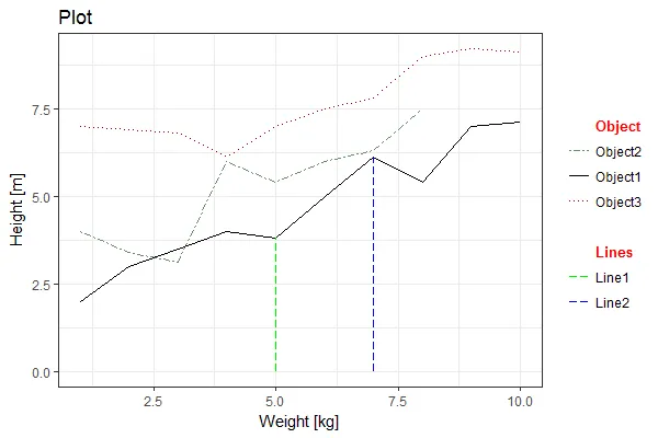
我建议将您的数据合并为一个数据框。这样更整洁,方便传递给ggplot()函数:
df <- rbind(X1, X2, X3)
df$Group <- rep(c("Object1", "Object2", "Object3"), each = 10)
df <- rbind(df,
data.frame(Weight = 5,
Height = c(0, X1["5", 2]),
Group = "Line1"),
data.frame(Weight = 7,
Height = c(0, X1["7", 2]),
Group = "Line2"))
在ggplot中,我们的设计是每个比例尺类型都有一个图例,因此拥有两个线条颜色的图例并不是自然而然的。这篇文章讨论了一些方法。我使用了第二种解决方案:
df$Group <- factor(df$Group, levels = c("Object",
"Object2", "Object1", "Object3",
" ",
"Lines",
"Line1", "Line2"))
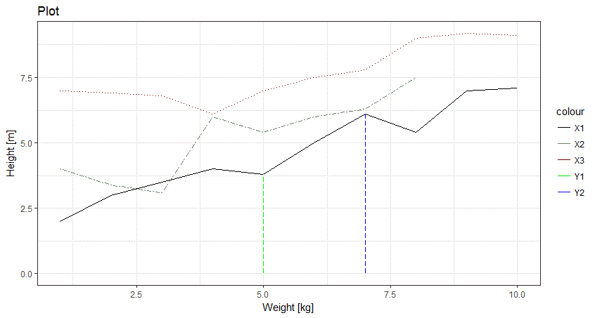
此外,我建议使用ggplot而不是qplot。正如该软件包的文档所指出的那样,qplot被设计为一个方便的包装器,以保持与基本plot函数语法的一致性,但ggplot更擅长处理更复杂的绘图要求:
p <- ggplot(df,
aes(x = Weight, y = Height,
group = Group, linetype = Group, color = Group)) +
geom_line() +
scale_linetype_manual(values = c(
"Object1" = "solid",
"Object2" = "twodash",
"Object3" = "dotted",
"Line1" = "longdash",
"Line2" = "longdash",
"Object" = "solid", "Lines" = "solid", " " = "solid"),
drop = F) +
scale_color_manual(values = c(
"Object1" = "black",
"Object2" = "darkseagreen4",
"Object3" = "darkred",
"Line1" = "green2",
"Line2" = "blue",
"Object" = "white", "Lines" = "white", " " = "white"),
drop = F) +
labs(title = "Plot", x = "Weight [kg]", y = "Height [m]") +
theme_bw() +
theme(legend.title = element_blank())
p
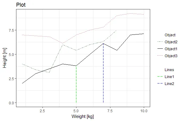
编辑以包括更改单个图例标签:
为了使伪图例标题与其他“正常”标签更加清晰地区分开来,我们可以进一步更改单个图例标签。由于ggplot的图例并非设计用于处理此用例,因此我们可以通过将绘图(ggplot2对象)转换为grob对象(实质上是一组图形对象嵌套列表),并在其中进行修改来进行操作:
# convert original plot (saved as p) into a grob
g <- ggplotGrob(p)
找到与图例标签对应的嵌套grob(有使用代码按关键字搜索的方法,但对于一次性使用情况,我发现浏览列表更容易和清晰...):
> g
TableGrob (10 x 9) "layout": 18 grobs
z cells name grob
1 0 ( 1-10, 1- 9) background rect[plot.background..rect.174]
2 5 ( 5- 5, 3- 3) spacer zeroGrob[NULL]
3 7 ( 6- 6, 3- 3) axis-l absoluteGrob[GRID.absoluteGrob.124]
4 3 ( 7- 7, 3- 3) spacer zeroGrob[NULL]
5 6 ( 5- 5, 4- 4) axis-t zeroGrob[NULL]
6 1 ( 6- 6, 4- 4) panel gTree[panel-1.gTree.104]
7 9 ( 7- 7, 4- 4) axis-b absoluteGrob[GRID.absoluteGrob.117]
8 4 ( 5- 5, 5- 5) spacer zeroGrob[NULL]
9 8 ( 6- 6, 5- 5) axis-r zeroGrob[NULL]
10 2 ( 7- 7, 5- 5) spacer zeroGrob[NULL]
11 10 ( 4- 4, 4- 4) xlab-t zeroGrob[NULL]
12 11 ( 8- 8, 4- 4) xlab-b titleGrob[axis.title.x..titleGrob.107]
13 12 ( 6- 6, 2- 2) ylab-l titleGrob[axis.title.y..titleGrob.110]
14 13 ( 6- 6, 6- 6) ylab-r zeroGrob[NULL]
15 14 ( 6- 6, 8- 8) guide-box gtable[guide-box]
16 15 ( 3- 3, 4- 4) subtitle zeroGrob[plot.subtitle..zeroGrob.171]
17 16 ( 2- 2, 4- 4) title titleGrob[plot.title..titleGrob.170]
18 17 ( 9- 9, 4- 4) caption zeroGrob[plot.caption..zeroGrob.172]
> g$grobs[[15]]
TableGrob (5 x 5) "guide-box": 2 grobs
z cells name grob
99_ff1a4629bd4c693e1303e4eecfb18bd2 1 (3-3,3-3) guides gtable[layout]
0 (2-4,2-4) legend.box.background zeroGrob[NULL]
> g$grobs[[15]]$grobs[[1]]
TableGrob (12 x 6) "layout": 26 grobs
z cells name grob
1 1 ( 1-12, 1- 6) background rect[legend.background..rect.167]
2 2 ( 2- 2, 2- 5) title zeroGrob[guide.title.zeroGrob.125]
3 3 ( 4- 4, 2- 2) key-3-1-bg rect[legend.key..rect.143]
4 4 ( 4- 4, 2- 2) key-3-1-1 segments[GRID.segments.144]
5 5 ( 5- 5, 2- 2) key-4-1-bg rect[legend.key..rect.146]
6 6 ( 5- 5, 2- 2) key-4-1-1 segments[GRID.segments.147]
7 7 ( 6- 6, 2- 2) key-5-1-bg rect[legend.key..rect.149]
8 8 ( 6- 6, 2- 2) key-5-1-1 segments[GRID.segments.150]
9 9 ( 7- 7, 2- 2) key-6-1-bg rect[legend.key..rect.152]
10 10 ( 7- 7, 2- 2) key-6-1-1 segments[GRID.segments.153]
11 11 ( 8- 8, 2- 2) key-7-1-bg rect[legend.key..rect.155]
12 12 ( 8- 8, 2- 2) key-7-1-1 segments[GRID.segments.156]
13 13 ( 9- 9, 2- 2) key-8-1-bg rect[legend.key..rect.158]
14 14 ( 9- 9, 2- 2) key-8-1-1 segments[GRID.segments.159]
15 15 (10-10, 2- 2) key-9-1-bg rect[legend.key..rect.161]
16 16 (10-10, 2- 2) key-9-1-1 segments[GRID.segments.162]
17 17 (11-11, 2- 2) key-10-1-bg rect[legend.key..rect.164]
18 18 (11-11, 2- 2) key-10-1-1 segments[GRID.segments.165]
19 19 ( 4- 4, 4- 4) label-3-3 text[guide.label.text.127]
20 20 ( 5- 5, 4- 4) label-4-3 text[guide.label.text.129]
21 21 ( 6- 6, 4- 4) label-5-3 text[guide.label.text.131]
22 22 ( 7- 7, 4- 4) label-6-3 text[guide.label.text.133]
23 23 ( 8- 8, 4- 4) label-7-3 text[guide.label.text.135]
24 24 ( 9- 9, 4- 4) label-8-3 text[guide.label.text.137]
25 25 (10-10, 4- 4) label-9-3 text[guide.label.text.139]
26 26 (11-11, 4- 4) label-10-3 text[guide.label.text.141]
我们可以找到与“Object”和“Lines”相对应的grobs。它们是:
因此,它们分别是:
g$grobs[[15]]$grobs[[1]]$grobs[[19]]
g$grobs[[15]]$grobs[[1]]$grobs[[24]]
> str(g$grobs[[15]]$grobs[[1]]$grobs[[19]])
List of 11
$ label : chr "Object"
$ x :Class 'unit' atomic [1:1] 0
.. ..- attr(*, "valid.unit")= int 0
.. ..- attr(*, "unit")= chr "npc"
$ y :Class 'unit' atomic [1:1] 0.5
.. ..- attr(*, "valid.unit")= int 0
.. ..- attr(*, "unit")= chr "npc"
$ just : chr "centre"
$ hjust : num 0
$ vjust : num 0.5
$ rot : num 0
$ check.overlap: logi FALSE
$ name : chr "guide.label.text.214"
$ gp :List of 5
..$ fontsize : num 8.8
..$ col : chr "black"
..$ fontfamily: chr ""
..$ lineheight: num 0.9
..$ font : Named int 1
.. ..- attr(*, "names")= chr "plain"
..- attr(*, "class")= chr "gpar"
$ vp : NULL
- attr(*, "class")= chr [1:3] "text" "grob" "gDesc"
我们可以看到格式化是在
.$gp下捕获的(一个图形参数列表,更多信息请参见
这里)。我们可以列出更改列表,并将它们替换为每个标签的原始列表:
gp.new <- list(fontsize = 10,
col = "red",
font = 2L)
for(i in c(19, 24)){
gp <- g$grobs[[15]]$grobs[[1]]$grobs[[i]]$gp
ind1 <- match(names(gp.new), names(gp))
ind2 <- match(names(gp), names(gp.new))
ind2 <- ind2[!is.na(ind2)]
g$grobs[[15]]$grobs[[1]]$grobs[[i]]$gp <- replace(x = gp,
list = ind1,
values = gp.new[ind2])
}
rm(gp, gp.new, ind1, ind2, i)
绘制结果。请注意,要绘制grob,您需要使用grid包中的grid.draw():
grid::grid.draw(g)