.item, .item>*, .rate {
display: flex;
justify-content: center; align-items: center;
}
.rate { flex-direction: column }
.item {
position: relative;
width: 400px;
height: 600px;
background-image: url("https://i.ytimg.com/vi/fqumdSlyLxg/maxresdefault.jpg");
background-repeat: no-repeat;
background-size: cover;
background-color: rgba(0,0,0,0.3);
background-blend-mode: overlay;
margin: 5rem auto;
font-size: 1.5em;
font-weight: bold;
color: rgba(255,255,255,.6);
border-radius: 12px;
}
.item>* {
position: absolute;
width : 100px; height: 100px;
opacity: 0.7;
}
.rate { text-shadow: 0px 0px 7px rgba(255,255,255,.8) }
.circle {
border: 5px solid rgba(255,255,255,.3);
border-radius: 50%;
filter: blur(1px);
}
.item:hover {
background-blend-mode: normal;
color: rgba(255,255,255,1);
}
.item:hover>* {
opacity: 1;
}
.item:hover .circle {
border-color: rgba(255,255,255,.8);
}
.item {
box-shadow: 0px 2px 1px -1px rgba(0,0,0,.20),
0px 1px 1px 0px rgba(0,0,0,.14),
0px 1px 3px 0px rgba(0,0,0,.12);
}
.item:hover {
transform: scale(1.01);
box-shadow: 0px 3px 3px -2px rgba(0,0,0,.20),
0px 3px 4px 0px rgba(0,0,0,.14),
0px 1px 8px 0px rgba(0,0,0,.12);
}
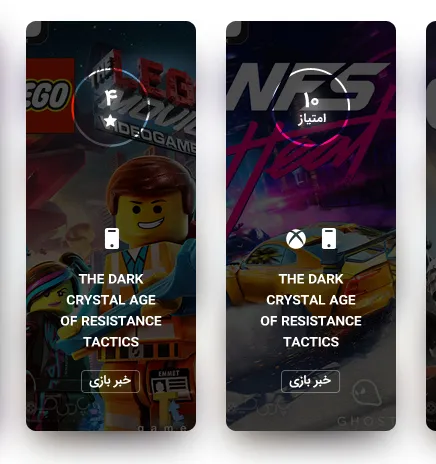
<div class="item">
    <div class="circle"></div>
    <div class="rate">
        <span class="amount">10</span>
        <span>text</span>
    </div>
</div>