背景上物品周围的“透明”边框

4

有一些关于透明边框的问题,但不是我所寻找的。

enter image description here

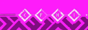
可能很愚蠢,但是:是否有可能以某种方式在背景(黑色纹理)上拥有物品(那些白色正方形),使得每个物品都有一个边框,该边框“删除”10像素(或任何值)的背景?因此,您可以拥有连续的背景,并且位于其顶部的每个项目都会“切出”其中的一部分。

真正的“透明”边框(如其他问题)显然只会让您看到背景,因此这不是我的意思。

如果不行,那么实现这种响应式设计的方法是什么?

抱歉,我不知道其他解释方式。谢谢。

请参见示例/演示:jsfiddle.net/14nn2pLy

   html, body {
    margin: 0;
    padding: 0;
    height: 100%;
    background: #fd1dfa;
}

#main_header {
    position: fixed;
    top: 0px;
    width: 100%;
    height: 200px;
    background: url() no-repeat center top;
    background-size: contain;
}

#main_footer {
    position: fixed;
    bottom: 0px;
    width: 100%;
    height: 200px;
    background: url(https://preview.ibb.co/hACMzS/background_footer.png) no-repeat center bottom;
    background-size: contain;
}

#icons {
    position: fixed;
    bottom: 0px;
    width: 900px;
    height: 75px;
    background: url(https://preview.ibb.co/mkPODn/footer_items.png) no-repeat center bottom;
    border: 10px;
    border-color: rgba( 0, 0, 0, 0);
}
<div id="main_header"></div>

<div id="main_footer">
    <div id="icons"></div>
</div>


有没有任何代码可以展示您的问题和最终失败的尝试?也许有CSS方法,也可能没有,代码、图像和浏览器的选择都很重要;您能否澄清一下问题? - G-Cyrillus
@MichaelSorensen 我明白黑色部分应该混合/渐变到品红色...混合模式可以做到,不是透明度 ;) OP的代码缺失最终有一个真正的线索。 - G-Cyrillus
@MrLister,是的,听起来也不错,只要白色条纹被保留就可以了 ;) - G-Cyrillus
1
我认为你可以通过重复背景并使用SVG遮罩来实现它。我不会写教程,但是我会给你提供一个Codepen示例,在我看来,这个示例直接切入了重点。 - Christian Vincenzo Traina
哦,很好,可能就是这样。谢谢。我会研究一下的。 - sigug
显示剩余2条评论
2个回答

3

我的思考过程

我所能想到的唯一方法是将边框颜色与背景色相同(在您的情况下,是那个粉色的色调),但请注意,这仅在存在实心背景色的情况下才可能。

示例:

.bg {
  position: relative;
  height: 250px;
  width: 500px;
  background-image: url(https://i.imgur.com/nRXO8xa.jpg);
}

.border {
  height: 20px;
  position: absolute;
  top: 0;
  bottom: 0;
  left: 30px;
  margin: auto;
  padding: 10px;
  background: steelblue;
  border: 10px solid black;
}

.no-border {
  height: 20px;
  position: absolute;
  top: 0;
  bottom: 0;
  right: 30px;
  margin: auto;
  padding: 10px;
  background: steelblue;
  border: 10px solid #F7F2D5;
}
<div class="bg">
  <div class="border">black border</div>
  <div class="no-border">"transparent" border</div>
</div>

解决方案:

使用 clip-path 处理背景可以实现所需效果。请注意,我已经更改了 HTML 和 CSS,否则它不会起作用。 clip-path 用于基本上“剪切”您不想要的背景图像部分,使其变为“透明”,并在悬停时激活。

body,
html {
  height: 100%;
  margin: 0;
}

body {
  background: url(https://images.unsplash.com/photo-1473662712020-75289ee3c5de);
  background-size: cover;
}

.container {
  height: 140px;
  width: 618px;
  position: relative;
  top: 40%;
  margin: 0 auto;
}

.bg {
  height: 140px;
  width: 618px;
  position: relative;
}

.icon {
  height: 50px;
  width: 50px;
  position: absolute;
  top: 25.25%;
  left: 38.25%;
  z-index: 1;
}

.icon:hover+.bg {
  clip-path: polygon(0 0, 0 100%, 44% 78.5%, 37.5% 50%, 44% 22%, 50.5% 50%, 44% 78.5%, 0 100%, 100% 100%, 100% 0);
}
<div class="container">

  <div class="icon">
    <img src="https://i.imgur.com/V2eI4Rm.png" alt="icon">
  </div>

  <div class="bg">
    <img src="https://i.imgur.com/D3V3ZYq.png" alt="background">
  </div>

</div>


谢谢,但是是的,应该没有实心背景。所以我认为可能没有办法。但是在不同的设计中,它是如何完成的呢?我经常看到一个项目有一个“边框”来突出显示它与背景的区别。嗯。 - sigug
1
如果要“删除该项周围的背景”,那会是什么样子呢?因为我能想到的只有在图标周围加上一个实色边框,使其看起来像背景已经消失了。如果您说的是图标周围的内容,您可以随时增加边距。您能否给我提供一张背景(图片)和一个您想要看到它工作的图标,这样我就可以试着调整一下? - Jos van Weesel
1
谢谢,这将非常有帮助。我会在明天第一时间处理! - Jos van Weesel
1
不要那么着急!我已经成功地使用剪辑路径创建了这个效果。如果你想要多个这样的图标,所需的工作量非常大,但是它是可以实现的。我已经更新了我的答案,请将其标记为被接受的答案,我花了很多心血来完成它 :) - Jos van Weesel
1
不客气,那是我迄今为止最有趣的挑战,谢谢你! - Jos van Weesel
显示剩余7条评论

0

你可以创建一个带有透明背景的图像,并将其用作边框图像。

.background {
position: relative;
  width: 100%;
  height: 100%;
  padding: 10px;
  background-color: #fd1dfa;
  z-index: 1 !important;
}

.background:after {
  content: "";
  display: table;
  clear: both;
}

hr {
  border: 10px solid white;
  position: relative;
  top: 100px;
  z-index: 5 !important;
}

.center {
  position: relative;
  width: 50px;
  height: 50px;
  background-color: #fd1dfa;
  color: #ffffff;
  padding: 10px;
  z-index: 10 !important;
}

.border {
  position: relative;
  z-index: 8 !important;
  margin: 30px;
  width: 70px;
  height: 70px;
  float: left;
  background: white;
  border: 10px solid transparent;
  border-image: 
  
}
<div class="background">
 <hr>
  <div class="border">
    <div class="center">
      text and words
    </div>
  </div>

  <div class="border">
    <div class="center">
      text and words
    </div>
  </div>

  <div class="border">
    <div class="center">
      text and words
    </div>
  </div>
   
  
</div>


谢谢,但是不行,因为边框上有“background-color” - 这使其不透明。 - sigug
1
@Grimwood,好的。也许可以使用canvas或svg。最新的编辑已经尽可能接近了。 - crffty

网页内容由stack overflow 提供, 点击上面的
可以查看英文原文,
原文链接