按钮渐变边框与透明背景

8
这是我得到的结果: 悬停时渐变边框/渐变背景 
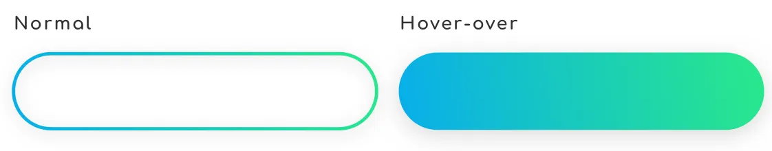
默认按钮具有透明背景的渐变边框(因为我想通过它看到父元素的背景)。当用户悬停在按钮上时,我希望用与边框相同的渐变填充它。
所以我首先尝试了border-image属性和一个svg图像来制作我的边框。
button {
  background: transparent;
  background-repeat: no-repeat;
  border: 3px;
  border-style: solid;
  border-color: transparent;
  border-image-source: url(assets/images/icons/border.svg);
  border-image-repeat: stretch stretch;
  border-image-slice: 49;
  border-image-width: 100px;
  border-image-outset: 6px;
  padding: 16px 28px;
  border-radius: 100px;
}

我已经得到了我期望的结果: Result 现在问题是如何管理悬停动画并填充背景而不改变尺寸!?
也许border-image不是最好的方法?
感谢您的帮助,祝好!

你能分享一下你创建的SVG吗? - Temani Afif
@TemaniAfif 你可以在这里获取它:https://wetransfer.com/downloads/02be51549919378264f1789c3264d9f520180816002553/0f52af - Noé VIRICEL
@TemaniAfif 目前我正在使用 SVG,但也许我们可以用颜色来复制相同的效果...?这是我的正确线性渐变:border-image: linear-gradient(-45deg, #2ae88a 0%, #08aeea 100%); - Noé VIRICEL
是的,我今天会尝试一下,你昨天晚上发布了这个问题 :p - Temani Afif
3个回答

3

解决方案

好的,最终我找到了一个解决办法来实现我的愿望,它几乎全部来源于SVG文件。我微调了一下我的SVG文件,以便获得两个不同的路径:一个具有渐变描边但未填充,另一个具有渐变填充但无描边。一个覆盖在另一个上,并且透明度是关键 :)

<a type="button" href="#">
<svg class="icon" viewBox="0 0 250 100" version="1.1" xmlns="http://www.w3.org/2000/svg" xmlns:xlink="http://www.w3.org/1999/xlink">
  <defs>
      <linearGradient x1="0%" y1="100%" x2="100%" y2="0%" id="linearGradient-1">
          <stop stop-color="#08AEEA" offset="0%"></stop>
          <stop stop-color="#2AE88A" offset="100%"></stop>
      </linearGradient>
  </defs>
  <path fill="none" d='M50,95 a45,45 0 0,1 0,-90 h150 a45,45 0 1,1 0,90 h-150' />
  <path class="icon--plain" fill="url(#linearGradient-1)" d='M50,95 a45,45 0 0,1 0,-90 h150 a45,45 0 1,1 0,90 h-150' />
</svg>
Invest now

以下是CSS代码(顺便说一下,我在使用SCSS):

a[type="button"] {
  position: relative;
  padding: 1rem 1.75rem;
  z-index: 0;

  .icon {
    position: absolute;
    top: 0px;
    left: 0px;
    height: 100%;
    width: 100%;
    z-index: -1;

    path {
      transition: opacity 0.4s ease;

      &:first-of-type {
        fill: transparent;
        stroke: url(#linearGradient-1);
        stroke-width: 3;
        opacity: 1;
      }

      &.icon--plain {
        opacity: 0;
        stroke: none;
        stroke-width: 0;
      }
    }    
  }

  &:hover {
    path {
      &:first-of-type {
        opacity: 0;
      }

      &.icon--plain {
        opacity: 1;
      }
    }
  }
}

1
最好使用纯CSS的解决方案,如果可以的话。你要避免使用SVG所涉及的额外复杂性和浏览器问题。 - Kalnode
1
你在谈论哪些与SVG相关的浏览器问题?说实话,在我看来,这个解决方案并不复杂,"困难"的部分是构思SVG文件,其余只是简单的CSS操作。 - Noé VIRICEL

3
一种方法是依赖于background-attachement:fixed,因为你使用了背景图片,我们可以模拟透明效果,但是你会在背景上看到滚动效果:

.container {
  padding:100px 0;
  background:
    url(https://picsum.photos/800/300?image=1069) fixed;
}
.button {
  width:200px;
  height:50px;
  cursor:pointer;
  color:#fff;
  margin: auto;
  border:3px solid transparent;
  border-radius:50px;
  text-align:center;
  font-size:30px;
  background:
    url(https://picsum.photos/800/300?image=1069) padding-box fixed,
    linear-gradient(-45deg, #2ae88a 0%, #08aeea 100%) border-box;
}
.button:hover {
  background:
    linear-gradient(-45deg, #2ae88a 0%, #08aeea 100%) border-box;
}
<div class="container">
  <div class="button">Some text</div>
</div>


好的,谢谢。这帮助我找到了正确的解决方案,我会更新我的帖子。 - Noé VIRICEL

0

这可以通过CSS渐变实现。请看下面我的解决方案:

.box {
  width: 250px;
  height: 100px;
  background: transparent;
  border: 5px solid transparent;
  -moz-border-image: -moz-linear-gradient(top, #3acfd5 0%, #3a4ed5 100%);
  -webkit-border-image: -webkit-linear-gradient(top, #3acfd5 0%, #3a4ed5 100%);
  border-image: linear-gradient(to bottom, #3acfd5 0%, #3a4ed5 100%);
  border-image-slice: 1;
  color: white;
}

.box:hover {
  background: linear-gradient(to bottom, #3acfd5 0%, #3a4ed5 100%);
}

请注意,在background-image: linear-gradient下,您需要将自己的渐变添加到.btn类中...

在这里尝试我的解决方案: https://codepen.io/lachiekimber/pen/mjYNeN


1
这不是透明的,他使用的是图像作为背景而不是颜色。 - Temani Afif
5
唯一的问题是边框半径(border-radius)。 - Lachie

网页内容由stack overflow 提供, 点击上面的
可以查看英文原文,
原文链接