在广泛搜索后,我不知道如何在CSS中复制此按钮,特别是边框部分。如果可能,我需要将其用于其他元素。
设计的按钮
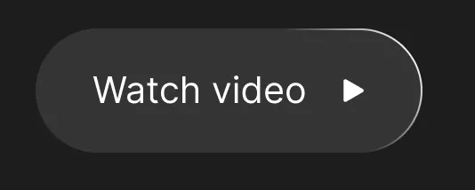
button.rounded-button {
    box-sizing: border-box;
    display: flex;
    flex-direction: row;
    justify-content: center;
    align-items: center;
    padding: 1.125rem 2rem;

    position: absolute;
    width: 13.5919rem;
    height: 4.375rem;

    background: rgba(255, 255, 255, 0.1);
    backdrop-filter: blur(0.7942rem);

    border-radius: 5.8652rem;
    border-image-slice: 1 1 0 0;
    border: 1px solid;
    border-image-source: linear-gradient(257.34deg, #FFFFFF 4.56%, rgba(255, 255, 255, 0) 29.19%);

    font-size: 1.25rem;
    line-height: 2.125rem;
    color: #fff;
}

body {
    background: #393939;
}
<!-- SVG Not included with the example -->
<button type="button" class="rounded-button">
Watch video
<!-- <img src="/assets/img/glyphs/ic-play.svg" alt="Watch video"> -->
</button>理想情况下,我希望有一个可以应用于任何元素的类,以添加所需的效果,并且可以被撤销。我尝试过伪元素,如:after,但没有成功。
我真的不确定这是否可以在纯CSS中实现 ♂️
border-radius与border-image-source结合使用:https://dev59.com/r7voa4cB1Zd3GeqP0EGX - Terry