我有一个UI需求 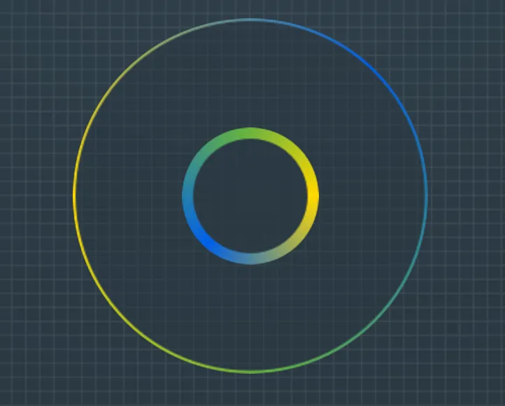
目前,我有一个工作的解决方案,它由一个具有固定高度和宽度以及外部渐变边框背景图像的div和一个伪元素组成,位置为absolute,具有内部边框的背景图像。
.div {
    position: relative;
    width: 254px;
    height: 254px;
    border: 2px solid transparent;
    border-radius: 50%;
    background: url(../img/gradient_border_circle.png) no-repeat 50%;
}
div:before {
    content: "";
    position: absolute;
    top: 50%;
    transform: translate(-50%,-50%);
    left: 50%;
    width: 98px;
    height: 98px;
    border-radius: 50%;
    background: url(../img/gradient_border_circle_inner.png) no-repeat 50%;
}
然而,我正在寻找一种更优雅的解决方案(纯 CSS 或 SVG 渐变?),而不使用背景图像,使渐变可以进行无像素缩放。
我已经做了研究,最接近的解决方案是https://codepen.io/nordstromdesign/pen/QNrBRM和Possible to use border-radius together with a border-image which has a gradient?,但我需要一种中心透明的解决方案以便显示页面的背景。
更新:理想情况下,我正在寻找在所有现代浏览器中具有相对良好支持的解决方案。