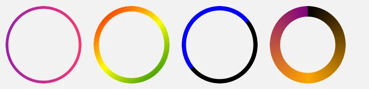
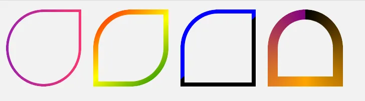
边框渐变与边框半径

42

我有以下的CSS:

a.btn.white-grad {
    background: $lgrey;
    color: #313149 !important;
    border: 1px solid #000;
    border-image-source: linear-gradient(to right, #9c20aa, #fb3570);
    border-image-slice: 20;
    float: left;
    @include font-size(26);
    margin: 75px 0;
}

添加 border-radius: 5px 似乎没有任何效果。我猜想这是因为我正在使用边框渐变... 是否有办法让我实现所需的 5px 边框半径呢?

@TemaniAfif 标题需要反映出所提出的问题,旧标题模糊且不具描述性。这个新标题要好得多,因为它是一个问题,并且清楚地说明了OP所询问的内容/困扰的问题。它还明确表示这不是一个重复的问题,例如https://dev59.com/JHE85IYBdhLWcg3wkkU8。 - TylerH
@TylerH 这个标题也是为了SEO目的而设。旧标题非常好,吸引了所有与渐变和边框半径相关的查询。我还将我的答案设定为一个包含更多内容的规范答案,超出了最初的问题。由于这些原因,这个问题很受欢迎,改变标题可能会影响它,并使其变得不那么受欢迎。 - Temani Afif
@TemaniAfif 这个问题将会保持受欢迎的程度——它是一个经典问题,有很多与之相关联的问题,所以 SEO 不会受到太大的影响。此外,旧标题具有误导性和模糊性——这不是我们想要获得的流量类型,而且,SEO 应该始终次于对问题的准确描述。 - TylerH
@TylerH,旧标题并没有误导人。人们想要创建“带有边框半径的边框渐变”,我分享了所有可能的方法,包括不同的技术,但都没有使用border-image。所以人们不需要知道“为什么border-image不能与border-radius一起使用”,这是一个非常具体的问题,在搜索引擎中也不会得到良好的结果。这个问题吸引了很多流量,我也得到了新的赞同票,这意味着它运作得很好,而这正是我们想要的。我们吸引人们关注的是一个通用解决方案,而不是一个具体的问题。使用border-image并不是正确的做法。 - Temani Afif
3个回答

128
2021年:如果你想要透明度,我建议使用CSS遮罩方法,因为现在的支持相当不错。
你不能在渐变中使用border-radius。这里有另一个想法,你可以依赖多个背景并调整background-clip。

.white-grad {
  background: 
    linear-gradient(#ccc 0 0) padding-box, /*this is your grey background*/
    linear-gradient(to right, #9c20aa, #fb3570) border-box;
  color: #313149;
  padding: 10px;
  border: 5px solid transparent;
  border-radius: 15px;
  display: inline-block;
  margin: 75px 0;
}
<div class="white-grad"> Some text here</div>

<div class="white-grad"> Some long long long text here</div>

<div class="white-grad"> Some long long <br>long text here</div>

CSS border gradient with radius

SVG方法

如果你想要透明度,你可以考虑使用以下的SVG方法:

svg {
  width:200px;
  height:100px;
  margin:10px;
}
<svg xmlns="http://www.w3.org/2000/svg">
<defs>
      <linearGradient id="Gradient" x1="0" x2="100" y1="0" y2="0" gradientUnits="userSpaceOnUse">
         <stop stop-color="#9c20aa" offset="0"/>
         <stop stop-color="#fb3570" offset="1"/>
      </linearGradient>
   </defs>
  <rect x="5" y="5" height="100%" width="100%" style="width:calc(100% - 10px);height:calc(100% - 10px)" rx="20" ry="20" stroke-width="10" fill="transparent" stroke="url(#Gradient)"/>
</svg>

你可以应用作为背景的内容是:

.white-grad {
    background:url('data:image/svg+xml;utf8,<svg   xmlns="http://www.w3.org/2000/svg" ><defs><linearGradient id="Gradient" x1="0" x2="100" y1="0" y2="0" gradientUnits="userSpaceOnUse"><stop stop-color="%239c20aa" offset="0"/><stop stop-color="%23fb3570" offset="1"/></linearGradient></defs><rect x="5" y="5" width="100%" height="100%" style="height:calc(100% - 10px);width:calc(100% - 10px)" rx="20" ry="20" stroke-width="10" fill="transparent" stroke="url(%23Gradient)"/></svg>');
    color: #313149;
    padding:25px;
    border-radius:15px;
    display:inline-block;
    margin: 75px 0;
}

body {
  background:yellow;
}
<div class="white-grad"> Some text here</div>

<div class="white-grad"> text very loooooooooooong here</div>

同样的方式,就像你可以在SVG之外获取渐变一样,也可以使用mask

.white-grad {
  color: #313149;
  padding: 25px;
  border-radius: 15px;
  display: inline-block;
  margin: 75px 0;
  background-size: 0 0;
  position: relative;
  z-index: 0;
}

.white-grad::before {
  content: "";
  position: absolute;
  z-index: -1;
  top: 0;
  left: 0;
  right: 0;
  bottom: 0;
  background-image: inherit;
  background-size: auto;
  --mask: url('data:image/svg+xml;utf8,<svg  xmlns="http://www.w3.org/2000/svg" ><rect x="5" y="5" width="100%" height="100%" style="height:calc(100% - 10px);width:calc(100% - 10px)" rx="20" ry="20" stroke-width="10" fill="transparent" stroke="white"/></svg>');
  -webkit-mask: var(--mask);
          mask: var(--mask);
}

body {
  background: yellow;
}
<div class="white-grad" style="background-image:linear-gradient(to right,blue,red)"> Some text here</div>

<div class="white-grad" style="background-image:linear-gradient(black,lightblue,green)"> text very loooooooooooong here</div>

<div class="white-grad" style="background-image:radial-gradient(blue,pink)"> text very<br> loooooooooooong here</div>

CSS border gradient with SVG mask


你还可以将其作为常见元素使用,并考虑使用position:absolute来将其放置在文本周围。

.white-grad {
  color: #313149;
  padding: 25px;
  border-radius: 15px;
  display: inline-block;
  margin: 75px 0;
  position:relative;
  z-index:0;
}
.white-grad > svg {
  position:absolute;
  top:0;
  left:0;
  height:100%;
  width:100%;
  z-index:-1;
}

body {
  background: yellow;
}

.hide {
 height:0;
 width:0;
}
<svg class="hide" xmlns="http://www.w3.org/2000/svg"><defs><linearGradient id="Gradient" x1="0" x2="100" y1="0" y2="0" gradientUnits="userSpaceOnUse"><stop stop-color="#9c20aa" offset="0"/><stop stop-color="#fb3570" offset="1"/></linearGradient></defs><rect x="5" y="5" width="100%" height="100%" id="border" style="height:calc(100% - 10px);width:calc(100% - 10px)" rx="20" ry="20" stroke-width="10" fill="transparent" stroke="url(#Gradient)"/></svg>


<div class="white-grad"> 
<svg xmlns="http://www.w3.org/2000/svg">
  <use href="#border" />
</svg>
Some text here</div>

<div class="white-grad"> 
<svg xmlns="http://www.w3.org/2000/svg">
  <use href="#border" />
</svg>
text very loooooooooooong here</div>


CSS遮罩方法

这里有一个使用CSS的不同想法,使用mask可以实现透明度,并且还可以响应式:

.white-grad {
  color: #313149;
  padding: 10px;
  display: inline-block;
  margin: 75px 0;
  position: relative;
  z-index: 0;
}
.white-grad:before {
  content: "";
  position: absolute;
  z-index: -1;
  inset: 0;
  padding: 5px;
  border-radius: 15px;
  background: linear-gradient(to right, #9c20aa, #fb3570);
  -webkit-mask: 
     linear-gradient(#fff 0 0) content-box, 
     linear-gradient(#fff 0 0);
          mask: 
     linear-gradient(#fff 0 0) content-box, 
     linear-gradient(#fff 0 0);
  -webkit-mask-composite: xor;
          mask-composite: exclude;

}
<div class="white-grad"> Some text here</div>

<div class="white-grad"> Some long long long text here</div>

<div class="white-grad"> Some long long <br>long text here</div>

CSS border radius with linear gradient

使用CSS变量,我们可以轻松调整以下内容:

.white-grad {
  --b:5px;  /* border width*/
  --r:15px; /* the radius */

  color: #313149;
  padding: calc(var(--b) + 5px);
  display: inline-block;
  margin: 75px 0;
  position:relative;
  z-index:0;
}
.white-grad:before {
  content: "";
  position: absolute;
  z-index: -1;
  inset: 0;
  padding: var(--b);
  border-radius: var(--r);
  background: var(--c,linear-gradient(to right, #9c20aa, #fb3570)); 
  -webkit-mask: 
     linear-gradient(#fff 0 0) content-box, 
     linear-gradient(#fff 0 0);
          mask: 
     linear-gradient(#fff 0 0) content-box, 
     linear-gradient(#fff 0 0);
  -webkit-mask-composite: xor;
          mask-composite: exclude;
}

body {
  background:#f2f2f2;
}
<div class="white-grad"> Some text here</div>

<div class="white-grad" style="--r:20px;--b:10px;--c:linear-gradient(140deg,red,yellow,green)"> Some long long long text here</div>

<div class="white-grad"  style="--r:30px;--b:8px;--c:linear-gradient(-40deg,black 50%,blue 0)"> Some long long <br>long text here</div>

<div class="white-grad"  style="--r:40px;--b:20px;--c:conic-gradient(black,orange,purple)"> Some long long <br>long text here<br> more and more more and more</div>

CSS gradient mask with border radius

相关问题以获得不同的效果:如何在CSS中仅将渐变应用于边框的外部到内部?


上述示例还涵盖了圆形:

.white-grad {
  --b:5px;  /* border width*/

  color: #313149;
  display: inline-block;
  margin: 10px;
  width: 150px;
  aspect-ratio: 1;
  position: relative;
  z-index: 0;
}

.white-grad:before {
  content:"";
  position:absolute;
  z-index:-1;
  inset: 0;
  background: var(--c,linear-gradient(to right, #9c20aa, #fb3570));
  padding: var(--b);
  border-radius: 50%;
  -webkit-mask: 
     linear-gradient(#fff 0 0) content-box, 
     linear-gradient(#fff 0 0);
          mask: 
     linear-gradient(#fff 0 0) content-box, 
     linear-gradient(#fff 0 0);
  -webkit-mask-composite: xor;
          mask-composite: exclude;
}

body {
  background:#f2f2f2;
}
<div class="white-grad"></div>

<div class="white-grad" style="--b:10px;--c:linear-gradient(140deg,red,yellow,green)"></div>

<div class="white-grad"  style="--b:8px;--c:linear-gradient(-40deg,black 50%,blue 0)"></div>

<div class="white-grad"  style="--b:20px;--c:conic-gradient(black,orange,purple)"></div>

CSS circular border with gradient

如果你想给边框应用动画效果,可以参考以下相关问题:具有透明背景和旋转渐变边框的按钮
还有不同半径的形状:

.white-grad {
  --b:5px;  /* border width*/

  color: #313149;
  display: inline-block;
  margin: 10px;
  width: 150px;
  aspect-ratio: 1;
  position: relative;
  z-index: 0;
}

.white-grad:before {
  content: "";
  position: absolute;
  z-index: -1;
  inset: 0;
  background: var(--c,linear-gradient(to right, #9c20aa, #fb3570));
  padding: var(--b);
  border-radius: var(--r,50%);
  -webkit-mask: 
     linear-gradient(#fff 0 0) content-box, 
     linear-gradient(#fff 0 0);
         mask: 
     linear-gradient(#fff 0 0) content-box, 
     linear-gradient(#fff 0 0);
  -webkit-mask-composite: xor;
          mask-composite: exclude;
}

body {
  background:#f2f2f2;
}
<div class="white-grad" style="--r:50% 0 50% 50%;"></div>

<div class="white-grad" style="--b:10px;--r:50% 0;--c:linear-gradient(140deg,red,yellow,green)"></div>

<div class="white-grad"  style="--b:8px;--r:50% 0 0;--c:linear-gradient(-40deg,black 50%,blue 0)"></div>

<div class="white-grad"  style="--b:20px;--r:50% 50% 0 0;--c:conic-gradient(black,orange,purple)"></div>

CSS curved shape with gradient border

不同的边框厚度:

.white-grad {
  --b:5px;  /* border width*/

  color: #313149;
  display: inline-block;
  margin: 10px;
  width: 150px;
  aspect-ratio: 1;
  position: relative;
  z-index: 0;
}
.white-grad:before {
  content: "";
  position: absolute;
  z-index: -1;
  inset: 0;
  background: var(--c,linear-gradient(#9c20aa, #fb3570));
  padding: var(--b);
  border-radius:var(--r,50%);
  -webkit-mask: 
     linear-gradient(#fff 0 0) content-box, 
     linear-gradient(#fff 0 0);
          mask: 
     linear-gradient(#fff 0 0) content-box, 
     linear-gradient(#fff 0 0);
  -webkit-mask-composite: xor;
          mask-composite: exclude;
}

body {
  background:#f2f2f2;
}
<div class="white-grad" style="--b:0 0 20px 20px;--r:50% 0 50% 50%;"></div>

<div class="white-grad" style="--b:10px 0 10px 0;--r:50% 0;--c:linear-gradient(140deg,red,yellow,green)"></div>

<div class="white-grad"  style="--b:8px 0px 0px 8px;--r:50% 0 0;--c:linear-gradient(40deg,black 50%,blue 0)"></div>

<div class="white-grad"  style="--b:20px 20px 0 20px;--r:50% 50% 0 0;--c:conic-gradient(pink,orange,red,pink)"></div>

Linear gradient curved shape


如何在您的解决方案中获取透明背景?谢谢! - Noé VIRICEL
2
@mikespitz_8 第一个方案无法处理透明度,你需要考虑其他透明度解决方案(如SVG或遮罩)。 - Temani Afif
1
这真的很酷,但如果盒子背景和页面背景是不同的颜色,页面背景的正方形角将从边框后面突出。 - Stonecraft
通过将-wekit-mask-composite设置为source-outxor,在Safari上实现了掩码版本的工作。 - Kasper
1
@MrJWolf,掩码内部的颜色并不重要,它需要是一个没有透明度的纯色(您可以使用#000、红色、蓝色、#f00等)。您看到的颜色来自背景定义。 - Temani Afif
显示剩余6条评论

4
2023 - 单一元素,无伪元素,无SVG,无遮罩。
我不能为此而自豪,我在一个网站上看到的(我忘记了网站,也找不到它了)。
  • 它只是一个普通的带有圆角和渐变背景的
  • 它使用了一个insetbox-shadow来填充内部白色
  • 它有一个2像素的边框,实际上是透明的,所以按钮的边缘可以透过来显示

body {
  background: aliceblue;
}

.gradient-border {  
  border-radius: 24px;
  padding: 6px 12px;
  background-image: linear-gradient(90deg, red 0%, blue 100%);
  /* Fill the inside with white */
  background-origin: border-box;
  box-shadow: inset 0 100vw white;
  /* A transparent border, so the very edge of the button shows through */
  border: 2px solid transparent;
}
<button class="gradient-border">Hello</button>


3
这个问题是,与遮罩方法不同,你无法拥有一个(半)透明的背景。如果页面背景的每个像素要么比文本和边框的每个像素更暗,要么更亮,你可以使用混合(blending)方法...这种情况可能发生,但很少见。如果按钮需要具有渐变背景,使用box-shadow填充方法也不是正确的选择。 - undefined
谢谢 @Ana。是的,我同意这些都是合理的批评。在我们的情况下,我不需要透明背景或渐变填充,所以这些限制是可以接受的。 - undefined

-1
您需要将按钮包裹在一个 div 元素中,并对该父元素设置 border-radius 属性。为了使其生效,还需要在该父元素上设置 overflow:hidden 属性。代码如下:

.btn-wrap {
    border-radius: 5px;
    overflow: hidden;
    margin: 20px;
    width: 60px;
}
a.btn.white-grad {
    background: #eee;
    color: #313149 !important;
    border: 20px solid #000;
    border-image-source: linear-gradient(to right, #9c20aa, #fb3570);
    border-image-slice: 20;
    line-height: 2;
}
 <div class="btn-wrap">
  <a href="#" class="btn white-grad">link</a>
 </div>


网页内容由stack overflow 提供, 点击上面的
可以查看英文原文,
原文链接