我正在尝试只使用CSS和HTML创建光效,就像这张图片一样 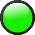
我不知道是否可能,也不知道如何做。
任何帮助都将不胜感激。
.circle {
  border: 10px solid;
  border-radius: 50%;
  width: 200px;
  height: 200px;
  background-color: green;
}<div class="circle"></div>我正在尝试只使用CSS和HTML创建光效,就像这张图片一样
我不知道是否可能,也不知道如何做。
任何帮助都将不胜感激。
.circle {
border: 10px solid;
border-radius: 50%;
width: 200px;
height: 200px;
background-color: green;
}<div class="circle"></div>这是我的例子
*,
*:before,
*:after {
  box-sizing: border-box;
}
div {
  width: 120px;
  height: 120px;
  border-radius: 60px;
  background: linear-gradient(to bottom, #393939 0%, #151515 100%);
  position: relative;
}
div:before {
  content: '';
  width: 106px;
  height: 106px;
  border-radius: 53px;
  background: #19f000;
  border: 1px solid black;
  position: absolute;
  left: 7px;
  top: 7px;
}
div:after {
  content: '';
  width: 80px;
  height: 60px;
  border-radius: 50%;
  background: linear-gradient(to bottom, rgba(255, 255, 255, 1) 0%, rgba(255, 255, 255, 0) 100%);
  position: absolute;
  transform: rotate(-18deg);
  left: 13px;
  top: 9px;
}<div></div>您可以使用第二个 div 进行高亮,以尝试提供更强的三维效果,从而使 box-shadow 可用于边缘的深色勾勒。
.circle {
  width: 164px;
  height: 164px;
  background-color: #19f000;
  border-radius: 100%;
  position: relative;
  border: 10px solid #444444;
  box-shadow: 0 0 15px 0 rgba(0,0,0,.8) inset;
  transform: rotate(-20deg);
}

.highlight {
  position: absolute;
  top: 2px;
  right: 0;
  left: 0;
  margin: auto;
  width: 80%;
  height: 64%;
  opacity: .92;
  border-radius: 100%;

  /* gratuitous gradient compatibility - activate! */
  background: -moz-linear-gradient(top, rgba(255,255,255,1) 0%, rgba(255,255,255,0) 100%); /* FF3.6+ */
  background: -webkit-gradient(linear, left top, left bottom, color-stop(0%,rgba(255,255,255,1)), color-stop(100%,rgba(255,255,255,0))); /* Chrome,Safari4+ */
  background: -webkit-linear-gradient(top, rgba(255,255,255,1) 0%,rgba(255,255,255,0) 100%); /* Chrome10+,Safari5.1+ */
  background: -o-linear-gradient(top, rgba(255,255,255,1) 0%,rgba(255,255,255,0) 100%); /* Opera 11.10+ */
  background: -ms-linear-gradient(top, rgba(255,255,255,1) 0%,rgba(255,255,255,0) 100%); /* IE10+ */
  background: linear-gradient(to bottom, rgba(255,255,255,1) 0%,rgba(255,255,255,0) 100%); /* W3C */
  filter: progid:DXImageTransform.Microsoft.gradient( startColorstr='#ffffff', endColorstr='#00ffffff',GradientType=0 ); /* IE6-9 */
}<div class="circle">
<div class="highlight"></div>
</div>.circle::after {
background: white none repeat scroll 0 0;
border-radius: 50%;
content: " ";
display: block;
height: 100px;
opacity: 0.15;
position: absolute;
width: 150px;
left: 20px;
}
.circle {
background-image: radial-gradient(ellipse at 50px 10px , #ffffff 0%, #fff 5%, #00ff00 100%);
border: 10px solid;
border-radius: 50%;
height: 200px;
position: relative;
width: 200px;
}<div class="circle">
</div>.circle {
border: 10px solid;
border-radius: 50%;
width: 200px;
height: 200px;
background: radial-gradient(ellipse at 90px 45px, rgba(255, 255, 255, 0.75) 10%, rgba(255,255,255,0.5) 30%, rgba(255,255,255,0) 32%, rgba(25,240,0,1) 45%), linear-gradient(160deg, transparent 12%, rgb(25, 240, 0) 30%);
background-size: 125% 80%, 100% 100%;
background-repeat: no-repeat;
}<script src="https://cdnjs.cloudflare.com/ajax/libs/prefixfree/1.0.7/prefixfree.min.js"></script>
<div class="circle"></div>浏览器兼容性图表:
<!doctype html>
<html>
<head>
<style>
.circle {
border:10px solid;
border-radius: 50%;
width: 200px;
height: 200px;
background: rgb(25,240,0); /* Old browsers */
background: -moz-linear-gradient(top, rgba(25,240,0,1) 0%, rgba(255,255,255,1) 100%); /* FF3.6+ */
background: -webkit-gradient(linear, left top, left bottom, color-stop(0%,rgba(25,240,0,1)), color-stop(100%,rgba(255,255,255,1))); /* Chrome,Safari4+ */
background: -webkit-linear-gradient(top, rgba(25,240,0,1) 0%,rgba(255,255,255,1) 100%); /* Chrome10+,Safari5.1+ */
background: -o-linear-gradient(top, rgba(25,240,0,1) 0%,rgba(255,255,255,1) 100%); /* Opera 11.10+ */
background: -ms-linear-gradient(top, rgba(25,240,0,1) 0%,rgba(255,255,255,1) 100%); /* IE10+ */
background: linear-gradient(to top, rgba(25,240,0,1) 0%,rgba(255,255,255,1) 100%); /* W3C */
filter: progid:DXImageTransform.Microsoft.gradient( startColorstr='#19f000', endColorstr='#ffffff',GradientType=0 ); /* IE6-9 */
}
</style>
<head>
<body>
<div class="circle">

</div>
</body>
</html>
尝试像这样使用盒子阴影:更新演示
根据您的需要调整阴影值和背景渐变颜色。
 .circle {
    border:10px solid;
    border-radius: 50%;
    width: 200px;
    height: 200px;
    background: #f8ffe8;
    background: url(data:image/svg+xml;
    base64, PD94bWwgdmVyc2lvbj0iMS4wIiA/Pgo8c3ZnIHhtbG5zPSJodHRwOi8vd3d3LnczLm9yZy8yMDAwL3N2ZyIgd2lkdGg9IjEwMCUiIGhlaWdodD0iMTAwJSIgdmlld0JveD0iMCAwIDEgMSIgcHJlc2VydmVBc3BlY3RSYXRpbz0ibm9uZSI+CiAgPGxpbmVhckdyYWRpZW50IGlkPSJncmFkLXVjZ2ctZ2VuZXJhdGVkIiBncmFkaWVudFVuaXRzPSJ1c2VyU3BhY2VPblVzZSIgeDE9IjAlIiB5MT0iMCUiIHgyPSIwJSIgeTI9IjEwMCUiPgogICAgPHN0b3Agb2Zmc2V0PSIwJSIgc3RvcC1jb2xvcj0iI2Y4ZmZlOCIgc3RvcC1vcGFjaXR5PSIxIi8+CiAgICA8c3RvcCBvZmZzZXQ9IjE3JSIgc3RvcC1jb2xvcj0iIzU2YmM2YyIgc3RvcC1vcGFjaXR5PSIxIi8+CiAgICA8c3RvcCBvZmZzZXQ9IjEwMCUiIHN0b3AtY29sb3I9IiMxOTliMDAiIHN0b3Atb3BhY2l0eT0iMSIvPgogIDwvbGluZWFyR3JhZGllbnQ+CiAgPHJlY3QgeD0iMCIgeT0iMCIgd2lkdGg9IjEiIGhlaWdodD0iMSIgZmlsbD0idXJsKCNncmFkLXVjZ2ctZ2VuZXJhdGVkKSIgLz4KPC9zdmc+);
    background: -moz-linear-gradient(top, #f8ffe8 0%, #56bc6c 17%, #199b00 100%);
    background: -webkit-gradient(linear, left top, left bottom, color-stop(0%, #f8ffe8), color-stop(17%, #56bc6c), color-stop(100%, #199b00));
    background: -webkit-linear-gradient(top, #f8ffe8 0%, #56bc6c 17%, #199b00 100%);
    background: -o-linear-gradient(top, #f8ffe8 0%, #56bc6c 17%, #199b00 100%);
    background: -ms-linear-gradient(top, #f8ffe8 0%, #56bc6c 17%, #199b00 100%);
    background: linear-gradient(to bottom, #f8ffe8 0%, #56bc6c 17%, #199b00 100%);
    filter: progid:DXImageTransform.Microsoft.gradient(startColorstr='#f8ffe8', endColorstr='#199b00', GradientType=0);
    -webkit-box-shadow: inset -1px 60px 68px -28px rgba(255, 255, 255, 1);
    -moz-box-shadow: inset -1px 60px 68px -28px rgba(255, 255, 255, 1);
    box-shadow: inset -1px 60px 68px -28px rgba(255, 255, 255, 1);
}