Seaborn和Pandas都使用Matplotlib进行绘图。让我们看看谁返回bin值,我们需要调整x轴刻度:
import numpy as np
import pandas as pd
import seaborn as sns
from matplotlib import pyplot as plt
fig, (ax1, ax2, ax3) = plt.subplots(1, 3, figsize=(15, 5))
np.random.seed(1234)
n=20
start = pd.to_datetime("2020-11-15")
df = pd.DataFrame({"Time": pd.to_timedelta(np.random.rand(n), unit="D") + start, "A": np.random.randint(1, 100, n)})
pd_g = df["Time"].hist(bins=5, xrot=90, ax=ax1)
print(pd_g)
ax1.set_title("Pandas")
sns_g = sns.histplot(df["Time"], bins=5, ax=ax2)
ax2.tick_params(axis="x", labelrotation=90)
print(sns_g)
ax2.set_title("Seaborn")
mpl_g = ax3.hist(df["Time"], bins=5, edgecolor="white")
ax3.tick_params(axis="x", labelrotation=90)
print(mpl_g)
ax3.set_title("Matplotlib")
plt.tight_layout()
plt.show()
示例输出:
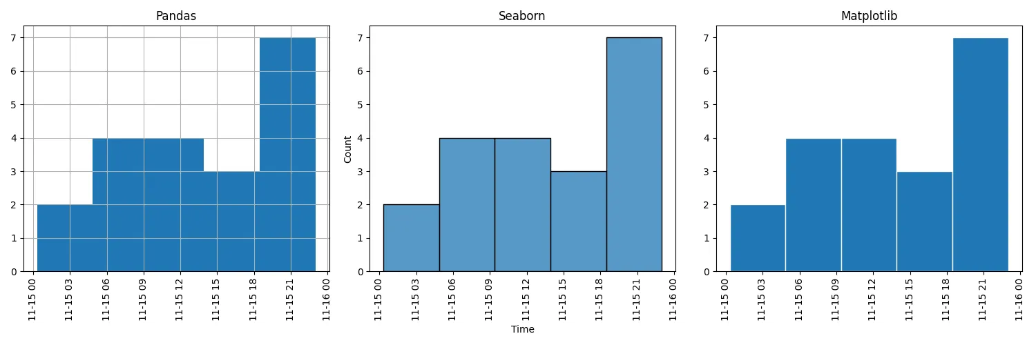
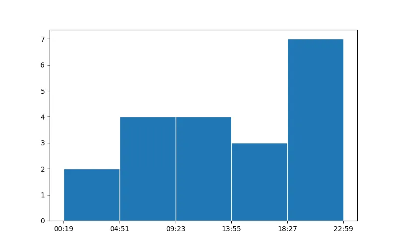
从这个练习中可以得出结论,所有三个引用指向相同的例程。因此,我们可以直接使用matplotlib提供的bin值:
import numpy as np
import pandas as pd
from matplotlib import pyplot as plt
from matplotlib.dates import num2date
fig, ax = plt.subplots(figsize=(8, 5))
np.random.seed(1234)
n=20
start = pd.to_datetime("2020-11-15")
df = pd.DataFrame({"Time": pd.to_timedelta(np.random.rand(n), unit="D") + start, "A": np.random.randint(1, 100, n)})
h_vals, h_bins, h_bars = ax.hist(df["Time"], bins=5, edgecolor="white")
ax.set_xticks(h_bins)
ax.set_xticklabels([num2date(curr_bin).strftime("%H:%M") for curr_bin in h_bins])
plt.show()
示例输出:
Seaborn和pandas会使生活更加轻松,因为它们提供了方便的包装器和一些额外的功能,用于常用的绘图函数。然而,如果它们提供的参数不足够,人们通常必须回归到matplotlib,后者在可执行的操作上更加灵活。当然,在pandas或seaborn中可能有更简单的方法,但我不知道。如果这些库有任何更好的建议,我很乐意点赞。