在seaborn的distplot中增加柱之间的空隙

10

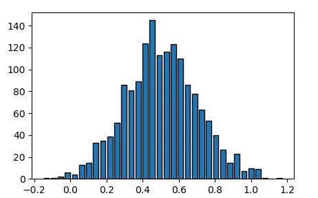
我有一个可能很简单的问题。我使用seaborn从Excel文件中的数据创建了一张柱状图。为了更好的可视化,我想在条形或箱子之间留些空间。这是可能的吗?

我的代码如下:

import pandas as pd
import matplotlib as mpl
import matplotlib.pyplot as plt
import numpy as np
import seaborn as sns

%matplotlib inline
from IPython.display import set_matplotlib_formats
set_matplotlib_formats('svg', 'pdf')


df = pd.read_excel('test.xlsx')
sns.set_style("white")
#sns.set_style("dark")
plt.figure(figsize=(12,10))
plt.xlabel('a', fontsize=18)
plt.ylabel('test2', fontsize=18)

plt.title ('tests ^2', fontsize=22)


ax = sns.distplot(st,bins=34, kde=False, hist_kws={'range':(0,1), 'edgecolor':'black', 'alpha':1.0}, axlabel='test1')

虽然有点离题,但我的第二个问题是,如何让图表标题中的指数实际上被抬起来?

谢谢!


@jojo:感谢提供链接。我希望能够得到更简单明了的方法。否则,我必须将图形导出为SVG格式,并使用Inkscape进行修正等操作。 - Jul
好的,这是一个愚蠢的问题,但我仍然需要一个LaTeX分发才能使它工作? - Jul
3个回答

16

Matplotlib的 hist 函数有一个参数 rwidth

rwidth : 标量或None,可选
条形图的宽度相对于条形宽度的比例。

你可以通过 distplothist_kws 参数使用它。

import matplotlib.pyplot as plt
import numpy as np
import seaborn as sns

x = np.random.normal(0.5,0.2,1600)

ax = sns.distplot(x,bins=34, kde=False, 
                  hist_kws={"rwidth":0.75,'edgecolor':'black', 'alpha':1.0})

plt.show()

hist_kws


1
很不幸,它不再与 seaborn >= 0.11 兼容。distplot() 已经变成了 displot() 或者 histplot(),但是两者都没有传递 rwidth 参数。 - MERose
1
2022年:sns.distplot()函数中可以使用hist_kws参数,但在sns.histplot()函数中不可用。 - PatrickT

9
对于Seaborn版本大于等于0.11,请使用shrink参数。这个参数将按比例缩放每个条形图的宽度,相对于每个条形图的binwidth。其余部分将为空白空间。
文档:https://seaborn.pydata.org/generated/seaborn.histplot.html 编辑: OP最初询问sns.distplot(),然而,在当前版本的>=0.11中,它已经被sns.histplotsns.displot()所取代。由于OP正在生成直方图,因此在hist模式下,histplotdisplot都将使用shrink参数。

OP 正在询问 sns.displot(),而 sns.histplot() 接受不同的参数。 - PatrickT
1
@PatrickT 谢谢您的注意,我已经改进了答案。 - miro
给我点赞。 :-) - PatrickT

0
在发布了我的答案后,我意识到我回答的是与被问的相反的问题。我在尝试弄清楚如何去除条形图之间的空格时发现了这个问题。我差点删除了我的答案,但是以防其他人偶然遇到这个问题并且正在尝试在seaborn的histplot中去除条形图之间的空格,我现在将其保留。

感谢@miro提供的Seaborn的更新文档,我发现element='step'对我有用。根据您想要的确切内容,element='poly'可能是您想要的。

我的实现方式是使用'step':

fig,axs = plt.subplots(4,2,figsize=(10,10))
i,j = 0,0
for col in cols:
    sns.histplot(df[col],ax=axs[i,j],bins=100,element='step')
    axs[i,j].set(title="",ylabel='Frequency',xlabel=labels[col])
    i+=1
    if i == 4: 
        i = 0
        j+=1

enter image description here

我的实现方式使用了“poly”:

fig,axs = plt.subplots(4,2,figsize=(10,10))
i,j = 0,0
for col in cols:
    sns.histplot(df[col],ax=axs[i,j],bins=100,element='poly')
    axs[i,j].set(title="",ylabel='Frequency',xlabel=labels[col])
    i+=1
    if i == 4: 
        i = 0
        j+=1

enter image description here


1
OP正在询问sns.distplot()而不是sns.histplot()。事实证明,它们是非常不同的。 - PatrickT

网页内容由stack overflow 提供, 点击上面的
可以查看英文原文,
原文链接