Plotly - 在子图中使用形状定位

5
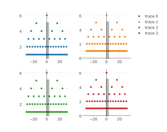
我想绘制带有形状的多个子图。从下面的代码中,如果我显示一个图,我会得到以下图表:Correct display of one plot 
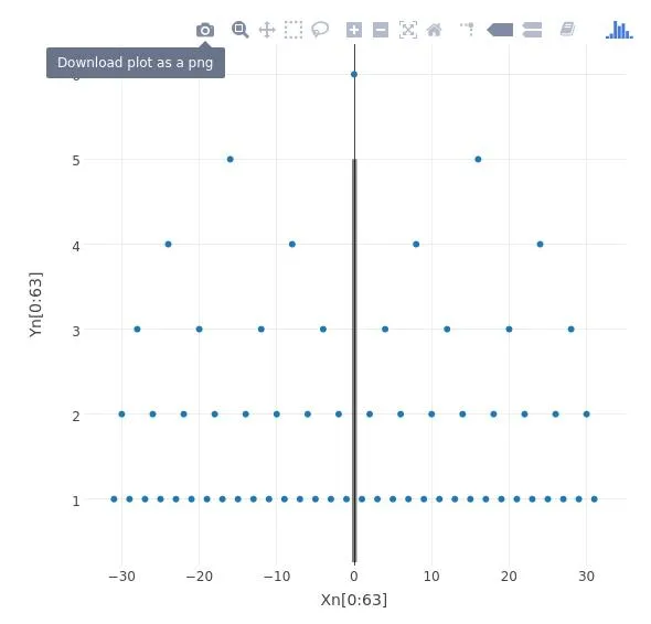
当我在一个子图中放置4个这样的图时,我得到以下结果:Incorrect display of 4 subplots. All shapes are drawn in same location 
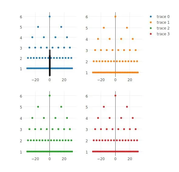
正如您所看到的,应该在每个子图上绘制的4条线都在左上角的原始位置上绘制了。有什么想法可以解决这个问题吗?
**编辑-使用“paper”
如果我在边缘形状的声明中使用“paper”作为xref和yref,则形状不会正确缩放。也许我在这里使用“paper”的上下文有误?我已经附上了下面的图片result of using xyref="paper"

library(plotly)
library(igraph)

tree <- make_tree(127,2)
tree_layout <- layout_as_tree(tree)
tree_layout_df <- as.data.frame(tree_layout)
Xn <- tree_layout_df[,1]
Yn <- tree_layout_df[,2]

edge_shapes  = list(
    type="line",
    line=list(color="#030303",width=5),
    opacity=0.3,
    x0 = 0, x1=0,
    x1 = 5,y1 = 5
)

reg_tree_plot <- plot_ly() %>%
    add_trace(x=~Xn[0:63], y=~Yn[0:63], type='scatter', width=700, height=500)

tree_layout <- layout(reg_tree_plot, shapes=edge_shapes)
x <- tree_layout
y <- tree_layout
z <- tree_layout

sub <- subplot(tree_layout,y,z,x,
              nrows=2,
              margin=0.05,
              shareX=FALSE,
              shareY=FALSE)


你需要计算适当的纸张坐标。它们从左到右,从上到下为0-1。我认为这不是一个实际的解决方案。 - Mike Wise
请查看我们在 Github 上关于您的问题的讨论。我相信 Carson 是 plotly 的主要作者之一。https://github.com/ropensci/plotly/issues/1019 - 欢迎您加入并提出自己的想法和评论。 - Mike Wise
2个回答

4
我认为这很明显是plotly中subplot的一个bug,可以进行补偿,但它很丑并需要维护。如果您将其发布到plotly网站并查看布局中的数据,则可以看到这一点。请注意,适当的坐标系似乎是:
  • "x1","y1" - 第一个图 - 左上角
  • "x2","y2" - 第二个图 - 右上角
  • "x3","y3" - 第三个图 - 左下角
  • "x4","y4" - 第四个图 - 留给读者作为练习

这里有几个问题:

  • 形状被添加到布局中而没有正确的坐标引用。
  • 第二个和第四个图的y坐标系与第一个和第三个图中的不同,并且可能与下一个问题有关。
  • 第一个和第三个图的x轴没有被绘制,可能是由于坐标系也没有被设置正确,但是这些结构看起来很混乱,所以我没有仔细看。
  • 我认为您的代码中有一个错别字,在创建edge_shape时两次指定了x0

无论如何,这里有一些可以实现您想要的功能的代码(但存在轴错误)。

library(plotly)
library(igraph)

tree <- make_tree(127,2)
tree_layout <- layout_as_tree(tree)
tree_layout_df <- as.data.frame(tree_layout)
Xn <- tree_layout_df[,1]
Yn <- tree_layout_df[,2]

get_edgeshape <- function(xref,yref,xfak=1,yfak=1){
  edge_shapes  = list(
    type="rect",
    line=list(color="#030303",width=5),
    opacity=0.3,
    x0 = 0*xfak, x1 = 5*xfak,
    y0 = 0*yfak, y1 = 5*yfak,
    xref=xref,
    yref=yref
  )
}
reg_tree_plot <- plot_ly() %>%
  add_trace(x=~Xn[0:63], y=~Yn[0:63], type='scatter', width=700, height=500)

ycor1 <- 2
ycor2 <- 2*1.125
tree_layout <- layout(reg_tree_plot, shapes=get_edgeshape("x1","y1",yfak=ycor1))
x <-           layout(reg_tree_plot, shapes=get_edgeshape("x2","y2",yfak=ycor2))
y <-           layout(reg_tree_plot, shapes=get_edgeshape("x3","y3",yfak=ycor1))
z <-           layout(reg_tree_plot, shapes=get_edgeshape("x4","y4",yfak=ycor2))

sub <- subplot(tree_layout,y,z,x,
               nrows=2,
               margin=0.05,
               shareX=F,
               shareY=F)
sub

这里是结果:

以下是结果:

enter image description here

请注意,这不是一个很好的解决方案,如果您更改布局中的任何内容,您将需要微调参数。只有 plotly 修复才能真正解决问题。所以我在 GitHub 网站上将其作为一个问题进行了提交。

我正在使用来自 GitHub 的最新 plotly(4.7.0),使用 devtools::install_github("ropensci/plotly") 安装,并且这是我的 sessionInfo()

R version 3.4.0 (2017-04-21)
Platform: x86_64-w64-mingw32/x64 (64-bit)
Running under: Windows >= 8 x64 (build 9200)

Matrix products: default

locale:
[1] LC_COLLATE=English_United States.1252  LC_CTYPE=English_United States.1252    LC_MONETARY=English_United States.1252
[4] LC_NUMERIC=C                           LC_TIME=English_United States.1252    

attached base packages:
[1] stats     graphics  grDevices utils     datasets  methods   base     

other attached packages:
[1] igraph_1.0.1  plotly_4.7.0  ggplot2_2.2.1

loaded via a namespace (and not attached):
 [1] Rcpp_0.12.10      magrittr_1.5      devtools_1.12.0   munsell_0.4.3     xtable_1.8-2      viridisLite_0.2.0 colorspace_1.3-2 
 [8] R6_2.2.0          rlang_0.1.1       httr_1.2.1        plyr_1.8.4        dplyr_0.5.0       tools_3.4.0       grid_3.4.0       
[15] gtable_0.2.0      DBI_0.6-1         git2r_0.18.0      withr_1.0.2       crosstalk_1.0.0   htmltools_0.3.6   yaml_2.1.14      
[22] lazyeval_0.2.0    digest_0.6.12     assertthat_0.2.0  tibble_1.3.1      shiny_1.0.3       tidyr_0.6.3       purrr_0.2.2.2    
[29] htmlwidgets_0.8   curl_2.5          mime_0.5          memoise_1.1.0     compiler_3.4.0    scales_0.4.1      jsonlite_1.4     
[36] httpuv_1.3.3     

2

目前至少在使用subplot()时,形状和注释只能在纸张坐标系下重新缩放/重新定位,例如:

rect <- list(
  type = "rect",
  xref = "paper", yref = "paper",
  x0 = 0.5, x1 = 0.6, 
  y0 = 0.5, y1 = 0.6
)
p1 <- layout(plot_ly(), shapes = rect)
subplot(p1, p1)

您可以在此跟踪非纸质坐标的进展情况--https://github.com/ropensci/plotly/issues/1019


这可以被视为权威答案。 - Mike Wise
嗨,卡森,感谢您的回复。我已经更新了我的帖子,以说明当我将此应用于我的示例时会发生什么。 - Daniel Cole

网页内容由stack overflow 提供, 点击上面的
可以查看英文原文,
原文链接