在Plotly子图中合并图例

3

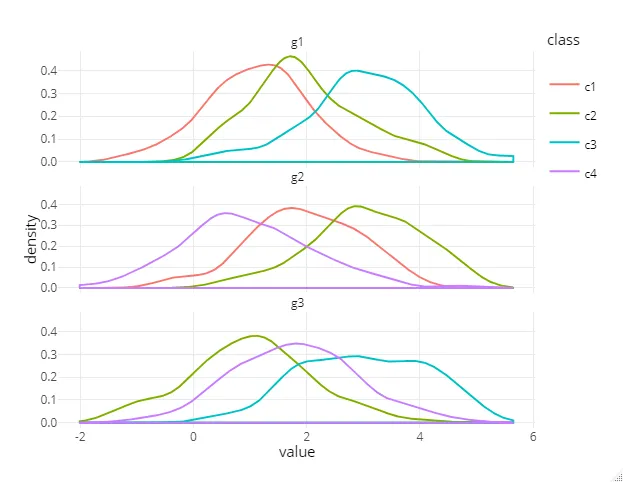
我有几个组,每个组都有几个类别,我对每个类别进行了连续值的测量:

set.seed(1)

df <- data.frame(value = c(rnorm(100,1,1), rnorm(100,2,1), rnorm(100,3,1),
                           rnorm(100,3,1), rnorm(100,1,1), rnorm(100,2,1),
                           rnorm(100,2,1), rnorm(100,3,1), rnorm(100,1,1)),
                 class = c(rep("c1",100), rep("c2",100), rep("c3",100),
                           rep("c2",100), rep("c4",100), rep("c1",100),
                           rep("c4",100), rep("c3",100), rep("c2",100)),
                 group = c(rep("g1",300), rep("g2",300), rep("g3",300)))

df$class <- factor(df$class, levels =c("c1","c2","c3","c4"))
df$group <- factor(df$group, levels =c("g1","g2","g3"))

数据中的每个组并不具有相同的类,或者说每个组都有所有类的子集。

我正在尝试生成针对每个组的 R plotly 密度曲线,按类别进行彩色编码,然后使用 plotlysubplot 函数将它们组合到一个单独的图中。

这就是我正在做的事情:

library(dplyr)
library(ggplot2)
library(plotly)


set.seed(1)

df <- data.frame(value = c(rnorm(100,1,1), rnorm(100,2,1), rnorm(100,3,1),
                           rnorm(100,3,1), rnorm(100,1,1), rnorm(100,2,1),
                           rnorm(100,2,1), rnorm(100,3,1), rnorm(100,1,1)),
                 class = c(rep("c1",100), rep("c2",100), rep("c3",100),
                           rep("c2",100), rep("c4",100), rep("c1",100),
                           rep("c4",100), rep("c3",100), rep("c2",100)),
                 group = c(rep("g1",300), rep("g2",300), rep("g3",300)))

df$class <- factor(df$class, levels =c("c1","c2","c3","c4"))
df$group <- factor(df$group, levels =c("g1","g2","g3"))

plot.list <- lapply(c("g1","g2","g3"), function(g){
  density.df <- do.call(rbind,lapply(unique(dplyr::filter(df, group == g)$class),function(l)
    ggplot_build(ggplot(dplyr::filter(df, group == g & class == l),aes(x=value))+geom_density(adjust=1,colour="#A9A9A9"))$data[[1]] %>%
      dplyr::select(x,y) %>% dplyr::mutate(class = l)))
  plot_ly(x = density.df$x, y = density.df$y, type = 'scatter', mode = 'lines',color = density.df$class) %>%
    layout(title=g,xaxis = list(zeroline = F), yaxis = list(zeroline = F))
})
subplot(plot.list,nrows=length(plot.list),shareX=T)

这里给出:

enter image description here

我想要解决的问题是:

  1. 只在图例中出现一次(现在对于每个组都会重复出现),合并所有类别
  2. 使标题在每个子图中出现,而不仅仅是像现在这样只在最后一个图中出现。(我知道可以将组名作为x轴标题,但我宁愿节省空间,因为实际上我有多于3个组)

这里是关于plotly.js的相关FR,以及这里是关于r-plotly的相关问题。 - undefined
2个回答

5
您可以使用以下代码。
library(tidyverse)
library(plotly)

ggplotly(
  ggplot(df, aes(x=value, col = class)) + 
  geom_density(adjust=1) + 
  facet_wrap(~group, ncol = 1) +
    theme_minimal() + 
    theme(legend.position = 'top')
)

这给了我下面的图表:在此输入图片描述


4
使用plot_ly()有点棘手,至少如果您想继续使用color参数来从数据生成多个跟踪。 您需要定义一个legendgroup,考虑到您的类变量。但是这个legendgroup不会将图例项合并为一个(它只是对它们进行分组)。因此,为了避免图例中出现重复的条目,您需要针对要隐藏的跟踪设置showlegend = FALSE(关于图例)。 编辑:这可以通过plotly :: style 完成:
set.seed(1)

df <- data.frame(value = c(rnorm(100,1,1), rnorm(100,2,1), rnorm(100,3,1),
                           rnorm(100,3,1), rnorm(100,1,1), rnorm(100,2,1),
                           rnorm(100,2,1), rnorm(100,3,1), rnorm(100,1,1)),
                 class = c(rep("c1",100), rep("c2",100), rep("c3",100),
                           rep("c2",100), rep("c4",100), rep("c1",100),
                           rep("c4",100), rep("c3",100), rep("c2",100)),
                 group = c(rep("g1",300), rep("g2",300), rep("g3",300)))

df$class <- factor(df$class, levels =c("c1","c2","c3","c4"))
df$group <- factor(df$group, levels =c("g1","g2","g3"))

library(dplyr)
library(ggplot2)
library(plotly)

plot.list <- lapply(c("g1","g2","g3"), function(g){
  density.df <- do.call(rbind,lapply(unique(dplyr::filter(df, group == g)$class),function(l)
    ggplot_build(ggplot(dplyr::filter(df, group == g & class == l),aes(x=value))+geom_density(adjust=1,colour="#A9A9A9"))$data[[1]] %>%
      dplyr::select(x,y) %>% dplyr::mutate(class = l)))

  p <- plot_ly(data = density.df, x = ~x, y = ~y, type = 'scatter', mode = 'lines', color = ~class, legendgroup = ~class, showlegend = FALSE) %>%
    layout(xaxis = list(zeroline = F), yaxis = list(zeroline = FALSE)) %>%
    add_annotations(
      text = g,
      x = 0.5,
      y = 1.1,
      yref = "paper",
      xref = "paper",
      xanchor = "middle",
      yanchor = "top",
      showarrow = FALSE,
      font = list(size = 15)
    )
  if(g == "g1"){
    p <- style(p, showlegend = TRUE)
  } else if(g == "g2"){
    p <- style(p, showlegend = TRUE, traces = 3)
  } else {
    p <- style(p, showlegend = FALSE)
  }
  p
})

subplot(plot.list, nrows = length(plot.list), shareX = TRUE) # margin = 0.01

可以通过设置showlegend = TRUE只为第一个图并使用虚拟数据强制显示所有可用类别来完成此操作。请参见以下内容:
set.seed(1)

df <- data.frame(value = c(rnorm(100,1,1), rnorm(100,2,1), rnorm(100,3,1),
                           rnorm(100,3,1), rnorm(100,1,1), rnorm(100,2,1),
                           rnorm(100,2,1), rnorm(100,3,1), rnorm(100,1,1)),
                 class = c(rep("c1",100), rep("c2",100), rep("c3",100),
                           rep("c2",100), rep("c4",100), rep("c1",100),
                           rep("c4",100), rep("c3",100), rep("c2",100)),
                 group = c(rep("g1",300), rep("g2",300), rep("g3",300)))

df$class <- factor(df$class, levels =c("c1","c2","c3","c4"))
df$group <- factor(df$group, levels =c("g1","g2","g3"))

library(dplyr)
library(ggplot2)
library(plotly)

plot.list <- lapply(c("g1","g2","g3"), function(g){
  density.df <- do.call(rbind,lapply(unique(dplyr::filter(df, group == g)$class),function(l)
    ggplot_build(ggplot(dplyr::filter(df, group == g & class == l),aes(x=value))+geom_density(adjust=1,colour="#A9A9A9"))$data[[1]] %>%
      dplyr::select(x,y) %>% dplyr::mutate(class = l)))
  
  p <- plot_ly(data = density.df, x = ~x, y = ~y, type = 'scatter', mode = 'lines', color = ~class, legendgroup = ~class, showlegend = FALSE) %>%
    layout(xaxis = list(zeroline = F), yaxis = list(zeroline = FALSE)) %>%
    add_annotations(
      text = g,
      x = 0.5,
      y = 1.1,
      yref = "paper",
      xref = "paper",
      xanchor = "middle",
      yanchor = "top",
      showarrow = FALSE,
      font = list(size = 15)
    )
  if(g == "g1"){
    dummy_df <- data.frame(class = unique(df$class))
    dummy_df$x <- density.df$x[1]
    dummy_df$y <- density.df$y[1]
    p <- add_trace(p, data = dummy_df, x = ~x, y = ~y, color = ~class, type = "scatter", mode = "lines", showlegend = TRUE, legendgroup = ~class, hoverinfo = 'none')
  }
  p
})

subplot(plot.list, nrows = length(plot.list), shareX = TRUE)

result

另一种方法(避免虚拟数据的解决方法)是通过循环创建每个迹线(或通过lapply),并根据该项的第一次出现控制它的图例可见性。

此外,我认为可以使用?plotly::style控制图例项的可见性。但是,目前我无法单独控制单条迹线的图例项。我在这里提交了一个问题。

关于子图的标题,请参见这里


网页内容由stack overflow 提供, 点击上面的
可以查看英文原文,
原文链接