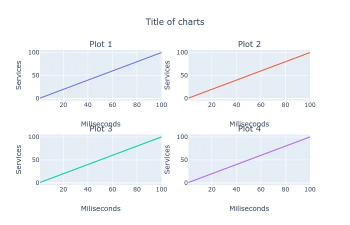
子图中的X轴标题 Plotly Python

4

我正在尝试在作为子图显示的四个甘特图中的x-轴y-轴上添加相同的标题。 我在网上找到了figs.update_layout(),但这只在第一个图表上显示标题,而不是所有图表。我在R中找到了一些答案,但希望能提供Python方面的帮助。

figs = make_subplots(
rows=2, cols=2,
shared_xaxes=False,
subplot_titles =('Plot 1', 'PLot 2', 'PLot 3', 'Plot 4')
)
figs.update_layout(
    title="Plot Title",
    xaxis_title="Miliseconds",
    yaxis_title="Services",
)

for trace in fig_operable.data:
    figs.add_trace(trace, row=1, col=1)
for trace in fig_dynamic.data:
    figs.add_trace(trace, row=2, col=1)
for trace in fig_early.data:
    figs.add_trace(trace, row=1, col=2)
for trace in fig_hmi.data:
    figs.add_trace(trace, row=2, col=2)

figs.update_layout(showlegend=False, title_text="Title of charts")
figs.show()
1个回答

6

如果我理解得正确,您正在寻找类似于

import numpy as np
import plotly.graph_objs as go
from plotly.subplots import make_subplots

subplot_titles = ['Plot 1', 'Plot 2', 'Plot 3', 'Plot 4']
xaxis_title="Miliseconds"
yaxis_title="Services"
rows = 2
cols = 2
height = 300 * rows

trace = go.Scatter(x=np.linspace(1,100,100),
                   y=np.linspace(1,100,100))


fig = make_subplots(rows=rows, cols=cols,
                    shared_xaxes=False,
                    subplot_titles=subplot_titles
                    )

for i, col in enumerate(subplot_titles):
    r = int(np.ceil(((i+1)/cols)))
    c = i%2+1
    fig.add_trace(trace, row=r, col=c)
    fig.update_xaxes(title_text=xaxis_title, row=r, col=c)
    fig.update_yaxes(title_text=yaxis_title, row=r, col=c)

fig.update_layout(showlegend=False,
                  title_text="Title of charts",
                  title_x=0.5,
                  height=height)
fig.show()    

enter image description here

如果您有其他疑问,可以查看此处的文档。

太棒了,谢谢。我正在使用之前创建的甘特图。最好把它们插入到哪里以便跟踪? - Elizabeth
如果您有4个甘特图,您可以将它们放在一个名为traces的列表中,并在add_trace中使用traces[i]而不是trace。 - rpanai

网页内容由stack overflow 提供, 点击上面的
可以查看英文原文,
原文链接