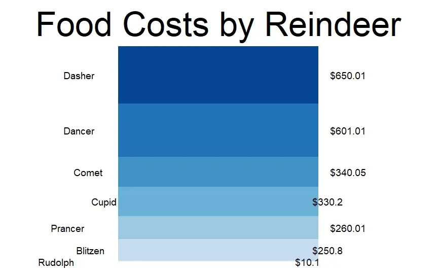
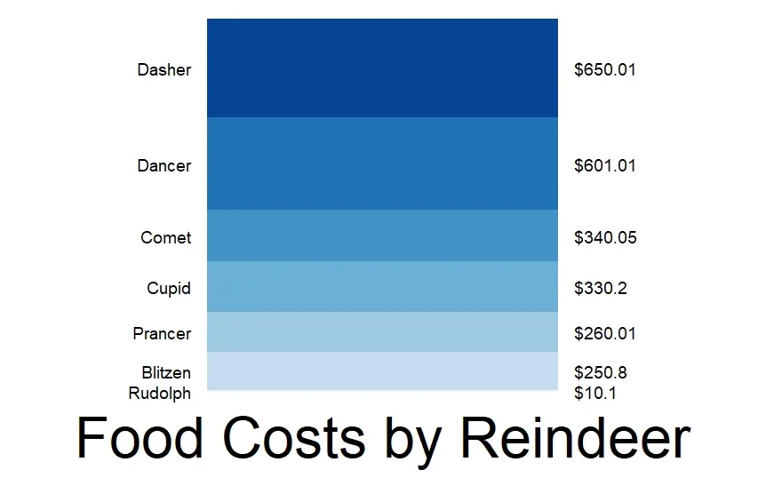
我将我的标签大致对齐到了堆叠条形图的两侧。问题是它们看起来很凌乱,因为它们在每侧的条形上没有正确地左右对齐。我该如何解决这个问题,让它们看起来更专业呢?
df3 <- data.frame(
  Label = c("Dasher", "Dancer", "Comet", "Cupid", "Prancer", "Blitzen", "Rudolph"),
  Amount = c(650.01, 601.01, 340.05, 330.20, 260.01, 250.80, 10.10)
)

# Sort order
level_order <- df3 %>%
  arrange(desc(Amount))

ggplot(level_order, aes(fill=fct_inorder(Label), y=Amount, x="")) +
               geom_bar(position="stack", stat="identity", width = 0.55) +
               scale_fill_brewer(palette = "Blues", direction = -1) +
               theme_void() +
               geom_text(aes(label = paste0("$", Amount)),
                         position = position_stack(vjust = 0.5),
                         hjust = -3.1,
                         size = 5) +
               geom_text(aes(label = Label),
                         position = position_stack(vjust = 0.5),
                         hjust = 5,
                         size = 5) +
               theme(legend.position = "none") +
               theme(plot.title = element_text(size = 50, hjust = .5, vjust = 0)) +
               ggtitle("Food Costs by Reindeer")