自定义箭头但不使用图片:Android

9
我按照这个教程进行操作:http://looksok.wordpress.com/2013/08/24/android-triangle-arrow-defined-as-an-xml-shape/ 
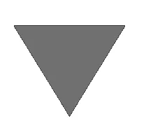
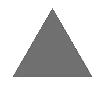
该教程是为了创建自定义箭头作为增量/减量按钮而无需使用图像。箭头的形状很好,但向上箭头在按钮视图底部以其基础为位置,向下箭头在按钮视图顶部以其基础为位置。换句话说,箭头未正确对齐。
我想知道,是否有某种y轴偏移量可用于更好地定位箭头按钮?我拥有的代码是:
<RelativeLayout xmlns:android="http://schemas.android.com/apk/res/android"
    xmlns:tools="http://schemas.android.com/tools"
    android:layout_width="match_parent"
    android:layout_height="match_parent" >

    <Button
        android:id="@+id/arrow_up"
        android:layout_width="75dp"
        android:layout_height="75dp"
        android:background="@drawable/custom_arrow" />

    <Button
        android:id="@+id/arrow_down"
        android:layout_width="75dp"
        android:layout_height="75dp"
        android:rotation="180"
        android:layout_toRightOf="@id/arrow_up"
        android:background="@drawable/custom_arrow" /> 
</RelativeLayout>

custon_arrow.xml文件是:

<?xml version="1.0" encoding="utf-8"?>
<layer-list xmlns:android="http://schemas.android.com/apk/res/android" >
    <item>
        <!-- android:pivotX="-40%" -->
        <rotate 
            android:fromDegrees="45"
            android:toDegrees="45"
            android:pivotX="-20%"
            android:pivotY="88%" >
            <shape
                android:shape="rectangle" >
                <stroke android:color="@color/transparent" android:width="5dp"/> 
                <solid
                    android:color="@color/grey_shade" />
            </shape>
        </rotate>
    </item>
</layer-list>
4个回答

16
<TextView 
        android:layout_width="wrap_content"
        android:layout_height="wrap_content"
        android:text="▲"/>
或者
<TextView 
        android:layout_width="wrap_content"
        android:layout_height="wrap_content"
        android:text="▼"/>

您可以在这里获取更多选项。


我现在才看到这个,但是这太棒了!非常好的答案。 - portfoliobuilder
你是最有价值的球员! - Allinone51

14

可以使用路径轻松完成:

<?xml version="1.0" encoding="utf-8"?>
<vector xmlns:android="http://schemas.android.com/apk/res/android"
        android:width="32dp"
        android:height="24dp"
        android:viewportWidth="32.0"
        android:viewportHeight="24.0">
    <path android:fillColor="#e4e4e8"
          android:pathData="M0 0 h32 l-16 24 Z"/>
</vector>

箭头


2
使您的 marginLeft 属性保持一致(一个是3dp,另一个是5dp)。
看到图片后,您在谈论垂直对齐!
我认为您可以轻松地向上箭头添加一些 paddingBottom 并向下箭头添加一些 paddingTop。
好吧,这是一个简单粗暴的技巧,但...
... 这个答案肯定更好:看看

marginLeft属性是从左到右定位的。它不会影响按钮视图内部的形状。我想知道如何影响按钮。让我截个屏,也许这样会更好。 - portfoliobuilder
这也是我最初想的,但它对箭头形状没有影响。忽略边距属性,我只是快速复制和粘贴。边距是相关的,只是在我这里呈现它们的上下文中不相关。我的实际程序中有更多的代码。对于混淆感到抱歉。但边距也与形状定位无关。我尝试添加paddingTop和paddingBottom,分别为20dp、10dp和70dp,只是想看看箭头是否会消失在视图中。但这些都没有影响。还有其他想法吗? - portfoliobuilder

1

enter image description here

  <?xml version="1.0" encoding="utf-8"?>
        <vector xmlns:android="http://schemas.android.com/apk/res/android"
            android:width="12dp"
            android:height="10dp"
            android:viewportWidth="32.0"
            android:viewportHeight="24.0">
            <path android:fillColor="#707070"
                android:pathData="M0 0 h32 l-16 24 Z"/>
        </vector>

enter image description here

<?xml version="1.0" encoding="utf-8"?>
<vector xmlns:android="http://schemas.android.com/apk/res/android"
    android:height="12dp"
    android:width="10dp"
    android:viewportHeight="100"
    android:viewportWidth="100" >
    <group
        android:name="triableGroup">
        <path
            android:name="triangle"
            android:fillColor="#707070"
            android:pathData="m 50,0 l 50,70 -100,0 z" />
    </group>
</vector>  

网页内容由stack overflow 提供, 点击上面的
可以查看英文原文,
原文链接