我采用了不同的方法来创建自定义按钮,并且它运行得非常好,所以我想分享给大家。
我使用样式来创建一个左侧带有图像、中右侧带有文本的自定义按钮。只需按照以下4个“简单步骤”:
I. 使用至少3个不同的PNG文件和 /YOUR_OWN_PATH/android-sdk-mac_x86/tools/./draw9patch 工具创建你的九宫格图形。在此之后,你应该会得到:
button_normal.9.png,button_focused.9.png 和 button_pressed.9.png
然后下载或创建一个 24x24 的 PNG 图标。
ic_your_icon.png
把所有文件都保存在 Android 项目的 drawable/ 文件夹下。
II. 在 drawable/ 文件夹下创建一个名为 button_selector.xml 的 XML 文件。状态应该如下:
<item android:state_pressed="true" android:drawable="@drawable/button_pressed" />
<item android:state_focused="true" android:drawable="@drawable/button_focused" />
<item android:drawable="@drawable/button_normal" />
III. 进入values/文件夹并打开或创建styles.xml文件,然后创建以下XML代码:
<style name="ButtonNormalText" parent="@android:style/Widget.Button">
    <item name="android:textColor" >@color/black</item>
    <item name="android:textSize" >12dip</item>
    <item name="android:textStyle" >bold</item>
    <item name="android:height" >44dip</item>
    <item name="android:background" >@drawable/button_selector</item>
    <item name="android:focusable" >true</item>
    <item name="android:clickable" >true</item>
</style>

<style name="ButtonNormalTextWithIcon" parent="ButtonNormalText">
    <item name="android:drawableLeft" >@drawable/ic_your_icon</item>
</style>
ButtonNormalTextWithIcon是一个“子样式”,因为它扩展了ButtonNormalText(“父样式”)。
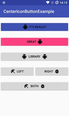
请注意,通过在ButtonNormalTextWithIcon样式中更改drawableLeft到drawableRight、drawableTop或drawableBottom,您可以将图标放置在文本相对于其他位置。
IV. 转到存储UI的XML文件的layout/文件夹,并进入要应用样式并使其呈现如下所示的Button:
<Button android:id="@+id/buttonSubmit"
android:text="@string/button_submit"
android:layout_width="fill_parent"
android:layout_height="wrap_content"
style="@style/ButtonNormalTextWithIcon" ></Button>
而且... 奇迹发生了!你得到了一个左侧带有图片的按钮。
对我来说,这是更好的方法!因为用这种方式做,可以单独管理按钮文本的大小和所要显示的图标,并使用相同的背景可绘制对象为多个带有不同图标的按钮服务,遵循 Android UI Guidelines 使用样式。
您还可以为应用程序创建主题,并将“父样式”添加到其中,以便所有按钮看起来都相同,并在需要时仅应用带有图标的“子样式”。

CardView>> 只需将LinearLayout放入CardView中,将image设置为LinearLayout的背景,并在此LinearLayout中使用textView。有关更多详细信息,请查看此链接> https://dev59.com/AW855IYBdhLWcg3wPBz6#65172123。谢谢,编码愉快 :) - AG-Developer