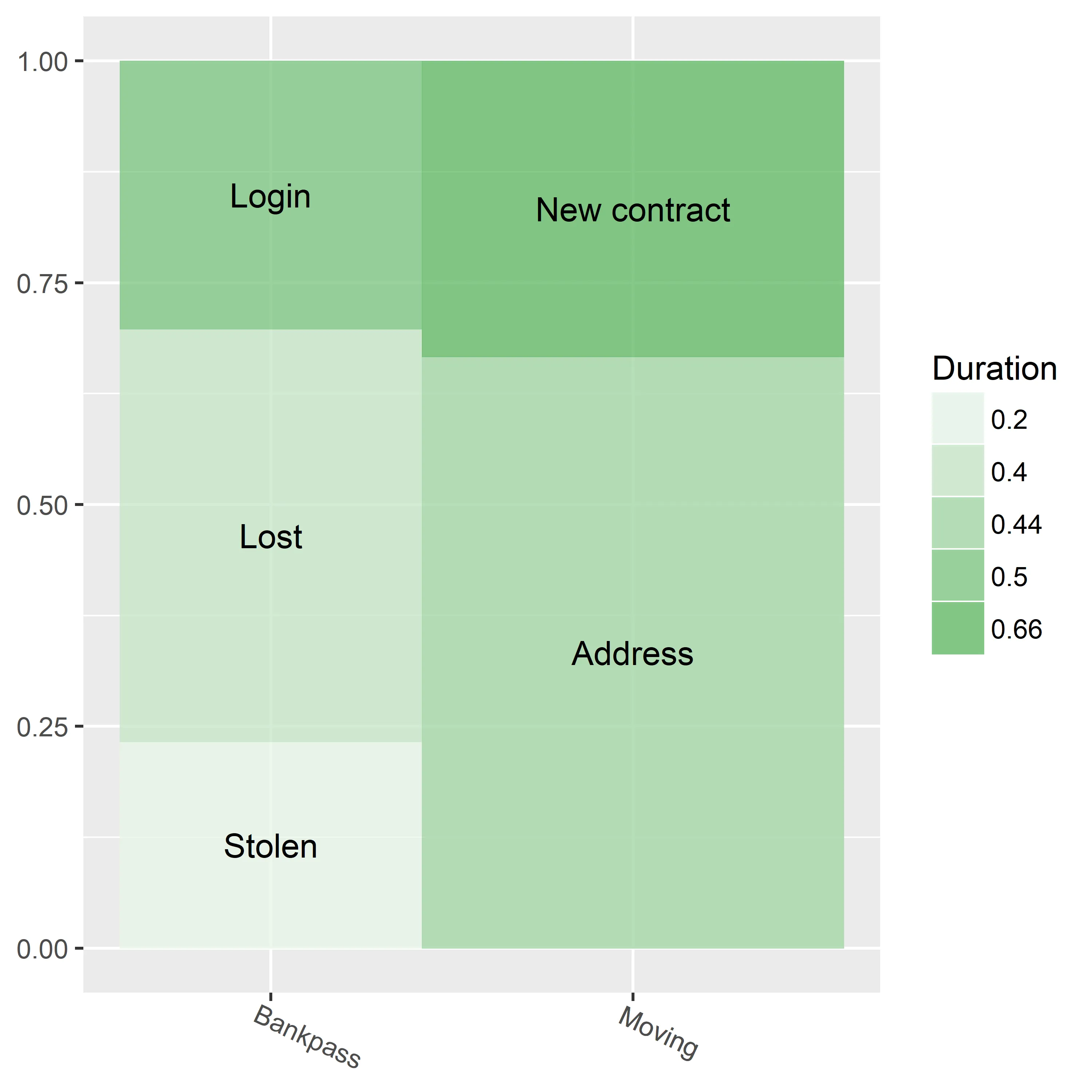
将文本标签添加到ggplot2镶嵌图中

5

使用以下数据:

Category <- c("Bankpass", "Bankpass", "Bankpass", "Moving", "Moving")
Subcategory <- c("Stolen", "Lost", "Login", "Address", "New contract")
Weight <- c(10,20,13,40,20)
Duration <- as.character(c(0.2,0.4,0.5,0.44,0.66))
Silence <- as.character(c(0.1,0.3,0.25,0.74,0.26))
df <- data.frame(Category, Subcategory, Weight, Duration, Silence)

我用它来创建以下马赛克图:
library (ggplot2)
library (ggmosaic)

g <- ggplot(data = df) +
  geom_mosaic(aes(weight = Weight, x = product(Category), fill = Duration), 
              offset = 0, na.rm = TRUE) +  
  theme(axis.text.x = element_text(angle = -25, hjust = .1)) +
  theme(axis.title.x = element_blank()) +
  scale_fill_manual(values = c("#e8f5e9", "#c8e6c9", "#a5d6a7", "#81c784", "#66bb6a"))

这里输入图片描述

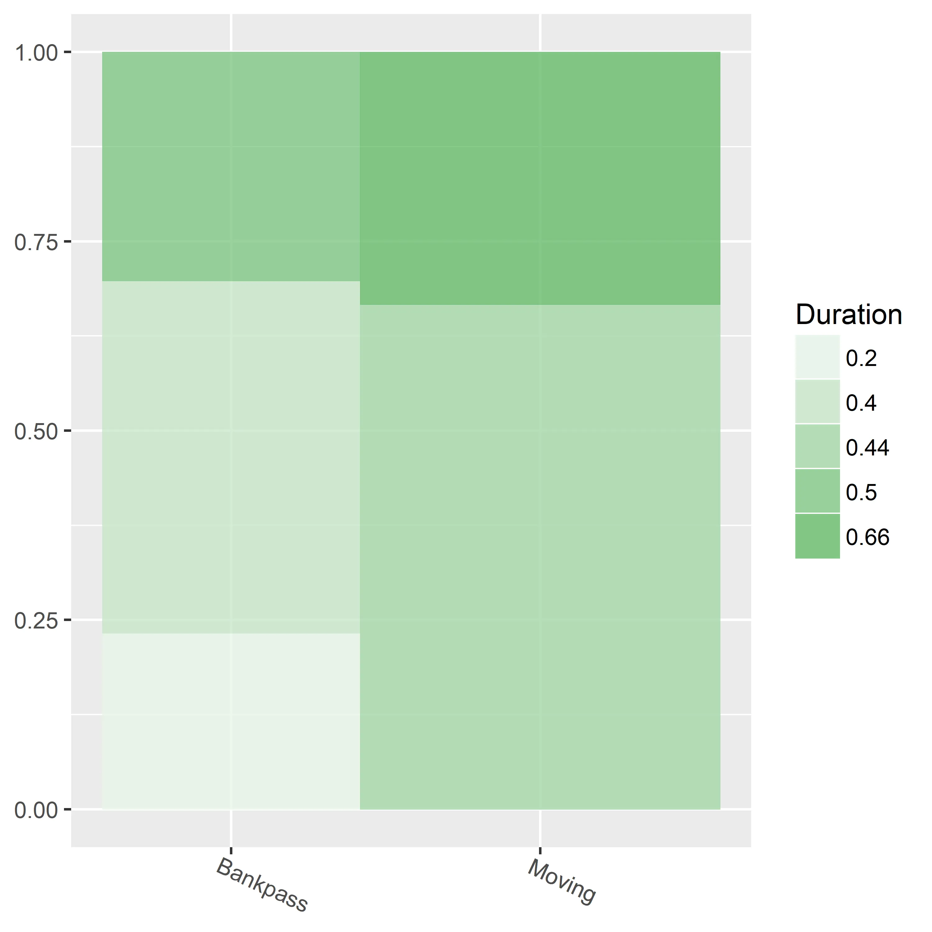
这个图表可以展示数据,但我希望在图表元素上包含文本标签(例如“显示被盗、丢失的费用”等)。

但是,当我这样做时:

g + geom_text(x = Category, y = Subcategory, label = Weight)

我遇到了以下错误:

运行 UseMethod("rescale") 时出错:没有可适用于 "character" 类型对象的 'rescale' 方法

你有什么想法,是什么导致了这个问题?
2个回答

8
这是我的尝试。x轴是离散变量(即Category)。因此,您不能在geom_text()中使用它。您需要为轴创建数字变量。同样,您需要找到标签在y轴上的位置。为了获得两个维度的数字值,我决定访问在图形背后的数据框。当您使用ggmosaic包时,在此情况下有一个图形后面的数据框。您可以使用ggplot_build()获取它。您可以使用数据框中的信息(例如,xmin和xmax)计算x和y值。这是好消息。但是,我们也有坏消息。当您到达数据时,您会意识到缺少用于标签的子类别信息。
我们可以通过将上面的数据框与原始数据连接来克服这一挑战。当我连接数据时,我计算了原始数据和其他数据的比例。这些值被故意转换为字符。 temp是您需要添加标签的数据集。
library(dplyr)
library(ggplot2)
library(ggmosaic)

# Add proportion for each and convert to character for join

df <- group_by(df, Category) %>%
      mutate(prop = as.character(round(Weight / sum(Weight),3)))

# Add proportion for each and convert to character.
# Get x and y values for positions
# Use prop for join

temp <- ggplot_build(g)$data %>%
        as.data.frame %>%
        transmute(prop = as.character(round(ymax - ymin, 3)),
                  x.position = (xmax + xmin) / 2,
                  y.position = (ymax + ymin) / 2) %>%
        right_join(df)

g + geom_text(x = temp$x.position, y = temp$y.position, label = temp$Subcategory) 

enter image description here


2
我认为您正在寻找类似于这样的东西。
library(ggplot2)
library(ggmosaic)

您的数据:

Category <- c("Bankpass", "Bankpass", "Bankpass", "Moving", "Moving")
Subcategory <- c("Stolen", "Lost", "Login", "Address", "New contract")
Weight <- c(10,20,13,40,20)
Duration <- as.character(c(0.2,0.4,0.5,0.44,0.66))
Silence <- as.character(c(0.1,0.3,0.25,0.74,0.26))
mydf <- data.frame(Category, Subcategory, Weight, Duration, Silence)

ggplot(data = mydf) +
    geom_mosaic(aes( x = product(Duration, Subcategory), fill=factor(Duration)), na.rm=TRUE) + 
    theme(axis.text.x=element_text(angle=-25, hjust= .1)) +
    labs(x="Subcategory", title='f(Duration, Subcategory | Category)')  + 
    facet_grid(Category~.) + 
    guides(fill=guide_legend(title = "Duration", reverse = TRUE))

输出结果为: enter image description here 在ggmosaic包中,这已经是最好的表现了。您可以尝试其他的包。
祝您的项目工作顺利!;-)

2
其他的包? - Sigfried
1
@Scipione Sarlo,你能告诉我一些你在这里提到的其他软件包吗? - cparmstrong
vcd,例如,或图形(参见:http://www.datasciencemadesimple.com/mosaic-plot-in-r/) - Scipione Sarlo

网页内容由stack overflow 提供, 点击上面的
可以查看英文原文,
原文链接