避免使用ggplot2部分切断轴标签文本。

11
我试图生成一个带有轴标签的水平图。
df = data.frame(quality = c("low", "medium", "high", "perfect"),
                n = c(0.1, 11, 0.32, 87.45))

require(ggplot2)
require(dplyr)
size = 20
df %>% 
        ggplot() +
        geom_bar(aes(x = quality, y = n),
                 stat = "identity", fill = "gray70",
                 position = "dodge") +
        geom_text(aes(x = quality, y = n,
                      label = paste0(round(n, 2), "%")),
                  position = position_dodge(width = 0.9),
                  hjust = -0.2,
                  size = 10, color = "gray50") +
        coord_flip() +
        ggtitle("") +
        xlab("gps_quality\n") +
        #scale_x_continuous(limits = c(0, 101)) +
        theme_classic() +
        theme(axis.title = element_text(size = size, color = "gray70"),
              axis.text.x = element_blank(),
              axis.title.x = element_blank(),
              axis.ticks = element_blank(),
              axis.line = element_blank(),
              axis.title.y = element_blank(),
              axis.text.y = element_text(size = size,
                                         color = ifelse(c(0,1,2,3) %in% c(2, 3), "tomato1", "gray40")))

不幸的是,有一根柱子比其他柱子要长得多,ggplot对其进行了部分裁剪。
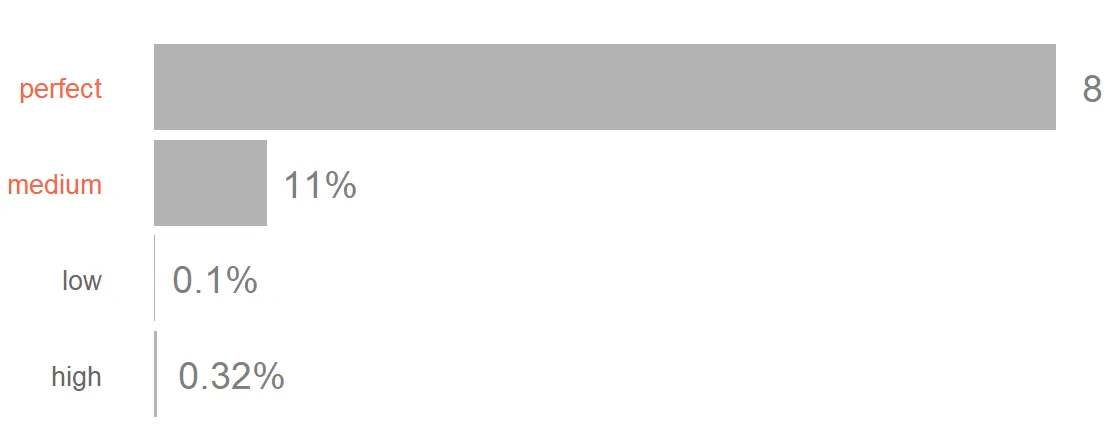
enter image description here

有什么好的想法吗?

我已经尝试过scale_y_continuous(expand = c(0, 0),但这会在刻度文本和柱子之间留下很多空隙。


3
在最新的{ggplot2}开发版本中,似乎可以在
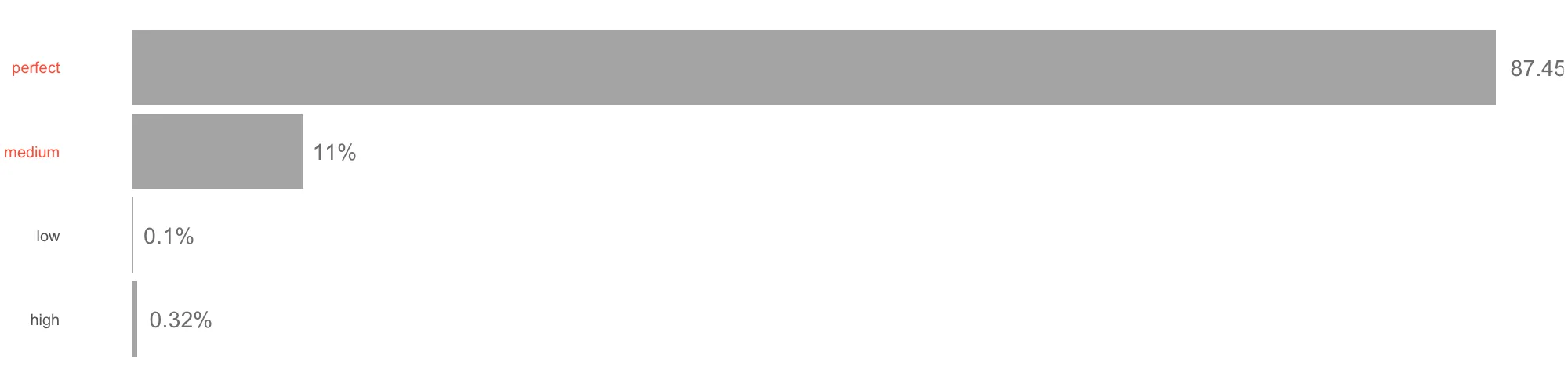
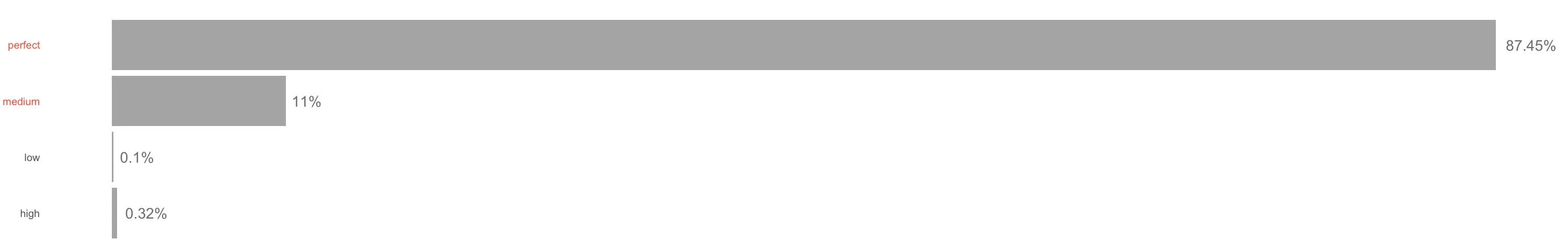
coord_cartesian中添加clip="off"。可以参考这个链接:https://twitter.com/ClausWilke/status/991542952802619392?s=19 - Sébastien Rochette
能否详细说明如何将其应用于我的问题? - Seymour
1
我不太确定。我只是在Twitter上看到这个,我觉得这可能适用于你的情况。我还没有深入研究过。 - Sébastien Rochette
如何在画布范围内制作geom_text绘图? - tjebo
2个回答

14
你需要:
### Need development version of ggplot2 for `clip = "off"`
# Ref: https://github.com/tidyverse/ggplot2/pull/2539

# install.packages("ggplot2", dependencies = TRUE)

library(magrittr)
library(ggplot2)

df = data.frame(quality = c("low", "medium", "high", "perfect"),
                n = c(0.1, 11, 0.32, 87.45))

size = 20

plt1 <- df %>% 
  ggplot() +
  geom_bar(aes(x = quality, y = n),
           stat = "identity", fill = "gray70",
           position = "dodge") +
  geom_text(aes(x = quality, y = n,
                label = paste0(round(n, 2), "%")),
            position = position_dodge(width = 0.9),
            hjust = -0.2,
            size = 10, color = "gray50") +

  # This is needed
  coord_flip(clip = "off") +

  ggtitle("") +
  xlab("gps_quality\n") +
  # scale_x_continuous(limits = c(0, 101)) +
  theme_classic() +
  theme(axis.title = element_text(size = size, color = "gray70"),
        axis.text.x = element_blank(),
        axis.title.x = element_blank(),
        axis.ticks = element_blank(),
        axis.line = element_blank(),
        axis.title.y = element_blank(),
        axis.text.y = element_text(size = size,
                                   color = ifelse(c(0,1,2,3) %in% c(2, 3),
                                   "tomato1", "gray40")))

plt1 + theme(plot.margin = margin(2, 4, 2, 2, "cm"))

这段文字是由reprex package(v0.2.0)创建于2018年5月6日。


1
在我的交互式屏幕设备上,我只需要扩大查看面板的大小。如果你想将其打印到带有图像格式的文件中,则首先要将结果分配一个名称,然后使用足够大的纵横比将其打印到文件设备中(并记得关闭它)。
plt <- df %>% 
         ggplot() +   
         ...............same as yours

 png(height=480, width=2000)
 print(plt);dev.off()

enter image description here

使用宽度为3000,我终于可以看到百分号。

enter image description here


但是你看,在你的设备上也被切掉了,因为你正在看到87而不是87.45%。 - Seymour
好的,那就把设备稍微放大一点。 - IRTFM
我已经尝试将其设置为最大可能值,但问题仍然存在。还有其他想法吗? - Seymour
我猜这需要的不仅仅是“一点点”。 - IRTFM
1
是的,我通过使用 expand = c(0, 0) 并手动使用画图工具修复了图表,但这不是一个非常数据科学的方法 XD。 - Seymour

网页内容由stack overflow 提供, 点击上面的
可以查看英文原文,
原文链接