使用ggplot2按组对密度曲线下方的区域进行阴影处理

16

我有这个数据框:

set.seed(1)
x <- c(rnorm(50, mean = 1), rnorm(50, mean = 3))
y <- c(rep("site1", 50), rep("site2", 50))
xy <- data.frame(x, y)

我制作了这个密度图:

library(ggplot2)
ggplot(xy, aes(x, color = y)) + geom_density()

对于site1,我需要遮蔽数据超过1%的曲线下面积。对于site2,我需要遮蔽数据低于75%的曲线下面积。

我希望绘图看起来像这样(经过Photoshop处理)。我在Stack Overflow上查找了相关信息,了解到其他人也询问了如何按组遮蔽曲线下部分区域,但我无法弄清楚如何实现。

enter image description here


我看过那个问题,但我无法弄清楚如何按组对不同的区域进行着色。 - luciano
3个回答

12

这里是一种方法(正如@joran所说,这是回答这里的扩展):

#  same data, just renaming columns for clarity later on
#  also, use data tables
library(data.table)
set.seed(1)
value <- c(rnorm(50, mean = 1), rnorm(50, mean = 3))
site  <- c(rep("site1", 50), rep("site2", 50))
dt    <- data.table(site,value)
#  generate kdf
gg <- dt[,list(x=density(value)$x, y=density(value)$y),by="site"]
#  calculate quantiles
q1 <- quantile(dt[site=="site1",value],0.01)
q2 <- quantile(dt[site=="site2",value],0.75)
# generate the plot
ggplot(dt) + stat_density(aes(x=value,color=site),geom="line",position="dodge")+
  geom_ribbon(data=subset(gg,site=="site1" & x>q1),
              aes(x=x,ymax=y),ymin=0,fill="red", alpha=0.5)+
  geom_ribbon(data=subset(gg,site=="site2" & x<q2),
              aes(x=x,ymax=y),ymin=0,fill="blue", alpha=0.5)

生成这个:


3
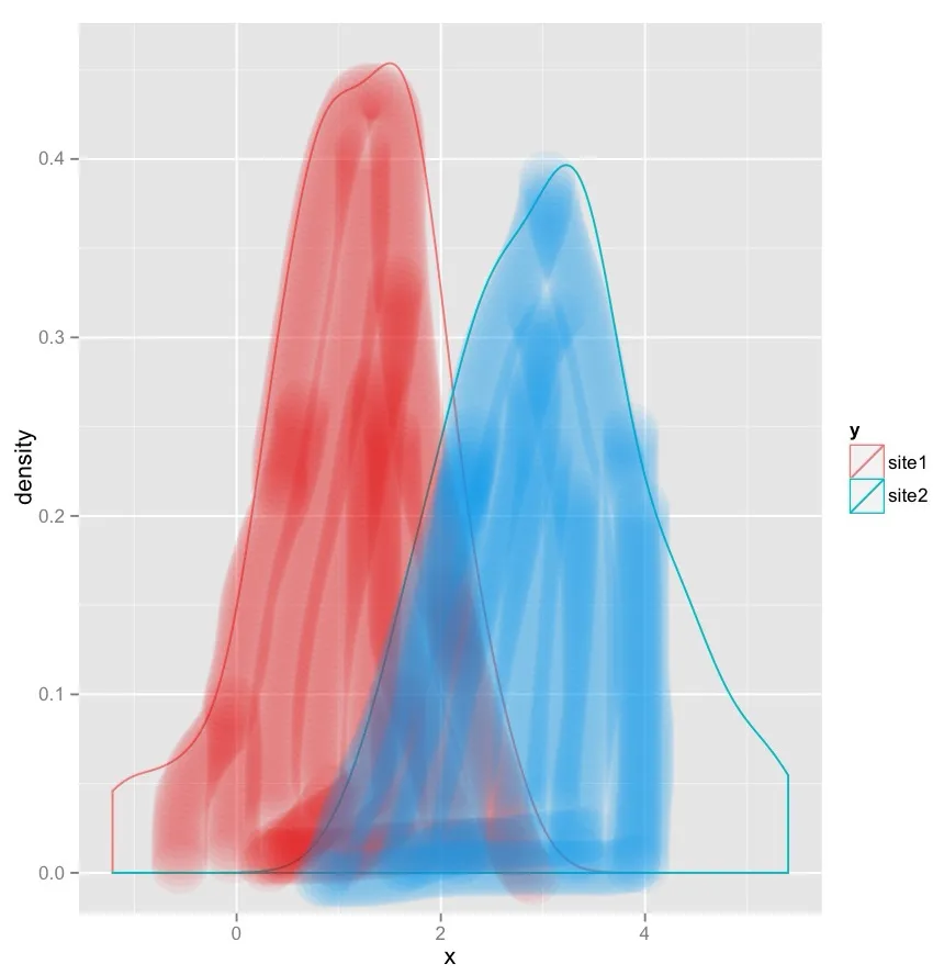
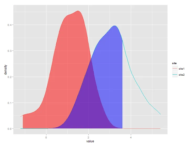
@jlhoward的解决方案存在问题,因为你需要为每个组手动添加goem_ribbon。我自己编写了一个ggplot统计包装器,按照这个指南编写。它的好处是可以自动与group_byfacet一起使用,并且您不需要为每个组手动添加几何图形。
StatAreaUnderDensity <- ggproto(
  "StatAreaUnderDensity", Stat,
  required_aes = "x",
  compute_group = function(data, scales, xlim = NULL, n = 50) {
    fun <- approxfun(density(data$x))
    StatFunction$compute_group(data, scales, fun = fun, xlim = xlim, n = n)
  }
)

stat_aud <- function(mapping = NULL, data = NULL, geom = "area",
                    position = "identity", na.rm = FALSE, show.legend = NA, 
                    inherit.aes = TRUE, n = 50, xlim=NULL,  
                    ...) {
  layer(
    stat = StatAreaUnderDensity, data = data, mapping = mapping, geom = geom, 
    position = position, show.legend = show.legend, inherit.aes = inherit.aes,
    params = list(xlim = xlim, n = n, ...))
}

现在你可以像使用其他 ggplot 几何对象一样使用 `stat_aud` 函数。
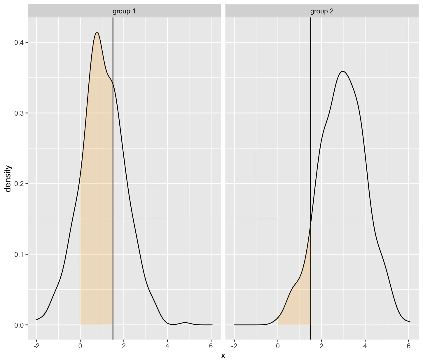
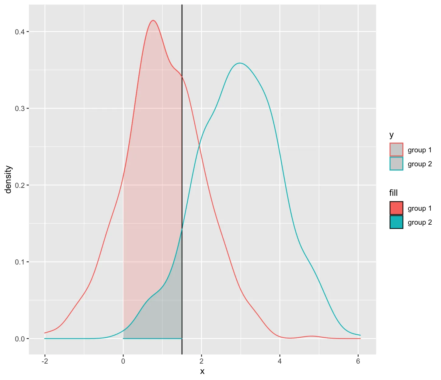
set.seed(1)
x <- c(rnorm(500, mean = 1), rnorm(500, mean = 3))
y <- c(rep("group 1", 500), rep("group 2", 500))
t_critical = 1.5

tibble(x=x, y=y)%>%ggplot(aes(x=x,color=y))+
  geom_density()+
  geom_vline(xintercept = t_critical)+
  stat_aud(geom="area",
           aes(fill=y),
           xlim = c(0, t_critical), 
              alpha = .2)

enter image description here

tibble(x=x, y=y)%>%ggplot(aes(x=x))+
  geom_density()+
  geom_vline(xintercept = t_critical)+
  stat_aud(geom="area",
           fill = "orange",
           xlim = c(0, t_critical), 
              alpha = .2)+
  facet_grid(~y)

enter image description here


1
我该如何根据data.frame中的变量,将此方法扩展为每个组使用不同的x_lim - Simon
你可以在这里阅读并尝试扩展自定义层以接受美学。[https://ggplot2.tidyverse.org/reference/ggplot2-ggproto.html] - Lala La

-1

你需要使用fill。color控制密度图的轮廓,如果你想要非黑色轮廓的话,这是必要的。

ggplot(xy, aes(x, color=y, fill = y, alpha=0.4)) + geom_density()

要实现这样的效果,您可以使用以下方法移除图例中的 alpha 部分。
ggplot(xy, aes(x, color = y, fill = y, alpha=0.4)) + geom_density()+ guides(alpha='none')

抱歉,这并不能给我所需的图形。请注意,每个组需要填充不同的区域,而不是曲线下的全部区域。 - luciano

网页内容由stack overflow 提供, 点击上面的
可以查看英文原文,
原文链接