ggplot2中密度曲线下的阴影区域

4
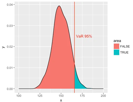
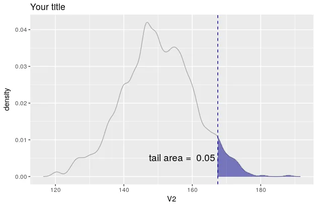
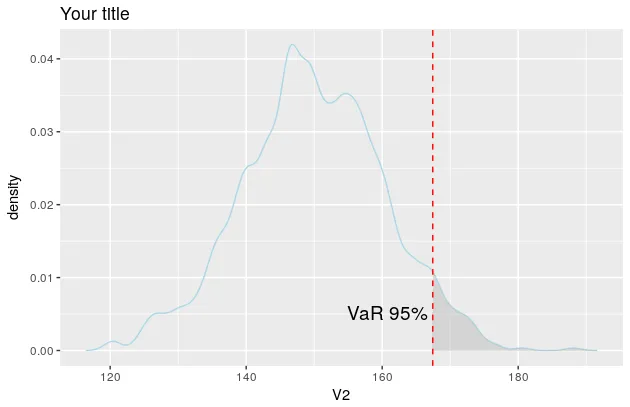
我已经绘制了一个分布图,希望能够给95%以上的区域着色。然而当我试图使用这里文档记录的不同技术:ggplot2 shade area under density curve by group时,由于我的数据集长度不同,它并没有起作用。
AGG[,1]=seq(1:1000)
AGG[,2]=rnorm(1000,mean=150,sd=10)
Z<-data.frame(AGG) 
library(ggplot2)
ggplot(Z,aes(x=Z[,2]))+stat_density(geom="line",colour="lightblue",size=1.1)+xlim(0,350)+ylim(0,0.05)+geom_vline(xintercept=quantile(Z[,2],prob=0.95),colour="red")+geom_text(aes(x=quantile(Z[,2],prob=0.95)),label="VaR 95%",y=0.0225, colour="red")
#I want to add a shaded area right of the VaR in this chart

你需要使用 rnorm 从分布中随机采样,还是仅使用 dnorm 绘制经验函数就足够了? - jdobres
实际上,我无法使用dnorm或类似的函数,因为我的分布不遵循通常的规律,我使用蒙特卡罗模拟来估计它。因此,假设AGG [,2]是任何给定的随机数,我想绘制密度并阴影区域高于第95个百分位数。 - Sabotar
感谢你们两位提供的有用答案。遗憾的是,在R中,使用GGplot来着色区域比使用通常的绘图函数更加复杂。 - Sabotar
这个回答解决了你的问题吗?在两个点之间给核密度图着色。 - Lala La
2个回答

10
这是 ggplot 的辅助函数和内置摘要可能会导致问题多于帮助的情况。在您的情况下,最好直接计算摘要统计信息,然后绘制它们。在下面的示例中,我使用基本的 stats 库中的 density 和 quantile 计算将要绘制的内容。直接将其提供给 ggplot 比尝试操作 ggplot 的摘要函数要简单得多。这样,使用 geom_ribbon 和 ggplot 的预期美学系统实现了阴影,无需深入研究绘图对象。
rm(list = ls())
library(magrittr)
library(ggplot2)

y <- rnorm(1000, 150, 10)

cutoff <- quantile(y, probs = 0.95)

hist.y <- density(y, from = 100, to = 200) %$% 
  data.frame(x = x, y = y) %>% 
  mutate(area = x >= cutoff)

the.plot <- ggplot(data = hist.y, aes(x = x, ymin = 0, ymax = y, fill = area)) +
  geom_ribbon() +
  geom_line(aes(y = y)) +
  geom_vline(xintercept = cutoff, color = 'red') +
  annotate(geom = 'text', x = cutoff, y = 0.025, color = 'red', label = 'VaR 95%', hjust = -0.1)
print(the.plot)

enter image description here


2
这里提供了使用函数WVPlots::ShadedDensity的解决方案。我将使用此函数,因为它的参数是自解释的,因此可以非常容易地创建图表。不过,定制有点棘手。但是,一旦您理解了ggplot对象,就会发现它并不神秘。
library(WVPlots)

# create the data
set.seed(1)
V1 = seq(1:1000)
V2 = rnorm(1000, mean = 150, sd = 10)
Z <- data.frame(V1, V2)

现在您可以创建您的图表。
threshold <- quantile(Z[, 2], prob = 0.95)[[1]]
p <- WVPlots::ShadedDensity(frame = Z, 
                            xvar = "V2",
                            threshold = threshold,
                            title = "Your title",
                            tail = "right")
p

enter image description here

如果您希望线的颜色为浅蓝色等,则需要操作对象p。在这方面,请参见此问题此问题

对象p包含四个图层:geom_linegeom_ribbongeom_vlinegeom_text。您可以在此处找到它们:p$layers

现在,您需要更改它们的美学映射。对于geom_line,只有一个映射,即colour

p$layers[[1]]$aes_params
$colour
[1] "darkgray"

如果您现在想要将线条颜色更改为淡蓝色,只需覆盖现有颜色,如下所示。
p$layers[[1]]$aes_params$colour <- "lightblue"

一旦你弄清楚了如何为一个图层做到这一点,其余的部分就很容易了。

p$layers[[2]]$aes_params$fill <- "grey"     #geom_ribbon
p$layers[[3]]$aes_params$colour <- "red"    #geom_vline
p$layers[[4]]$aes_params$label <- "VaR 95%" #geom_text

p

现在的情节看起来像这样:

在此输入图片描述


非常优雅且易于实现的解决方案! - Luis

网页内容由stack overflow 提供, 点击上面的
可以查看英文原文,
原文链接