R绘图:坐标轴居中

3

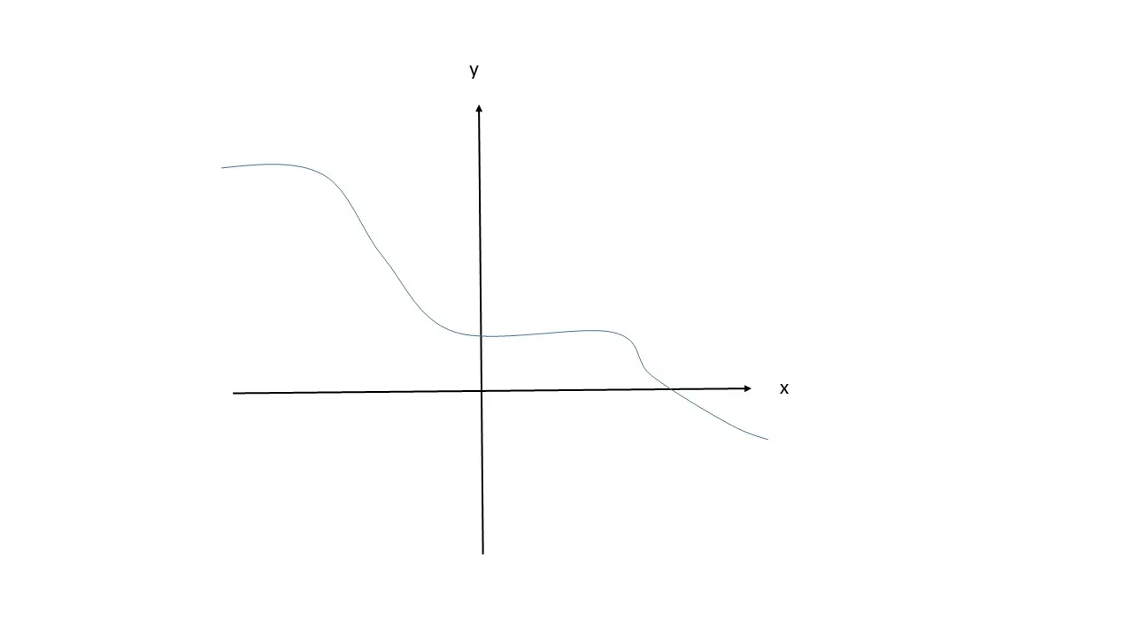
默认情况下,R中的笛卡尔坐标轴位于绘图的底部和左侧。
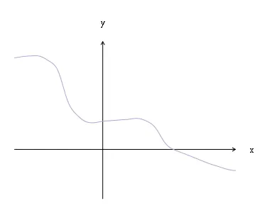
如何将坐标轴居中,如下图所示?

enter image description here

示例

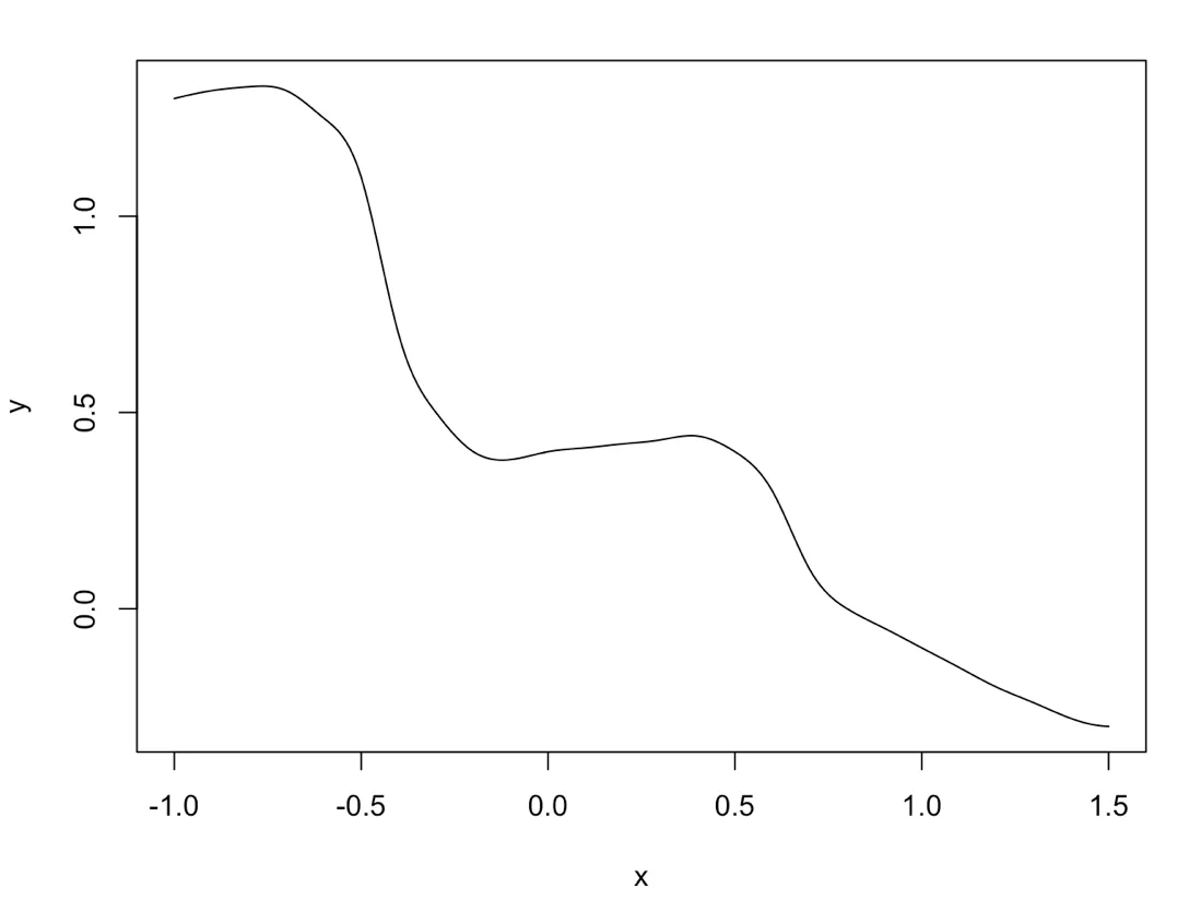
## using; data; generated; by; bgoldst;;
## estimate curve
x <- seq(-1,1.5,0.1);
y <- c(1.3,1.32,1.33,1.32,1.25,1.1,0.7,0.5,0.4,0.38,0.4,0.41,0.42,0.43,0.44,0.4,0.3,0.1,0,-0.05,-0.1,-0.15,-0.2,-0.24,-0.28,-0.3);
f <- splinefun(x,y);

## calculate precise points along estimated curve
x <- seq(-1,1.5,0.01);
y <- f(x);
plot(x, y, type = 'l')

enter image description here


2
RдёҚе–ңж¬ўеҲ¶дҪңиҝҷж ·зҡ„еӣҫиЎЁгҖӮжӮЁеҸҜд»ҘдҪҝз”Ёplot(..., axes=FALSE)е…ій—ӯжүҖжңүиҪҙпјҢ然еҗҺдҪҝз”Ёlines()жҲ–segments()еңЁд»»дҪ•дҪҚзҪ®з»ҳеҲ¶иҮӘе·ұзҡ„зәҝжқЎпјҢд№ҹи®ёеҸҜд»ҘдҪҝз”Ёlwd=дҪҝе®ғ们жӣҙзІ—гҖӮеҰӮжһңжӮЁжҸҗдҫӣдәҶдёҖдёӘеҸҜйҮҚзҺ°зҡ„зӨәдҫӢе’ҢжӮЁжү“з®—дҪҝз”Ёзҡ„з»ҳеӣҫеҢ…пјҲеҰӮжһңдёҚжҳҜеҹәжң¬зҡ„RпјүпјҢйӮЈд№Ҳеӣһзӯ”дјҡжӣҙе®№жҳ“дәӣгҖӮ - MrFlick
如果你真的想要箭头,那么你可以使用 axis(..., pos = 0) 轻松实现。然后其他答案可以给你这个。plot(x, y, xlim = c(-1.5, 1.5), ylim = c(-2, 2), axes = FALSE, ann = FALSE, type = 'n'); axis(1L, pos = 0, lwd.ticks = 0, labels = FALSE); axis(2L, pos = 0, lwd.ticks = 0, labels = FALSE); lines(x, y, col = 4L) - rawr
2个回答

5

@ForrestRStevens比我快,我一直在忙着用样条估计你的曲线 :)

## estimate curve
x <- seq(-1,1.5,0.1);
y <- c(1.3,1.32,1.33,1.32,1.25,1.1,0.7,0.5,0.4,0.38,0.4,0.41,0.42,0.43,0.44,0.4,0.3,0.1,0,-0.05,-0.1,-0.15,-0.2,-0.24,-0.28,-0.3);
f <- splinefun(x,y);

## calculate precise points along estimated curve
x <- seq(-1,1.5,0.01);
y <- f(x);

## precompute limits
xlim <- c(min(x),max(x));
ylim <- c(min(y)-0.4,max(y)+0.2);

## set global plot params
par(xaxs='i',yaxs='i',mar=c(1,1,3,3)+0.1); ## "internal" axis spacing, meaning no extended range, and slightly adjust margins

## draw plot
plot(NA,xlim=xlim,ylim=ylim,axes=F,ann=F); ## set plot bounds, no default ornaments
arrows(c(0,xlim[1]),c(ylim[1],0),c(0,xlim[2]),c(ylim[2],0),0.05); ## draw custom axes
mtext('y',3,1,at=0,las=1,cex=0.8,family='serif'); ## y label
mtext('x',4,1,at=0,las=1,cex=0.8,family='serif'); ## x label
lines(x,y,col='#aaaacc'); ## draw line on top

绘图

通常情况下,您可以使用基础图形绘制几乎任何图形,但与使用更复杂的软件包相比,这往往需要更多的工作,因为您必须手工绘制所有内容。


嘿,加一分给你的努力,实际解释问题的图形。非常印象深刻。 :) - Forrest R. Stevens
感谢您额外的努力来复制这行代码。 - JACKY88

4
我认为以下类似的内容可以在基础图形中实现您想要的功能:
##  Simulate your data:
x <- seq(-3, 3, by=0.01)
y <- 0.5*x - 0.3*x^2 + 0.4*x^3

##  Plot the polynomial function, removing axis ticks and bounding box,
##    as well as the axis labels:
plot(x, y, 
     type="l", 
     xaxt='n', yaxt='n', 
     bty='n', 
     xlab='', ylab='', 
     col="blue")

##  Next add in your axis arrows:
arrows(min(x), 0, max(x), 0, lwd=1, length=0.15)
arrows(0, min(y), 0, max(y), lwd=1, length=0.15)

##  And plot your x/y labels.  Note that if you want them
##    actually at the end of the arrows you would need to 
##    remove the pos= argument and shorten your arrows by
##    a small amount.  To match your original figure, you can
##    alter the x/y coordinate to be the max() instead.
text(0, min(y), "y", pos=2)
text(min(x), 0, "x", pos=3)

Plot


网页内容由stack overflow 提供, 点击上面的
可以查看英文原文,
原文链接