我在想是否有一种方法可以摆脱r-plot图表中的坐标轴值,分别是x轴或y轴。
我知道
我知道
axes=false可以摆脱整个坐标轴,但我只想去掉数字标注。axes=false可以摆脱整个坐标轴,但我只想去掉数字标注。如何在 x 轴或 y 轴上移除刻度标签?
plot(1:10, xaxt='n')
plot(1:10, yaxt='n')
如果你想要同时移除标签:
plot(1:10, xaxt='n', ann=FALSE)
plot(1:10, yaxt='n', ann=FALSE)
使用基本图形,标准的方法是使用 axes=FALSE,然后使用 Axis(或 axis)创建自己的坐标轴。例如,
x <- 1:20
y <- runif(20)
plot(x, y, axes=FALSE, frame.plot=TRUE)
Axis(side=1, labels=FALSE)
Axis(side=2, labels=FALSE)
library(lattice)
xyplot(y ~ x, scales=list(alternating=0))
@Richie Cotton提供了一个非常好的答案。我只能补充说,这个页面提供了一些示例。尝试以下内容:
x <- 1:20
y <- runif(20)
plot(x,y,xaxt = "n")
axis(side = 1, at = x, labels = FALSE, tck = -0.01)
你也可以在图表内部放置标签:
plot(spline(sub$day, sub$counts), type ='l', labels = FALSE)
你将会收到一个警告。我认为这是因为labels实际上是传递给plot运行的子例程(轴?)的参数。警告将弹出,因为它没有直接作为plot函数的参数。
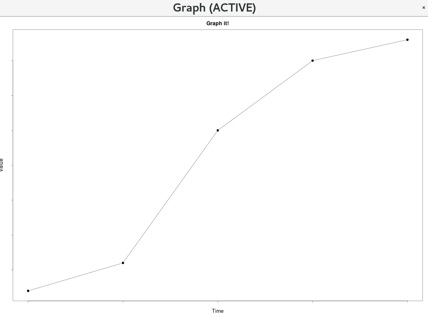
### Main Plotting Function ###
plotXY <- function(time, value){

    ### Plot Style Settings ###

    ### default bg is white, set it the same as the axis-colour
    background <- "white"

    ### default col.axis is black, set it the same as the background to match
    axis_colour <- "white"

    plot_title <- "Graph it!"
    xlabel <- "Time"
    ylabel <- "Value"
    label_colour <- "black"
    label_scale <- 2
    axis_scale <- 2
    symbol_scale <- 2
    title_scale <- 2
    subtitle_scale <- 2
    # point style 16 is a black dot
    point <- 16
    # p - points, l - line, b - both
    plot_type <- "b"

    plot(time, value, main=plot_title, cex=symbol_scale, cex.lab=label_scale, cex.axis=axis_scale, cex.main=title_scale, cex.sub=subtitle_scale, xlab=xlabel, ylab=ylabel, col.lab=label_colour, col.axis=axis_colour, bg=background, pch=point, type=plot_type)
}

plotXY(time, value)