使用特征名称绘制特征重要性图表

20
在R中有预先构建的函数来绘制随机森林模型的特征重要性。但在Python中似乎缺少这种方法。我在matplotlib中搜索了一种方法。
model.feature_importances给我以下结果:
array([  2.32421835e-03,   7.21472336e-04,   2.70491223e-03,
         3.34521084e-03,   4.19443238e-03,   1.50108737e-03,
         3.29160540e-03,   4.82320256e-01,   3.14117333e-03])

然后使用以下绘图函数:

>> pyplot.bar(range(len(model.feature_importances_)), model.feature_importances_)
>> pyplot.show()

我得到了一个条形图,但是我想要一个带标签的条形图,并且水平显示按排序方式显示的重要性。我也在探索 seaborn ,但是没有找到相应的方法。
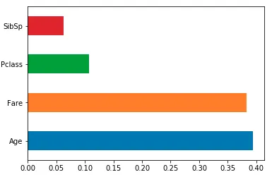
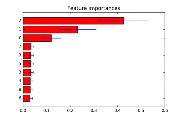

1
你正在寻找一个 barh(水平条形图)。将特征名称作为 tick_label 传递。 - DYZ
3个回答

69

针对时间紧张的数据科学家的快速答案:

将特征重要性加载到一个以列名为索引的pandas系列中,然后使用它的绘图方法。对于使用X训练的分类器model

feat_importances = pd.Series(model.feature_importances_, index=X.columns)
feat_importances.nlargest(20).plot(kind='barh')

稍微详细的答案及完整示例:

假设您使用包含在pandas数据帧中的数据训练了模型,如果您将特征重要性加载到panda系列中,则可以轻松地利用其索引来轻松显示变量名称。plot参数kind='barh'给出了一个水平条形图,但是如果您喜欢,您可以轻松地将此参数替换为kind='bar'以获得沿x轴的传统条形图和特征名称。

nlargest(n)是一种pandas Series方法,它将返回具有最大n值的子集。如果您的模型中有很多功能,并且您只想绘制最重要的功能,则这非常有用。

以下是一个快速的完整示例,使用经典的Kaggle Titanic数据集...

import pandas as pd
from sklearn.ensemble import RandomForestClassifier
%matplotlib inline            # don't forget this if you're using jupyter!

X = pd.read_csv("titanic_train.csv")
X = X[['Pclass', 'Age', 'Fare', 'Parch', 'SibSp', 'Survived']].dropna()
y = X.pop('Survived')

model = RandomForestClassifier()
model.fit(X, y)

(pd.Series(model.feature_importances_, index=X.columns)
   .nlargest(4)
   .plot(kind='barh'))        # some method chaining, because it's sexy!

这将给你这个结果:

sklearn随机森林特征重要性


2
如果我想要将这张图在y轴上翻转怎么办?也就是说,先显示年龄,然后是票价等。 - Thelonious Monk
5
调用 invert_yaxis() 方法 - 例如:pd.Series(model.feature_importances_, index=X.columns).nlargest(4).plot(kind='barh').invert_yaxis()。该方法可将绘图 y 轴反转。 - user5305519

19

不确定您要查找的内容。从这里得出一个例子。如评论中所述:如果您想自定义特征标签,可以将indices更改为标签列表,位于plt.yticks(range(X.shape[1]), indices)行。

import numpy as np
import matplotlib.pyplot as plt

from sklearn.datasets import make_classification
from sklearn.ensemble import ExtraTreesClassifier

# Build a classification task using 3 informative features
X, y = make_classification(n_samples=1000,
                           n_features=10,
                           n_informative=3,
                           n_redundant=0,
                           n_repeated=0,
                           n_classes=2,
                           random_state=0,
                           shuffle=False)

# Build a forest and compute the feature importances
forest = ExtraTreesClassifier(n_estimators=250,
                              random_state=0)

forest.fit(X, y)
importances = forest.feature_importances_
std = np.std([tree.feature_importances_ for tree in forest.estimators_],
             axis=0)
indices = np.argsort(importances)

# Plot the feature importances of the forest
plt.figure()
plt.title("Feature importances")
plt.barh(range(X.shape[1]), importances[indices],
       color="r", xerr=std[indices], align="center")
# If you want to define your own labels,
# change indices to a list of labels on the following line.
plt.yticks(range(X.shape[1]), indices)
plt.ylim([-1, X.shape[1]])
plt.show()

在这里输入图像描述


我通过将这行代码 plt.yticks(range(X.shape[1]), indices) 替换为 plt.yticks(range(X.shape[1]), [feature_names[i] for i in indices]),使特征名称出现在 y 轴上,而不是索引号。 - tsando

3

你可以直接将 df.columns 作为参数传递给 plt.xticks()

plt.bar( range(len(model.feature_importances_)), model.feature_importances_)
plt.xticks(range(len(model.feature_importances_)), train_features.columns)
plt.show()

网页内容由stack overflow 提供, 点击上面的
可以查看英文原文,
原文链接